How to Build a Real Time Shopify Sales Funnel Dashboard in Power BI, End-to-End Project, Edition 2025
TL;DR
A sales funnel dashboard in Power BI can analyze Shopify transaction performance, customer purchase behavior, retention, regional demand, and time trends across two linked report pages. The project uses one week of modified company data and includes dynamic metrics, drill-through details, and exportable order records. Read on to see the required KPIs, visuals, interactions, and build process.
Transcript
Hey guys, welcome back to my channel data tutorials and I'm back with another PowerBI project Shopify sales and customerfunnel report for funnel analysis. Right. So this is a brand new project and you can consider this as a kind of a realtime project also because everybody knows what is Shopify and those who don't know I will explain you what exact... Read More
Key Insights
- Shopify is an e-commerce platform that lets any individual run a business by creating an online store, selling products online and processing payments on that website itself. It also supports managing physical stores and marketing, and it offers a free trial on its official site.
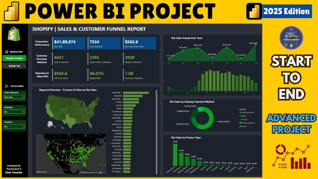
- Net sales is treated as a distinct metric from total sales in this report, and the transaction performance KPI group pairs it with total quantity and net average order value. The distinction is called out explicitly as something that will be explained during the build.
- Customer purchase behavior in the dashboard is measured by splitting total customers into single order customers and repeat customers. These metrics are described as very important for any e-commerce website or any customer facing B2C business.
- Retention and value are captured through three KPIs: LTV, meaning lifetime value, the repeat rate expressed as a percentage, and the frequency of purchase. These sit alongside the transaction and customer behavior KPI groups at the top of the dashboard.
- The regional overview uses color saturation on a province map, where province means state in the United States, so darker areas identify where the most selling products and quantities occur. A companion density or bubble map shows where most customers are concentrated.
- Clicking a province filters a city level bar chart, revealing the top city inside that state. Florida resolves to Miami, Texas resolves to Houston, and California resolves to Los Angeles, which gives both a high level and a more granular view of demand.
- The dataset covers one week, running from 18th of June to 24th of June, which supports a day wise area chart of sales and quantity volume so weekly customer behavior and day patterns can be identified across that seven day window.
- An hourly chart breaks the day into 24 hours to expose peak and lowest peak selling times. The stated business use is to concentrate marketing in the highest selling hours and to manage more inventory then, since most orders arrive during those hours.
- Map tooltips return a full record for a hovered location, showing location, total sales, average order value, quantity, customers, customers with one order, and LTV, so a single hover answers several questions for any state of interest.
- The details tab is an exportable sheet giving row wise information for each order, and it doubles as a drill through target. Selecting a province such as Florida and using drill through filters the sheet to just those records for export.
Install to Summarize YouTube Videos and Get Transcripts
Explore YouTube Video Summarizer or Get YouTube Transcript Extractor
Questions & Answers
Q: How do you build a sales funnel dashboard in Power BI?
Build a Shopify analysis page with KPI cards, regional and city visuals, day and hourly trends, payment gateway breakdowns, and product type views. Add a details page for row-level order data, then connect it through drill-through functionality and make the records exportable.
Q: What Shopify KPIs should the Power BI dashboard include?
Transaction performance includes net sales, total quantity, and net average order value. Customer purchase behavior includes total customers, single-order customers, and repeat customers, while retention and value includes LTV, repeat rate percentage, and purchase frequency.
Q: How is Shopify data connected to Power BI in this project?
The stated process begins with gathering business requirements and reviewing the raw Shopify data. It then moves to connecting the data to Power BI, cleaning it where required, building the dashboard, and generating insights against each business requirement.
Q: How does the measure changer make the Shopify dashboard dynamic?
The measure changer lets users switch the metric driving the regional charts. The same map and city bar chart can display net sales, quantity, or total customers based on the selected measure.
Q: What does the regional overview show in the Power BI report?
The province map uses color saturation to show where products and quantities are concentrated across United States states. A density or bubble map shows where most customers are located, while the related city chart provides a more granular view within a selected state.
Q: Which cities lead when Florida, Texas, and California are selected?
Selecting Florida filters the city chart to Miami, while selecting Texas shows Houston. Selecting California shows Los Angeles, demonstrating how the report moves from a state-level overview to city-level demand.
Q: Why does the dashboard analyze Shopify sales by day and hour?
The day chart analyzes patterns across the one-week dataset from 18th of June to 24th of June. The hourly chart divides each day into 24 hours to identify peak and lowest selling times, helping the business focus marketing and inventory on the busiest hours.
Q: How does the drill-through details page work?
The details page contains row-level information for every order and acts as a drill-through target. Selecting a province such as Florida opens records filtered to that province, and those filtered rows can then be exported.
Summary & Key Takeaways
-
The project builds a Shopify sales and customer funnel report in Power BI, presented as a realtime-style project because the underlying data comes from an actual small scale company. The name of the company cannot be revealed, and the shared file is one week of data with some values changed, so it is dummy data suitable for analysis without exposing private information.
-
Two dashboards are produced. The first is a complete analysis dashboard carrying KPIs, a regional map, a city bar chart, time trend charts and payment gateway and product type views. The second is a details page holding row wise information for every order, reachable through drill through and exportable, so a user can pull the underlying records for a selected province such as Florida.
-
The KPIs are grouped into three families. Transaction performance covers net sales, which the instructor notes is different from total sales, plus total quantity and net average order value. Customer purchase behavior covers total customers, single order customers and repeat customers. Retention and value covers LTV, repeat rate percentage and frequency of purchase.
-
Interactivity is the core design idea. A measure changer filter swaps which metric drives the regional charts, so the same map and bar chart can show net sales, quantity or total customers. Clicking a state, a day, a payment gateway such as Shopify payments or PayPal, or a product such as running shoes filters the whole dashboard to that selection.
-
The stated project steps begin with requirement gathering from the customer, followed by a data walkthrough of the raw data, connecting the data to Power BI, and data cleaning where required. Every step of the dashboard build is promised to be shown from start to end, along with how insights are generated and how each business requirement is met.
Read in Other Languages (beta)
Share This Summary 📚
Summarize YouTube Videos and Get Video Transcripts with 1-Click
Try YouTube Summary with ChatGPT & Claude or YouTube Transcript Generator
Explore More Summaries from Data Tutorials 📚


Summarize YouTube Videos and Get Video Transcripts with 1-Click
Try YouTube Summary with ChatGPT & Claude or YouTube Transcript Generator