How Do You Build a Hospital Emergency Room Dashboard in Power BI? | Data Tutorials
TL;DR
Build the hospital emergency room dashboard in Power BI as four report pages, beginning with a monthly view controlled by year and month selections. Its four headline KPIs cover patient count, average wait time, satisfaction score, and referred patients, while detailed charts analyze admissions, age groups, departments, wait-time targets, gender, race, and demand by day and hour. Read on for the dashboard’s structure, measures, and planning insights.
Transcript
hey guys welcome back to my channel data tutorials and in this video we are going to see a one more data analyst portfolio project and we are going to see this in a power V tool so in front of your screen you can see this will be an output or a final project and in screen also you can see the title of our dashboard is an Hospital emergency room das... Read More
Key Insights
- The hospital emergency room dashboard is a data analyst portfolio project that spans four separate dashboards, built start to end in Power BI and covering advanced DAX functions, advanced measures, and advanced calculated columns.
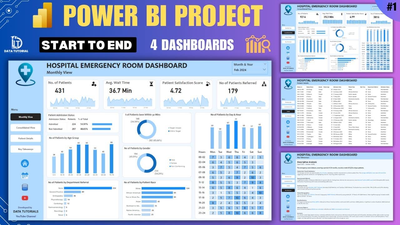
- The first dashboard page is a monthly view controlled by a slicer for year and month, so selecting January 2024, April 2024, or November 2023 refilters every KPI and chart on the page for that period.
- The four KPIs at the top of the monthly view are number of patients, average wait time, satisfaction score, and number of patients referred, giving a high level summary before any deeper breakdown.
- Patients referred means the patient arrived with an appointment already booked for a specific department such as oncology, orthopedics, or gynecology, rather than choosing a doctor on the spot at the hospital.
- The age group chart uses a 10 year interval, producing buckets such as 0 to 9 and 10 to 19, and the resulting distribution shows heavier patient volume in the early 30s through 50s and again in the 70 to 79 band.
- The 30 minute wait threshold is a target the presenter defined personally as the ideal patient wait time, and the chart splits patients into within target and missed target, with only 34 percent falling within target.
- Filtering to missed target shows 267 patients with an average wait time of 46.5, while the within target group averages 20 minutes, which the presenter describes as a good time.
- The day and hour analysis is a matrix chart or heat map with hours in rows and Monday through Sunday in columns, used to see when patient volume peaks so staffing and inventory resources can be planned.
Install to Summarize YouTube Videos and Get Transcripts
Explore YouTube Video Summarizer or Get YouTube Transcript Extractor
Questions & Answers
Q: How do you build a hospital emergency room dashboard in Power BI?
The project builds four Power BI dashboards from start to end, beginning with a monthly emergency room view. It combines a year-and-month filter, four KPI cards, daily trends, and detailed patient charts while covering advanced DAX functions, measures, calculated columns, design, and development.
Q: How many dashboards are included in the Power BI project?
The project includes four dashboards in total. The presenter walks through the design of every dashboard and describes the overall result as an advanced data analyst portfolio project.
Q: What KPIs appear on the monthly emergency room dashboard?
The four KPIs are number of patients, average wait time, satisfaction score, and number of patients referred. Each KPI provides high-level information for the year and month selected in the filter.
Q: What does “patients referred” mean in this dashboard?
It refers to patients who arrive with an appointment already booked for a particular department or doctor. The examples given include oncology, orthopedics, and gynecology, while other patients arrange their visit at the hospital without a prior referral.
Q: How does the dashboard analyze patient wait times?
The presenter defines 30 minutes as the ideal wait-time target and divides patients into within-target and missed-target groups. Only 34 percent are within target; the missed-target filter shows 267 patients averaging 46.5 minutes, compared with 20 minutes for the within-target group.
Q: How are patients grouped by age in the Power BI report?
Patients are placed into 10-year intervals such as 0–9 and 10–19. The resulting chart shows heavier patient volumes from the early 30s through the 50s and another concentration in the 70–79 group.
Q: What detailed patient breakdowns are included in the monthly view?
The lower section analyzes admission status, 10-year age groups, department referrals, performance against the 30-minute target, gender, and race. Admission status includes both counts and percentages for admitted and not-admitted patients.
Q: Why does the dashboard use a day-and-hour heat map?
The matrix places hours in rows, Monday through Sunday in columns, and patient counts in the cells. It reveals when patient traffic peaks so the hospital can plan staffing and inventory resources around demand.
Summary & Key Takeaways
-
The project builds a hospital emergency room dashboard in Power BI, positioned in the hospital, emergency, medical, or pharmaceutical domain. The presenter frames health as a fast growing industry where generated data needs analysis and insights so the workflow of the health industry can be optimized. Four dashboards are designed in total, each walked through step by step.
-
The monthly view page opens with a year and month slicer and four KPIs: number of patients, average wait time, satisfaction score, and number of patients referred. A monthly view graph beneath the KPIs gives a daily, more granular picture, showing how many patients arrived on a given date such as February 5th and how each measure moves day by day.
-
Lower charts deep dive into the data: patient admission status with admitted versus not admitted counts and percentages, patients by 10 year age group, patients by department referral, percentage seen within 30 minutes against target, patients by gender including a not confirming category, patients by race, and a day by hour heat map for resource planning.
Read in Other Languages (beta)
Share This Summary 📚
Summarize YouTube Videos and Get Video Transcripts with 1-Click
Try YouTube Summary with ChatGPT & Claude or YouTube Transcript Generator
Explore More Summaries from Data Tutorials 📚




Summarize YouTube Videos and Get Video Transcripts with 1-Click
Try YouTube Summary with ChatGPT & Claude or YouTube Transcript Generator