How to Build a Tableau EV Dashboard From Start to End
TL;DR
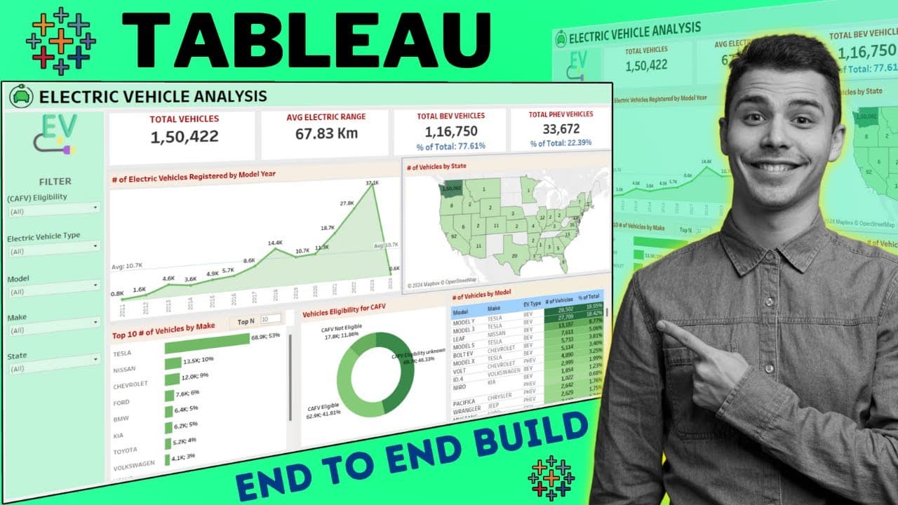
An electric vehicle dashboard in Tableau combines a top KPI row (total vehicles, electric range, total BEV, total PHEV) with charts for registrations by model year, vehicles by state, top 10 makes, CAFV eligibility, and vehicles by model. Left-side filter panels plus action filters let a click on Washington, California, Tesla, or Nissan refilter every element at once.
Transcript
hey guys so in this video we are going to see the electric vehicle data analysis in tblo software so in front of your screen you can see this is a complete interactive dashboard and we have used multiple filters multiple action filters quick filters in this particular dashboard by which this particular dashboard will be interactive and we can see t... Read More
Key Insights
- KPIs sit at the top of the dashboard as the summary layer: total vehicles, electric range, total BEV vehicles, and total PHEV vehicles, giving a headline view before the viewer drills into any of the more granular charts below.
- Charts provide the granularity that KPIs cannot, showing electric vehicle registrations by model year, total vehicles by state, top 10 vehicles by make, eligibility by CAFV, and total vehicles by model so business decisions can be grounded in detail.
- Action filters are the mechanism that makes the dashboard interactive: clicking a mark such as Washington, California, Tesla, or Nissan refilters every other element on the sheet without using the side filter panel.
- Quick filters on the left panel let a viewer select CAFV eligibility, electric vehicle type, model, or state, including multiple selections at once, so the same underlying data can be examined from several angles.
- Filtering to Tesla in the demo shows five models available, its CAFV eligibility breakdown, total vehicles sold, electric range, total BEV vehicles, and zero PHEV vehicles, which illustrates how one click rewrites every number on screen.
- Searching within the model filter works for a specific manufacturer: typing Ford or Mercedes-Benz narrows the dashboard to that make so its full electric vehicle trajectory over recent years can be traced.
- The color palette is a deliberate design choice, not decoration: green dominates the dashboard because electric energy is commonly described as green energy, tying the visual identity to the subject matter.
- A problem statement from the client drives the whole build, starting with KPI requirements, and it is sometimes delivered verbally rather than in writing, in which case the analyst has full liberty to design the dashboard.
Install to Summarize YouTube Videos and Get Transcripts
Explore YouTube Video Summarizer or Get YouTube Transcript Extractor
Questions & Answers
Q: What KPIs are shown at the top of the Tableau electric vehicle dashboard?
Four KPIs form the summary row at the top of the dashboard: total vehicles, electric range, total BEV vehicles, and total PHEV vehicles. These act as the headline figures before any drilling down happens. The presenter notes that the abbreviations used in the KPI row are explained later in the tutorial, at the point where each corresponding chart or calculation is actually built, rather than upfront. The KPIs respond to every filter selection, so choosing a make or state rewrites all four numbers at once.
Q: What charts are included in the electric vehicle dashboard?
The dashboard includes several charts below the KPI row. There is a chart of electric vehicle registrations by model year, a chart of total vehicles available by location meaning different states, a top 10 vehicles by make chart where make refers to the manufacturing companies, an eligibility chart by CAFV, and a total vehicles by model view. The model view shows each company's different models along with the highest selling ones, their make, EV type, total number of vehicles, and each model's share of all vehicles. Charts are included because they give more granular insight than KPIs alone, which is what supports business decisions.
Q: How do action filters work in this Tableau dashboard?
Action filters let a viewer click directly on a visual element rather than going to the filter panel. In the demo, clicking Washington filters every value across the whole dashboard so all data displayed is for Washington only. Clicking California switches the entire view to California. The same applies to makes: clicking Tesla shows only Tesla figures, and clicking Nissan switches to Nissan. The CAFV eligibility chart behaves the same way. The presenter states these are called action filters and says the tutorial covers how to configure them.
Q: What happens when you filter the dashboard to Tesla?
Selecting Tesla filters all dashboard elements to that make. The dashboard then shows five models available for Tesla, the CAFV eligibility breakdown for Tesla, the total number of vehicles Tesla has sold, its electric range, the total BEV vehicles, and PHEV vehicles which come out at zero for Tesla. This single example demonstrates the point of the interactive design: one click rewrites every KPI and chart on the page so a specific manufacturer's electric vehicle picture can be read in isolation.
Q: Where can you download the electric vehicle dataset used in this Tableau project?
The dataset behind the dashboard is shared by the creator through a link placed in the video description box, and it is distributed over Google Drive. The presenter mentions this at the start so viewers can follow along and rebuild the same dashboard in their own system. The description also lists the data download link alongside links to related tutorials on data modelling, data cleaning, data analyst portfolio projects, Power BI projects, and Tableau projects.
Q: What filter panels are available on the left side of the dashboard?
The left-hand side holds several filter panels. One filters by CAFV eligibility, and clicking it changes the dashboard values accordingly. Another filters by electric vehicle type. A model filter supports search, so entering a specific make such as Ford or Mercedes-Benz displays the complete data for that company, letting the viewer trace how that make's electric vehicle journey developed over recent years. A state filter lists the available states so the dashboard can be visualized state by state. Multiple filters can be selected at the same time.
Q: Why is the dashboard designed mostly in green?
The presenter chose green deliberately as the dominant color of the dashboard because electric energy is commonly referred to as green energy, so the palette matches the subject of the analysis. He frames color choice as one of the design aspects covered in the tutorial, alongside layouting and calculations. He also encourages viewers to use different color palettes, designs, and layouts in their own versions, since everyone has their own way of thinking about a dashboard.
Q: How does a data analyst receive the problem statement for a dashboard project?
The problem statement typically comes from the client or customer before design work starts. The presenter says the full problem statement is discussed first and the entire dashboard is then designed with respect to it, starting with the KPI requirements where KPI stands for key performance indicator. He also notes that sometimes no written problem statement is provided at all, and the client simply describes what they want orally, in which case the analyst is given full liberty to work on it and design the dashboards accordingly.
Q: What does the tutorial cover beyond showing the finished dashboard?
The presenter says he will guide viewers from start to end, step by step, through the entire procedure. That includes the calculations used, the design aspects, how the dashboard is designed, layouting, and how to apply action filters. Abbreviations such as CAFV are explained at the moment the relevant charts are built. Viewers are told to follow along and repeat the same steps on their own system, and are also encouraged to generate additional insights from the data and build something different from what the presenter created.
Summary & Key Takeaways
-
The dashboard analyzes electric vehicle data in Tableau. A summary band of KPIs runs across the top with total vehicles, electric range, total BEV vehicles, and total PHEV vehicles. Below it, charts break the data down by model year of registration, by state, by top 10 makes, by CAFV eligibility, and by individual model with its share of all vehicles.
-
Interactivity comes from two layers. The left-hand filter panels cover CAFV eligibility, electric vehicle type, model, and state, and support multiple selections plus search for a specific make such as Ford or Mercedes-Benz. Action filters work by clicking directly on a mark, so selecting Washington, California, Tesla, or Nissan refilters the entire dashboard instantly.
-
The tutorial promises a start to end walkthrough covering calculations, design aspects, layouting, and how to configure action filters, with viewers encouraged to rebuild it and add their own insights. The underlying dataset is shared through a Google Drive link in the description. Green was chosen as the dominant color because electric energy is called green energy.
Read in Other Languages (beta)
Share This Summary 📚
Summarize YouTube Videos and Get Video Transcripts with 1-Click
Try YouTube Summary with ChatGPT & Claude or YouTube Transcript Generator
Explore More Summaries from Data Tutorials 📚

Summarize YouTube Videos and Get Video Transcripts with 1-Click
Try YouTube Summary with ChatGPT & Claude or YouTube Transcript Generator