How to Build an IPL Power BI Dashboard (2008-2025)
TL;DR
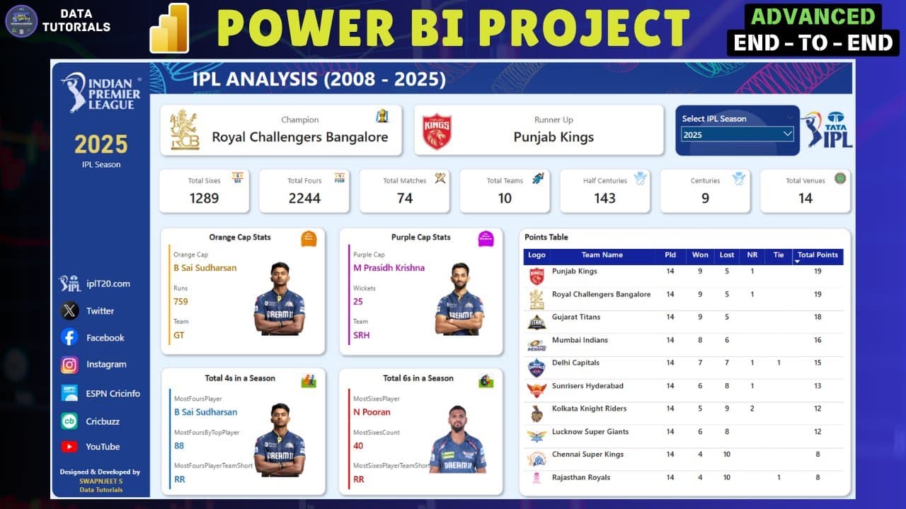
The dashboard covers 17 IPL seasons from 2008 to 2025 and is fully dynamic: selecting a season updates the champion and runner-up logos, the orange cap and purple cap holders, and every stat tile automatically. Building it requires advanced data modeling across multiple related tables, long DAX measures for season winner and runner-up, and dynamic images tied to the season filter.
Transcript
Hey guys, welcome back to my channel. So in today's video we are going to do the analysis of the most loved topic that is cricket and in that we are going to do the IPL analysis from 2008 to 202025. So right now this year it was a 2025 season in which RCB own their first IPL title and uh based on that we have created this entire dashboard. So it's ... Read More
Key Insights
- The IPL dataset used in this project spans 2008 to 2025, covering 17 seasons, and the download link is provided in the video description along with a Google Drive folder holding the source files.
- RCB won their first IPL title in the 2025 season, which is the season the dashboard displays by default before any other season is selected from the filter.
- A dynamic dashboard means every visual element responds to the season filter: switching from 2025 to 2024 changes the champion to KKR, the runner-up to SRH, and swaps both team logos automatically.
- The top-level KPI section tracks total sixes, total fours, matches played, teams involved, half centuries, centuries, and total venues or stadiums used across the selected season.
- Orange cap stats display the leading run scorer for the season along with his total runs, the team he represented, and his player image, all driven by the same season filter.
- Purple cap stats show the leading wicket taker, the number of wickets he took, and his team, mirroring the structure of the orange cap section on the dashboard.
- The points table is one of the most advanced components, built with long DAX expressions covering matches played, season winner, and season runner-up logic.
- The project is a multi-table build, so advanced data modeling with relationships between several files is required before any DAX measures or visuals can work correctly.
Install to Summarize YouTube Videos and Get Transcripts
Explore YouTube Video Summarizer or Get YouTube Transcript Extractor
Questions & Answers
Q: What years of IPL data does this Power BI project cover?
The project uses IPL data from 2008 through 2025, which the description states covers 17 seasons of cricket data. The 2025 season is the most recent one included, and the dashboard opens showing 2025 stats before any filter change. Viewers can move the season filter back through 2024, 2023, 2018, 2016, and all the way to 2008 to see each season's figures. The data download link is provided in the video description as a Google Drive folder.
Q: Who won the IPL in 2025 according to the dashboard?
RCB won their first IPL title in the 2025 season. The presenter mentions this at the start of the video as the reason the dashboard was built around that season as the default view. When the season filter is set to 2025, the champion section displays the RCB logo at the top of the dashboard, next to the runner-up logo for that season. Changing the filter to another year swaps both logos to the correct teams for that season.
Q: What KPIs does the IPL dashboard display for each season?
The dashboard shows high-level stats for the selected season including the total number of sixes hit, total fours, total matches played, how many teams were involved, how many players made half centuries, how many made centuries, and the total number of venues or stadiums used. Alongside these it displays the champion and runner-up teams with their logos, the orange cap and purple cap holders, and the players who hit the most fours and the most sixes, each with team name and player image.
Q: How does the dynamic image switching work in this dashboard?
All images on the dashboard, including team logos for the champion and runner-up and the player photos for the orange cap and purple cap holders, are tied to the season filter. When the presenter changes the selection from 2025 to 2024, the champion logo changes to KKR and the runner-up logo changes to SRH, with every other stat updating at the same time. The video covers how to set up this dynamic imaging as one of its main teaching points, alongside the DAX work.
Q: What is the orange cap and purple cap section on the dashboard?
The orange cap section shows who held the orange cap for the selected season, how many runs that player made, which team he represented, and his image. The purple cap section mirrors this structure, showing the purple cap holder, the number of wickets he took, and the team he played for. Both sections are dynamic, so selecting a different season from the filter updates the player names, the numbers, the team, and the photos to match that season.
Q: Why is advanced data modeling needed for this Power BI project?
The project uses multiple files and multiple related tables rather than a single flat dataset, so relationships between those tables have to be built before the measures and visuals will work. The presenter shows the data model view and describes it as advanced data modeling for a multi-table dashboard. This modeling underpins the points table and the season-level DAX measures, which pull from several tables at once to resolve values such as the season champion and runner-up.
Q: Can this IPL analysis project be built in tools other than Power BI?
Yes. The presenter states that although the dashboard is designed and built in Power BI, the same project can be recreated in Tableau, advanced Excel, SQL, Python, or machine learning and AI tools. The point made is that the procedures used here transfer across data handling and data analysis tools, so learners working in a different stack can use the same IPL dataset and produce comparable statistics in whichever tool they are studying.
Q: Is an IPL dashboard worth adding to a data analyst resume?
The presenter recommends that freshers add this dashboard to their resume. He acknowledges the objection that IPL statistics are already published on sites such as ESPN and official IPL pages, but argues that the value is in the process rather than the numbers. Building the dashboard from raw data teaches the same steps used in real-time and industrial projects, so the skills carry over even though the underlying stats are publicly available elsewhere.
Summary & Key Takeaways
-
The project builds a complete IPL analysis dashboard in Power BI using data from 2008 to 2025. The presenter walks through the finished dashboard first, showing the title, champion and runner-up logos, high-level season stats, orange cap and purple cap holders, top four and six hitters, and a dynamic points table.
-
Every component is tied to a season filter. Selecting 2024 replaces the 2025 view: the champion becomes KKR, the runner-up becomes SRH, and all logos, player images, and numbers update. The same behavior works for 2023, 2016, 2018, and back to the first season in 2008.
-
The build teaches advanced data modeling across multiple related tables, long DAX calculations for measures such as season winner and season runner-up, and dynamic image switching. The presenter notes the same approach transfers to Tableau, advanced Excel, SQL, Python, and machine learning tools.
Read in Other Languages (beta)
Share This Summary 📚
Summarize YouTube Videos and Get Video Transcripts with 1-Click
Try YouTube Summary with ChatGPT & Claude or YouTube Transcript Generator
Explore More Summaries from Data Tutorials 📚

Summarize YouTube Videos and Get Video Transcripts with 1-Click
Try YouTube Summary with ChatGPT & Claude or YouTube Transcript Generator