What six free fonts should every web designer know
TL;DR
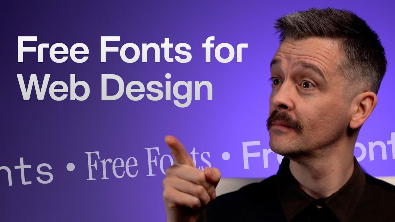
Free fonts can cover most design needs. The video highlights six typefaces, including BDO Grotesk, Outfit, Instrument Serif, Space Mono, Cooper Hewitt, and Hedvig, showing how each fits different roles like headlines, body copy, or display. Practical examples and links are provided to help designers try them in real sites and projects.
Transcript
stop wasting time trolling through thousands of fonts because these six type faces might be all you need as a web designer and they're free and they're slightly lesser known there's nothing here from the top 50 on Google fonts as well as giving you some design tips along the way I'm going to show you live website examples of each font in use I'll s... Read More
Key Insights
- BDO Grotesk is presented as a versatile sans for headlines and body copy with a modernist, friendly vibe.
- Outfit is recommended as a geometric sans that pairs well with narrower headlines and adds a friendly but professional feel.
- Instrument Serif is highlighted as a condensed display serif that works well in luxury or formal contexts and in short sentence headlines.
- Space Mono is shown as a distinctive monospace option suitable for captions and accents, offering a raw, functional aesthetic.
- Cooper Hewitt is introduced as a freely available, institutional typeface that demonstrates effective sans and serif pairing in a museum context.
- Hedvig offers both serif and sans variants and is used to achieve a timeless, versatile look across different site sections.
- The video emphasizes using a small, solid set of fonts to cover multiple typographic needs across brands and websites.
- Each font is linked to its source, encouraging hands-on testing and practical experimentation in real projects.
- More videos from this channel:
- More from this channel: Flux Academy
Install to Summarize YouTube Videos and Get Transcripts
Explore YouTube Video Summarizer or Get YouTube Transcript Extractor
Questions & Answers
Q: What six fonts are recommended for web design in this video
The video recommends six fonts that are free to use and suitable for a range of design tasks on the web. BDO Grotesk is a versatile grotesque sans that can handle headlines and body copy. Outfit is a geometric sans good for body text and headlines. Instrument Serif is a condensed serif suitable for display and short lines. Space Mono is a monospace font useful for captions and accents. Cooper Hewitt is a freely available typeface for general use, and Hedvig provides both serif and sans options for versatility. Each font is shown in live website examples to illustrate practical use. The overall message is that a small, well-chosen set can cover most design needs without needing many fonts.
Q: How is BDO Grotesk described in the video
BDO Grotesk is described as a real workhorse sans with a Helvetica style vibe that can serve both headlines and body copy. It is highlighted for its modernist feel and its ability to adapt across different sections of a site. The video uses real website examples to demonstrate its readability and personality, suggesting it as a strong default choice for many brands and layouts.
Q: What role does Outfit play in examples
Outfit is presented as a geometric sans that offers a friendly yet professional appearance. It is suggested for use in body copy and as part of a headline pairing with narrower, more condensed titles. The video notes its circular O shape as part of its geometric identity, which helps create a modern and approachable look in website copy.
Q: When is Space Mono particularly useful
Space Mono is positioned as a monospace option that adds a distinct, utilitarian vibe. It is shown for captions, small headings, and display elements where a techy or raw aesthetic is desired. The font’s unique letter shapes and ink traps contribute to a distinctive look without overpowering the overall layout.
Q: What is said about Cooper Hewitt font
Cooper Hewitt is described as a freely available typeface created for the Cooper Hewitt museum. The video stresses its usefulness for pairing with other fonts and notes its suitability for multiple weights, enabling strong typographic hierarchy in museum and institutional sites. The open-source nature is highlighted as a practical advantage for designers.
Q: How is Hedvig used in the examples
Hedvig is shown as a versatile option that provides both serif and sans variants. This dual availability supports flexible pairing across headlines and body text, allowing designers to maintain consistency while experimenting with rhythm and contrast. The video points to Hedvig as a font family that can adapt to different sections of a site.
Q: What design philosophy is emphasized regarding font choices
The video emphasizes using a small set of solid, free fonts that cover essential typographic needs across a website. It suggests that careful pairing and hierarchy can achieve a wide range of looks, from modern and friendly to formal and timeless. Real site examples illustrate how each font behaves in practice, encouraging testing and exploration.
Q: Are there any links or resources provided for fonts
Yes, the video provides links to the fonts' sources and pages where designers can download or test them. BDO Grotesk links are shown, Outfit is linked to Google Fonts, Instrument Serif and Hedvig fonts have Google Fonts pages, Space Mono is linked, and Cooper Hewitt is linked to its open-source page. These resources enable hands-on experimentation and direct access for implementation.
Summary & Key Takeaways
-
This video argues that a small set of six fonts can handle most design tasks for web projects, offering both practicality and flexibility. It demonstrates how different fonts work in headlines, body copy, and displays, and explains why each chosen typeface suits specific roles in branding and layout.
-
The six fonts include grotesque, geometric sans, serif, monospace, and a dedicated display serif and sans, each shown in real website contexts to illustrate rhythm, readability, and visual character. The emphasis is on free fonts that are widely accessible and easy to implement.
-
By exploring pairing strategies and real-world site examples, the video helps designers understand when to use a font for headlines versus body text, how to mix fonts without clashing, and how to rely on established type families for cohesive branding.
Read in Other Languages (beta)
Share This Summary 📚
Summarize YouTube Videos and Get Video Transcripts with 1-Click
Try YouTube Summary with ChatGPT & Claude or YouTube Transcript Generator
Explore More Summaries from Flux Academy 📚

Summarize YouTube Videos and Get Video Transcripts with 1-Click
Try YouTube Summary with ChatGPT & Claude or YouTube Transcript Generator