How to Master Graphic Design Fundamentals
TL;DR
Effective graphic design starts with a clear focal point, sufficient whitespace, and a hierarchy that prioritizes important information. Group related elements, use grids deliberately, and make thoughtful color, font, and typesetting choices so each composition communicates its purpose clearly and guides the viewer through the content.
Transcript
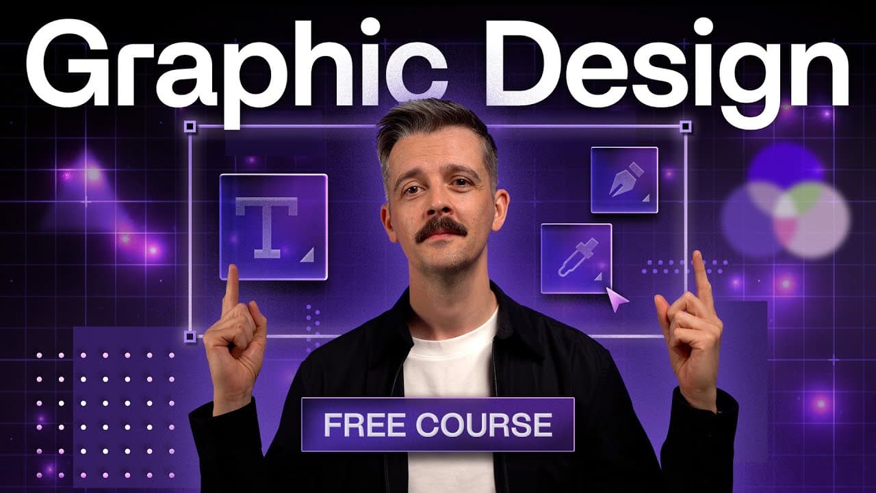
I'm reading my 20 years experience as a professional designer to share with you the fundamentals of graphic design layout color topography in this Mammoth 3our compilation we've created my most valuable videos on the subject videos which have already enjoyed over 1 million views into a collection which will take you from Total beginner to a designe... Read More
Key Insights
- A focal point is the primary center of visual interest, not necessarily the physical center of a layout. Solid shapes, intersections, prominent photographs, and carefully positioned subjects can attract attention and establish where the viewer begins exploring a composition.
- The rule of thirds is a method for positioning a subject along horizontal and vertical grid lines. The bird example shows that placing visual weight near these divisions can produce a more interesting composition than simply centering the subject.
- Whitespace is a quiet area of visual rest, and it does not have to be white. Calm backgrounds and open areas give surrounding elements room to breathe, improve navigation, and allow sharper or more important content to command attention.
- Visual hierarchy is the prioritization of information through differences in prominence. Headlines commonly stand above body copy, while supporting elements remain quieter, enabling viewers to orient themselves and follow an intentional journey through the layout.
- Effective principles work together rather than independently. A dominant image can create the focal point, open space can separate content, and contrasting headline and body-copy treatments can establish hierarchy within the same website section or magazine spread.
- Grouping is the practice of gathering related elements instead of spacing everything evenly. Website navigation demonstrates this principle because related links appear together, while separate functions such as search, sign-in, or a shopping basket form another recognizable group.
- A cluttered layout can weaken a brand by forcing visitors to determine where to look. The Pantone website example contains competing type, imagery, rotating content, colored elements, and heavy shapes that undermine its focal point, hierarchy, and whitespace.
- The course covers layout, grids, design vocabulary, color selection, font choice, and typesetting. These connected subjects are intended to take a total beginner toward familiarity with the essential principles that underpin effective graphic design work.
Install to Summarize YouTube Videos and Get Transcripts
Explore YouTube Video Summarizer or Get YouTube Transcript Extractor
Questions & Answers
Q: How do you create a clear focal point in graphic design?
Create a clear focal point by making one element more visually dominant than the surrounding content. A filled circle can attract more attention than outlined circles, an intersection can draw the eye, and a large photograph can lead viewers into a magazine spread. The focal point does not need to sit in the layout's physical center. Its purpose is to provide an obvious starting place for attention.
Q: What is whitespace in graphic design?
Whitespace is a quiet area of visual rest that gives other elements room to breathe. It does not need to be white. In a photograph, a blurred sea, sky, or background can function as whitespace by allowing the sharp subject to stand out. In layouts, these calmer areas reduce crowding, make navigation easier, and give important copy or imagery greater visual impact.
Q: Why is visual hierarchy important in a layout?
Visual hierarchy gives priority to the most important elements and helps viewers understand where they are and what to examine next. If every element is equally loud, nothing receives meaningful emphasis. A prominent headline, quieter body copy, appropriately small logo, and clearly placed call to action can establish an ordered journey while communicating the layout's main message quickly.
Q: How does the rule of thirds improve a composition?
The rule of thirds improves a composition by placing important visual weight along horizontal and vertical grid divisions rather than automatically centering it. In the course's bird example, positioning the head or neck area near the upper and right thirds reveals more of the bird and produces a more interesting image. The same positioning idea can also inform graphic design layouts.
Q: How should focal point, whitespace, and hierarchy work together?
Focal point, whitespace, and hierarchy should support one another within a unified composition. A dominant camera or landscape photograph can attract initial attention, open areas around the image and copy can prevent crowding, and differences between the headline and body text can communicate priority. Together, these principles help the viewer recognize the main idea, read supporting information, and navigate the layout comfortably.
Q: What is grouping in graphic design layouts?
Grouping means placing elements that belong together near one another instead of distributing everything with equal spacing. A website commonly groups its wordmark and primary navigation in one area, while search, sign-in, or shopping functions form a separate group. This visual organization helps readers recognize relationships between items and make sense of the available information more quickly.
Q: Why can a visually crowded website be ineffective?
A visually crowded website can be ineffective because multiple competing elements make it unclear where the viewer should look first. The Pantone example combines centered type, a separate large headline, many images, colored all-capital text, rotating carousel content, and heavy shapes. Without a strong focal point, clear hierarchy, or sufficient whitespace, visitors must work harder to understand the page and its brand message.
Q: What graphic design topics should a beginner study?
A beginner should study the connected fundamentals presented in the compilation: principles of layout, grids, professional design vocabulary, color selection, font choice, and typesetting. The course begins with concepts such as focal point, whitespace, hierarchy, and grouping, then expands into these additional subjects. Studying the examples also helps beginners train their eyes to identify why skilled designers make particular compositional decisions.
Summary & Key Takeaways
-
Successful layouts use foundational principles as boundaries for creative expression, helping designers fulfill a brief without suppressing creativity. The opening lessons focus on focal points, whitespace, and hierarchy, showing how these ideas work together in website hero sections, magazine spreads, photography, and other compositions.
-
A focal point is the element that first attracts attention, and it does not need to occupy the physical center. Whitespace provides quiet visual areas that help important content stand out, while hierarchy distinguishes headlines, body copy, navigation, and calls to action according to their relative importance.
-
The broader course develops essential design knowledge through lessons on layout principles, grouping, grids, professional vocabulary, color selection, font choice, and typesetting. Its examples encourage beginners to train their eyes, recognize deliberate design decisions, diagnose cluttered compositions, and organize information so viewers can understand and navigate it more easily.
Read in Other Languages (beta)
Share This Summary 📚
Summarize YouTube Videos and Get Video Transcripts with 1-Click
Try YouTube Summary with ChatGPT & Claude or YouTube Transcript Generator
Explore More Summaries from Flux Academy 📚





Summarize YouTube Videos and Get Video Transcripts with 1-Click
Try YouTube Summary with ChatGPT & Claude or YouTube Transcript Generator