How to Build a Responsive Website in Framer
TL;DR
Build a Framer website by arranging reusable components inside stacks, setting widths with percentages, and aligning content through wrapper frames. Shared colors, responsive navigation, animated text, and appearance effects make the project easier to customize while demonstrating the fundamentals needed to recreate a Figma design from scratch.
Transcript
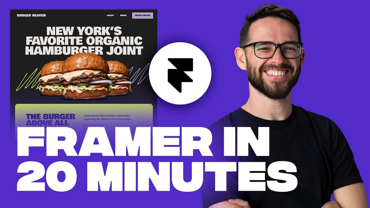
there's lots of hype about framer at the moment people are building some really cool stuff so today I want to give you an introduction to framer so that you can get started for free we're going to build this cool Burger website in about 20 minutes let's dive right into it we're building this burger website that I have here on figma we're not going ... Read More
Key Insights
- Framer can recreate a Figma design either through a one-click import plugin or through manual construction. Building manually is useful for understanding the fundamentals, because it shows how layouts, components, styles, effects, and responsive behavior can be customized after elements enter a project.
- Shared colors make repeated styling more efficient. The tutorial saves the dark gray background, a light brown color, and a purple color as named styles, allowing those colors to be reused across the navigation, text, button, and other page elements without repeatedly entering their values.
- Components are reusable elements that can appear across multiple pages or locations. Editing the master navigation component changes the elements that reuse it, and the supplied navigation already includes configurations for tablet and mobile layouts, including a hamburger menu for smaller screens.
- Stacks arrange elements vertically or horizontally and correspond to concepts such as Figma auto layout and Webflow flexbox. They provide consistent gaps, alignment, direction, and responsive behavior, making it easier to organize page sections and adapt them when the available screen size changes.
- Percentage-based sizing supports responsive layouts. Setting a frame to 100 percent width allows it to extend across the available space and respond when the screen size changes, while setting prominent content such as the animated headline or burger image to 90 percent preserves some surrounding space.
- Wrapper frames control the position of their contained elements. Turning the hero text frame into a stack and centering its alignment prevents the headline from being placed freely, ensuring that it remains centered as the frame or browser dimensions change.
- Ready-made Framer components can add sophisticated behavior without constructing every feature manually. The motion text component provides configurable animation by letter, word, or line, and the tutorial selects line-based animation to create the hero headline entrance.
- Appearance effects animate visual elements when they enter the page. The burger image receives an appear effect with a scaling option, and its delay can be adjusted so the animated headline begins before the burger image enters, creating a coordinated hero sequence.
Install to Summarize YouTube Videos and Get Transcripts
Explore YouTube Video Summarizer or Get YouTube Transcript Extractor
Questions & Answers
Q: How do you build a website from a Figma design in Framer?
Start by recreating the design structure with frames, stacks, reusable styles, and components. Add the page background, insert and customize navigation, then divide the hero into separate frames for its text, image, and information. Use percentage widths and centered stack alignment for responsive behavior. Although Framer provides a one-click Figma import plugin, manual construction reveals how the layout works and how each element can be customized.
Q: What are components in Framer used for?
Components are elements designed for reuse across multiple pages or locations. The navigation in the tutorial is a component, indicated by its purple selection state and component icon. Double-clicking it opens the master component for separate editing. Changes made there affect the reused versions, while the supplied navigation also contains prepared tablet and mobile configurations, including a hamburger menu.
Q: How do stacks work in Framer?
Stacks arrange contained elements either one above another or next to each other. They are presented as the same general concept as Figma auto layout and Webflow flexbox, and Framer uses flexbox when the design becomes code. A stack can control direction, spacing between items, and alignment, which makes page structure more consistent and helps layouts respond to different screen sizes.
Q: How can you make a Framer layout responsive?
Use stacks to control arrangement and alignment, then size key frames and content with percentages. The tutorial sets a section frame to 100 percent width so it responds when the screen changes. It also centers content inside stack-based wrappers and uses 90 percent widths for the headline and burger image. The ready-made navigation already provides tablet and mobile behavior.
Q: How do you create animated text in Framer?
Insert the motion text component from Framer's ready-made component supply, then replace its sample text with the desired headline. The component can animate text by letter, word, or line. After choosing line-based animation, adjust the font, size, width, color, and surrounding frame. Centering the component inside a stack keeps the animated headline aligned instead of allowing free placement.
Q: How do you animate an image in Framer?
Select the image, add an effect, and choose an appear effect. The burger image in the tutorial uses a scaling entrance, which can be previewed by playing or reloading the page. The effect settings also provide a delay, allowing the image entrance to begin after the headline animation. This creates a sequence in which the text appears before the burger image.
Q: Why should shared color styles be used in Framer?
Shared color styles improve efficiency when the same colors appear throughout a design. The tutorial saves the page's dark gray, light brown, and purple colors with names, then reuses them for backgrounds, text, and the navigation button. Because the colors are stored as shared styles, designers can select them again without repeatedly pasting the same color values into every element.
Q: How do you customize a ready-made Framer navigation component?
Open the navigation's master component, select its text elements, and change their font and text transformation. The tutorial applies the Bowly One Google font and converts the navigation labels and button text to uppercase. It also changes the background and text colors, gives the button a purple fill, and sets its corner radius from eight to zero while retaining the prepared responsive configurations.
Summary & Key Takeaways
-
The project recreates the opening sections of a burger website designed in Figma. Although Framer offers a plugin for importing Figma designs with one click, the site is built from scratch so users can understand the underlying tools, customize imported elements later, and create their own layouts with greater confidence.
-
The page begins with reusable colors and a ready-made navigation component. The navigation already includes tablet and mobile configurations, including a hamburger menu. Its master component controls reused instances, while fonts, uppercase transformations, button colors, background colors, and corner radius settings adapt it to the burger website design.
-
The hero area uses vertically arranged frames for text, an image, and supporting information. Stacks control direction, gaps, alignment, and responsive behavior. A ready-made motion text component animates the headline by line, while the burger image receives an appearance effect with scaling and a configurable delay to coordinate the entrance sequence.
Read in Other Languages (beta)
Share This Summary 📚
Summarize YouTube Videos and Get Video Transcripts with 1-Click
Try YouTube Summary with ChatGPT & Claude or YouTube Transcript Generator
Explore More Summaries from Flux Academy 📚





Summarize YouTube Videos and Get Video Transcripts with 1-Click
Try YouTube Summary with ChatGPT & Claude or YouTube Transcript Generator