How to Build a Strategic Brand Mood Board
TL;DR
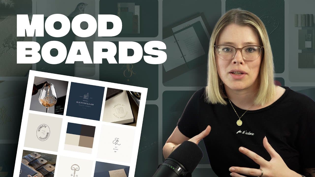
Start with discovery findings and a focused word map before collecting visual references. Develop two distinct directions, then curate each mood board with relevant logo styles, color, typography, imagery, graphic elements, and real-world applications so the client can judge how the complete brand identity will look and function.
Transcript
now this video is going to be an interpretation of pretty much exactly what I do when I'm doing a creative direction for a client two things the first thing is I will always present my client with two concepts I will very rarely do three the reason for that is because if you've done a rigorous strategy and you've done a discovery process I actually... Read More
Key Insights
- Two creative directions are usually sufficient when strategy and discovery have clearly defined the brand’s goals, audience, and personality. A third genuinely different concept can be difficult to justify when the strategic work points toward a limited number of appropriate visual routes.
- The safer creative route is an expected interpretation of the brand that fits its industry and feels familiar to the client. It can still be a strong solution, but it generally stays close to the client’s existing expectations and established market conventions.
- The more adventurous route is a direction with additional creative finesse, an unexpected element, or stronger alignment with an aspirational audience. It can help a brand address the people it wants to attract rather than only reflecting its current customer base.
- A word map is an early filter for visual research. Writing down conceptual terms before browsing helps the designer focus searches for logos, icons, color palettes, imagery, and other references instead of spending days collecting unrelated inspiration from a large online environment.
- A strategic mood board is a decision-making tool for the complete identity. Its references should clarify potential logo styles, including serif or sans serif typography and ornate or simple treatments, while also showing how those styles belong to distinct creative groupings.
- Color direction can emerge from imagery or other references, but it should be made visible enough for the client to begin aligning around a palette. For the boutique hotel’s safer direction, gold and deep blue support a classic, refined, traditional, old-school hotel character.
- Real-world applications make a proposed identity feel larger than a logo. Relevant examples can include business cards, letterheads, envelopes, information booklets, menus, stamps, digital invoicing, web applications, and hotel-specific items, depending on the client’s actual needs and project scope.
- Every mood-board reference should be customized to the client and project. Irrelevant collateral should be excluded, while useful elements such as typography, patterns, illustration, photography, or packaging should appear only when they help demonstrate how the identity will live across applicable touchpoints.
Install to Summarize YouTube Videos and Get Transcripts
Explore YouTube Video Summarizer or Get YouTube Transcript Extractor
Questions & Answers
Q: How do you build a strategic brand mood board?
Begin with findings from the strategy and discovery process, then create a brain dump, word map, or mind map of concepts that fit the brand. Use those terms to guide visual research. Curate references for logo styles, color, typography, imagery, graphic elements, and relevant applications, ensuring every selection supports the audience, goals, personality, and project scope.
Q: Why should a designer present two creative directions?
Two directions are often enough because rigorous strategy and discovery narrow the number of suitable ways to reach the brand’s goals and communicate with its audience. One direction can offer an expected, industry-appropriate interpretation, while the other can introduce more creative finesse, speak to an aspirational audience, pursue another goal, or show the opposite end of a personality scale.
Q: How should two brand concepts differ from each other?
The first concept can be safer, familiar, and close to what the client already imagines, while still providing a strong interpretation of the brand. The second should have a clear strategic reason for differing. It might target a desired new audience, emphasize another business goal, introduce something unexpected, or explore a contrasting personality uncovered during discovery.
Q: Why create a word map before searching Pinterest?
A word map gives visual research a defined focus before the designer enters a large source of inspiration. It identifies the concepts, logo references, icons, colors, and imagery worth pursuing. Without that filter, the designer can spend days scrolling through Pinterest and other sources while collecting attractive material that does not support the strategy or lead to coherent decisions.
Q: What should a brand mood board include?
A brand mood board should include references that support later identity decisions. These can cover logo styles, serif or sans serif typography, ornate or simple forms, color palettes, stationery, web or digital applications, illustration, patterns, graphic styling, photography, and other relevant touchpoints. The exact selection should reflect the client’s needs rather than follow a generic formula.
Q: How does a mood board show a brand beyond its logo?
A mood board can demonstrate how the identity will appear on useful physical and digital applications, such as letterheads, envelopes, menus, information booklets, business cards, stamps, invoicing systems, and web experiences. Showing these touchpoints gives the client a clearer sense of how the brand can live in the real world, develop longevity, and remain coherent across different uses.
Q: How was the boutique hotel mood board direction defined?
The hotel needed to preserve a small boutique luxury character with classic touches, reflect buildings with long-standing character, and avoid becoming overly modern. It also wanted to appeal to an older Millennial audience and beyond, including couples, small family groups, and corporate events. The selected concepts included classic, eclectic, warm, traditional, heritage-focused, family-oriented, and slightly unexpected qualities.
Q: What makes mood-board references relevant to a client?
Relevant references connect directly to the client’s strategy, audience, personality, goals, deliverables, and intended touchpoints. A designer should not include a business-card example when the client has explicitly said business cards are unnecessary. Each selection should show deliberate consideration for the project, helping the result feel customized instead of resembling a generic collection copied from Pinterest.
Summary & Key Takeaways
-
A rigorous discovery process should narrow the creative possibilities before visual research begins. The designer typically presents two concepts: one expected, industry-aligned direction that feels comfortable to the client, and one more creatively distinctive direction informed by an aspirational audience, a different goal, or an opposing aspect of the brand personality.
-
Before browsing Pinterest or other inspiration sources, create a brain dump, word map, or mind map of relevant ideas. This early focus helps determine which logos, icons, colors, and visual references deserve attention. Without defined search criteria, the large volume of online inspiration can lead to unfocused browsing and wasted time.
-
A useful mood board supports later brand decisions rather than merely collecting attractive images. It can include logo references, color direction, typography, stationery, digital uses, patterns, illustration styles, photography, and other relevant touchpoints. Every reference should suit the client, project scope, audience, strategy, and intended real-world applications.
Read in Other Languages (beta)
Share This Summary 📚
Summarize YouTube Videos and Get Video Transcripts with 1-Click
Try YouTube Summary with ChatGPT & Claude or YouTube Transcript Generator
Explore More Summaries from Flux Academy 📚




Summarize YouTube Videos and Get Video Transcripts with 1-Click
Try YouTube Summary with ChatGPT & Claude or YouTube Transcript Generator