How to design high converting landing pages with psychology
TL;DR
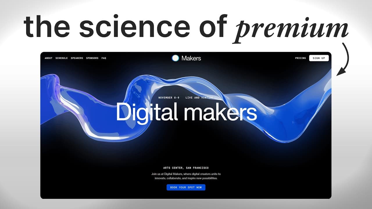
The key to higher conversions is applying three psychological principles: strong above the fold visuals and messaging, believable social proof, and low cognitive load. Focus on fast first impressions, show verifiable proof up front, and remove unnecessary clutter to make the path to conversion effortless. Halo effect matters in seconds, with imagery and headlines driving initial trust and engagement.
Transcript
Most businesses are so focused on getting more traffic, more clicks, more ads, more spend that they completely missed the one thing that's sabotaging their marketing. Over the last several years, I've built and optimized hundreds of high-converting landing pages to help brands like this and this consistently double, sometimes even triple their conv... Read More
Key Insights
- The halo effect makes first impressions determine subsequent judgments about your page.
- Above the fold is critical because it sets user expectations and engagement from the moment a visitor lands.
- High converting pages use imagery that mirrors the end result users desire so the brain can connect quickly.
- Social proof that includes images, names, and sources is significantly more believable than plain text reviews.
- Believability of reviews dramatically impacts trust and can lift conversions when presented clearly up front.
- A clutter free layout reduces cognitive load and helps users process information with minimal effort.
- Cognitive ease is achieved through simple messaging at a fifth or eighth grade reading level.
- A strong three step framework includes killer above the fold, ultra believable social proof, and minimalism in design and navigation.
- More videos from this channel:
- More from this channel: Arsh Sanwarwala | ThrillX
Install to Summarize YouTube Videos and Get Transcripts
Explore YouTube Video Summarizer or Get YouTube Transcript Extractor
Questions & Answers
Q: How can I use the halo effect on my landing page above the fold?
To leverage the halo effect, create a clean, premium looking above the fold section with a benefit driven headline and a relevant high quality image that directly ties to the end result your audience desires. This first impression shapes how visitors perceive everything that follows and can dramatically improve engagement and initial trust.
Q: What makes social proof believable on high converting pages?
Believability comes from showing real customers with faces, full names, and verifiable sources. Use images or videos of actual results, include names and credentials when possible, and present the proof prominently so visitors feel confident the testimonials reflect genuine experiences.
Q: Why is cognitive load important for landing page performance?
Cognitive load measures how much mental effort a user must expend to understand the page. Lowering it by simplifying layout, reducing text blocks, and using icons and bullets helps visitors process the message quickly, increasing the likelihood they will convert rather than leave due to cognitive friction.
Q: How should I structure the above the fold for maximum impact?
Focus on one hard hitting benefit and pair it with a supporting image that demonstrates the outcome. Create a strong hook in the headline and ensure the visual immediately communicates the end result. This combination creates a powerful halo effect that keeps users engaged to explore further.
Q: What role does imagery play in fast conversions?
Imagery matters because the brain processes visuals far faster than text. Use images that depict the dream outcome your audience seeks and align them with the headline. This accelerates recognition, reinforces messaging, and helps sustain attention through the page.
Q: How can I present social proof on mobile versus desktop?
On desktop, use a wall of social proof that shows multiple testimonials at once to maximize impact. On mobile, stack proof vertically so users see everything without swiping through a carousel. The goal is immediate believability and easy scanning regardless of device.
Q: What steps can I take to reduce navigational distractions?
Remove extraneous navigation items and keep the focus on one clear call to action. Simplify forms by consolidating fields, and minimize competing options. The aim is to guide the user toward the conversion without switching attention away from the primary goal.
Q: How can I use this framework to analyze my current landing pages?
Evaluate your page against three pillars: is the above fold compelling with a clear benefit, is the social proof believable and prominent, and is the rest of the page easy to scan with a low cognitive load. If any area lacks, iteratively test simpler copy, stronger proof, and a cleaner layout to improve performance.
Summary & Key Takeaways
-
A landing page that converts starts with a powerful above the fold that uses a premium look and a benefit driven headline to create a positive halo effect, influencing how visitors perceive the rest of the page. The imagery should relate to the end result and be processed quickly by the brain to grab attention.
-
Social proof increases trust when it is believable and verifiable. Use real images, full names, photos, and documented sources of reviews, and show them up front to boost conversions by making proof feel authentic and credible.
-
Cognitive load must be minimized by simplifying layout and copy. Use scannable icons, bullet points, and a clear visual hierarchy so users can digest information quickly and proceed to the main call to action with minimal effort.
Read in Other Languages (beta)
Share This Summary 📚
Summarize YouTube Videos and Get Video Transcripts with 1-Click
Try YouTube Summary with ChatGPT & Claude or YouTube Transcript Generator
Explore More Summaries from Arsh Sanwarwala | ThrillX 📚



Summarize YouTube Videos and Get Video Transcripts with 1-Click
Try YouTube Summary with ChatGPT & Claude or YouTube Transcript Generator