How to Build a High Converting Landing Page in 2026
TL;DR
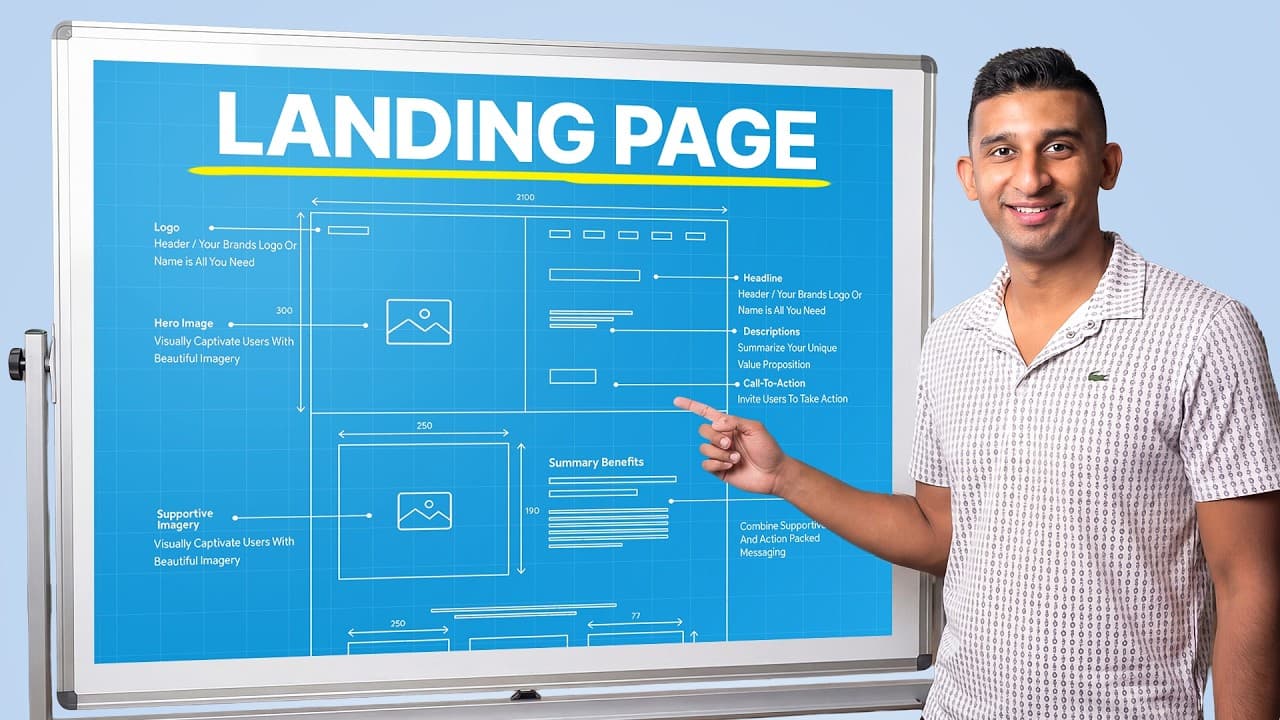
The video presents a proven landing page framework focused on above the fold clarity, social proof, and reducing fear, uncertainty, and doubts. It explains a sequence from a benefit driven headline to multiple value props, then how it works, optional about us, abundant social proof, FAQs, and a strong close. Real AB tests show double digit conversion gains with the right layout.
Transcript
Over the last few years, I've split tested hundreds of different landing pages across the 80 plus different niches that I've worked in. And through that testing, I think I found the single best layout possible for your landing page that converts higher than anything else. And not enough people know about this. This one single layout is responsible ... Read More
Key Insights
- The best landing page layout starts with an above the fold, benefit driven headline and a benefit driven sub headline.
- Social proof should appear early above the fold, not hidden in a carousel, to build trust fast.
- Reducing FUD (fear, uncertainty, doubts) is essential in the top section to prevent drop offs.
- A pain point oriented opening helps educate the audience before diving into features or how it works.
- Value props should form the core of the page, typically 5 to 8 sections each with supporting media.
- How it works sections clarify the process in simple steps and reinforce ease of use.
- Testimonials can be more effective than generic text if presented accessibly and not buried in carousels.
- AB testing demonstrates that layout changes can yield 109% or 45.5% lift in conversions in real cases
- More videos from this channel:
- More from this channel: Arsh Sanwarwala | ThrillX
Install to Summarize YouTube Videos and Get Transcripts
Explore YouTube Video Summarizer or Get YouTube Transcript Extractor
Questions & Answers
Q: How can I start a landing page to maximize conversions quickly
Begin with an above the fold area that presents a clear, benefit driven headline and a sub headline addressing the pain point. Add two to three credible social proofs up front, then place the core value proposition and a reinforcing image or video. This setup reduces fear and builds trust, paving the way for engagement and conversion.
Q: What role does social proof play in the top of the page
Social proof in the fold acts as an early trust signal, mitigating hesitation. The video shows placing multiple forms of social proof above the fold rather than relying on a carousel of testimonials, which can have low engagement. This approach accelerates credibility and decision making for visitors.
Q: Why is the painoint section important for the audience
The painoint section addresses the audience’s current struggles and contrasts them with your unique benefits. For unaware or complex offers, leading with pain points helps educate and align expectations before presenting how the product works, increasing relevance and perceived value.
Q: How should value props be structured on a high converting page
Value props should be visually supported by images or videos and arranged in a sequence that tells a story from problem to solution. Typically 5 to 8 sections cover different benefits, each reinforcing the core proposition and showing how the product delivers outcomes.
Q: What does the video suggest about the ‘how it works’ section
The how it works section explains the process in simple steps, reinforcing ease of use and removing friction. It should come after establishing the problem and social proof unless the audience is very aware, in which case ordering may differ to optimize engagement.
Q: Do AB tests really change conversion rates
Yes, AB tests are shown to produce substantial lifts. The video cites examples where a new landing page variant raised conversion rates from 2.46% to 5.15% and another client from 10% to 14.62%, illustrating the impact of structure, messaging, and social proof on performance.
Q: How should the page be tailored for different ad platforms
Tailoring involves aligning headlines, benefits, and visuals with the user intent on each platform. The video notes optimizing pages for Meta Ads, Facebook Ads, and Google Ads campaigns, ensuring messaging matches audience expectations and ad content for better coherence and higher conversions.
Q: What is the recommended approach to closing on the page
Finish with a closer section that provides a final persuasive push, reiterates key benefits, and reduces remaining friction points. The goal is to give visitors a clear, compelling next step and a strong incentive to convert, supported by proof and clarity throughout the page.
Summary & Key Takeaways
-
The video argues the above the fold area is critical because it is what 60% of users see and their first impression drives engagement.
-
It shows that headlines should immediately communicate the end benefit and differentiators, followed by a sub headline that addresses pain points and solution.
-
Social proof should be placed up front rather than buried in carousels to build trust quickly and reduce friction.
-
The framework emphasizes a painoint section to connect with unaware audiences before presenting proof or features.
-
Value prop sections should be visually supported with images or videos to reinforce claims.
-
An optional about us section can humanize the brand and build credibility before final closer messaging.
-
The speaker shares AB testing results to demonstrate how design changes translate to higher conversions
-
The content highlights strategies for tailoring pages to Meta Ads, Facebook Ads and Google Ads campaigns
Read in Other Languages (beta)
Share This Summary 📚
Summarize YouTube Videos and Get Video Transcripts with 1-Click
Try YouTube Summary with ChatGPT & Claude or YouTube Transcript Generator
Explore More Summaries from Arsh Sanwarwala | ThrillX 📚
Summarize YouTube Videos and Get Video Transcripts with 1-Click
Try YouTube Summary with ChatGPT & Claude or YouTube Transcript Generator