How to Pick Fonts for Your Projects
TL;DR
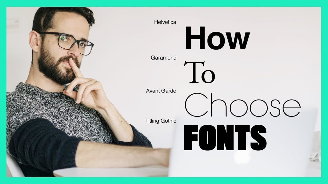
Choosing fonts hinges on two aims: readability and the desired vibe. Start with whether the font should feel classic or new, then decide serif or sans serif, and finally use trusted sources like classic fonts lists or curated new font collections to minimize risks and speed up decisions.
Transcript
you want to know how to stop wasting hours trying to choose the right font this video is going to help you do that hey everybody what's up and welcome to another segment of designer mind where i try to help you become a better designer and in this episode i got a question about how i choose fonts for my projects and i do want to share some of my le... Read More
Key Insights
- Typography serves two purposes: function and vibe, with readability as the default requirement and the font choice shaping tone.
- Font choices hinge on a core question about whether the project should feel classic and recognizable or new and distinctive.
- Classic fonts are time tested and widely readable, and they can power contemporary design when used thoughtfully.
- If the project aims for novelty, look for fonts that are less commonly used, aided by curated sources that preview how they feel in real work contexts.
- Whenever possible, prefer premium fonts from established foundries to ensure proper spacing and legibility in various layouts.
- Serif fonts convey tradition and formality, while sans serif fonts feel modern and clean, guiding initial direction before deeper exploration.
- Two practical sources recommended for font discovery are a well-known classic fonts list and a site that highlights new or trending fonts with usage examples.
- Avoid free fonts only when budget is not a constraint, as premium fonts often write more reliable metrics for readability and typographic behavior in paragraphs and headlines.
- More videos from this channel:
- More from this channel: Flux Academy
Install to Summarize YouTube Videos and Get Transcripts
Explore YouTube Video Summarizer or Get YouTube Transcript Extractor
Questions & Answers
Q: How do I decide between classic and new fonts for a brand?
Start by assessing the brand’s want for familiarity or freshness. If the goal is reliability and long standing recognition, lean toward classic fonts that have proven readability and strong presence. If you need to signal innovation and current trends, explore newer fonts from curated sources, while testing readability in body text and headlines.
Q: What is the role of readability in font selection?
Readability determines how easily the text can be scanned and understood, especially in longer passages. Choose fonts with clear letter shapes, balanced spacing, and consistent metrics. Prioritize fonts that perform well in both digital and print contexts, ensuring legibility across sizes and devices.
Q: Should I mix serif and sans serif in a project?
In many cases a careful mix can balance tradition and modernity, but this requires deliberate hierarchy and contrast. Use serif for formal accents or headlines and sans serif for body text or UI elements to maintain readability while conveying the desired mood.
Q: Where can I find reliable font options without overpaying?
Look to curated lists that separate classic, time tested fonts from newer releases. Classic lists offer safe, readable options that work across many contexts. If seeking novelty, use a site that showcases new fonts with practical usage examples to gauge fit before purchasing.
Q: Why should I avoid free fonts for serious projects?
Free fonts often lack the refined spacing, kerning, and hinting of premium fonts, which can hurt readability and layout consistency. In professional contexts, investing in high quality fonts reduces the risk of typographic issues in print and digital applications.
Q: How does font choice affect brand perception?
Font style communicates personality; serif fonts tend to feel established and formal, while sans serif fonts convey modernity and clarity. The chosen typeface shapes user expectations and influences perceived credibility, so align the font with the brand story and audience needs.
Q: What is a practical workflow for font selection?
Define the brand mood first, then pick a base font family that supports readability. Decide classic versus new, choose serif or sans serif, and test with real content. Use previews for headlines and body text, compare at multiple sizes, and validate across devices.
Q: What should I consider when testing font options?
Evaluate legibility at small sizes, readability in long passages, and aesthetic harmony with other design elements. Check performance in color and grayscale, ensure consistency across print and screen, and confirm that the chosen fonts render well in common browsers and apps.
Summary & Key Takeaways
-
The first summary point explains the dual purpose of typography, emphasizing readability as a baseline function and mood as the secondary goal, plus the practical steps to separate these concerns in early font decisions.
-
The second summary point outlines how to choose between classic and new font directions, and suggests starting points like a classic font list or a site that curates fresh fonts as reliable, fast routes to good options.
-
The third summary point covers practical cautions about font quality and cost, noting that paid fonts from reputable foundries usually offer better spacing and legibility than free options, reducing design risk over time.
Read in Other Languages (beta)
Share This Summary 📚
Summarize YouTube Videos and Get Video Transcripts with 1-Click
Try YouTube Summary with ChatGPT & Claude or YouTube Transcript Generator
Explore More Summaries from Flux Academy 📚






Summarize YouTube Videos and Get Video Transcripts with 1-Click
Try YouTube Summary with ChatGPT & Claude or YouTube Transcript Generator