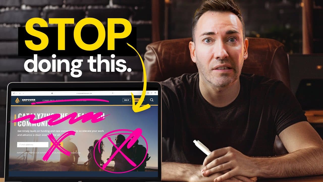
How to fix 10 website mistakes that cost leads
TL;DR
The key is to fix clear, customer-focused messaging and simple navigation. Start by replacing jargon with benefits, trim the menu to essential pages, and use clear calls to action. Use skimmable content, show real people, and add a compelling lead magnet to convert visitors into leads quickly.
Transcript
what if I told you that most small businesses would get more clients and make more money if instead of spending time on marketing for a whole month they focused on fixing these really common website mistakes that are scaring off potential customers in fact this business was able to get 54% more leads just by fixing two of these 10 mistakes now odds... Read More
Key Insights
- Website clarity is crucial because confusing messages cause visitor drop off and lost leads.
- Reduce menu options to essential pages so visitors can find what they need quickly.
- Benefits should be highlighted over features to show customer value.
- CTAs must be explicit, immediate, and aligned with the next step.
- Content should be skimmable with headings, bullets, and white space.
- Show authentic, relatable images and real people to build trust.
- Include a prominent lead magnet to capture high-intent visitors.
- Use ChatGPT or similar tools to rewrite copy for an 8th-grade reading level to improve clarity.
- More videos from this channel:
- More from this channel: Wes McDowell
Install to Summarize YouTube Videos and Get Transcripts
Explore YouTube Video Summarizer or Get YouTube Transcript Extractor
Questions & Answers
Q: What is the main reason a website loses potential clients according to the video
The main reason is that the website uses confusing jargon and lacks clear messaging that speaks to the customer's problems and solutions. When visitors cannot understand what is offered or how it helps them, they quickly leave, reducing the chances of turning them into clients. Clear, simple language changes engagement. The video emphasizes replacing complex phrases with client-focused terms to make benefits obvious and the experience straightforward.
Q: How should a homepage be structured to avoid overwhelming visitors
The video recommends showing only essential pages as signature dishes and keeping other pages in the footer. This makes the site easier to navigate and helps visitors quickly find what matters. It also suggests using a clean layout with clear headings, bullet points, white space, and visuals that support the message rather than detract from it.
Q: What role do headlines play in website conversion
Headlines should communicate benefits clearly and attract attention without being gimmicky. They should address how the service makes life better for customers, not just list features. The video suggests turning features into benefits and using those benefits as bold headlines to guide visitors toward the next action.
Q: Why are CTAs often ineffective, and how can they be fixed
CTAs fail when they are too witty, vague, or misleading about what comes next. The fix is to be direct and explicit about the action and the result, such as stating exactly what will happen when clicked (book a chat, schedule a call, or fill a form). This reduces friction and sets proper expectations.
Q: How can visuals influence trust on a service website
Visuals influence trust by showing real people and authentic expressions rather than over the top or stock photos. The video argues for images that depict real customers and genuine moments, which helps visitors feel more connected and confident about the business offering.
Q: What is a lead magnet and how should it be used on a website
A lead magnet is a valuable, low-commitment offer such as a free guide, checklist, or webinar designed to attract potential clients. The video advises placing an opt-in block in a prominent place on the homepage and repeating it on every page to build a consistent lead pool and increase conversions.
Q: How can ChatGPT assist in improving website copy
ChatGPT can take existing service details and rewrite them into simple, benefit-focused language that a wide audience can understand. By feeding the tool current copy and asking for a version that an 8th grader could grasp, you generate clearer messaging that improves comprehension and engagement.
Q: What single change could dramatically improve leads according to the video
The video asserts that fixing just a couple of the ten common website mistakes can dramatically increase leads, with one secret fix capable of changing a business overnight. Implementing clearer messaging, stronger CTAs, reduced clutter, and a visible lead magnet can collectively triple lead generation when executed well.
Summary & Key Takeaways
-
The video argues that many small businesses lose clients because their websites are confusing, overly complex, or misleading. By simplifying language, reducing menu distractions, and highlighting benefits, you can retain visitors and convert them into customers. A single clear change can dramatically impact lead generation.
-
The presenter emphasizes straightforward fixes such as benefit-focused headlines, actionable CTAs, and visible human elements on the site. He suggests using a lead magnet and a simple opt-in to capture prospects. The overall goal is to turn website traffic into reliable, growing inquiries.
-
The content uses kitchen and restaurant analogies to illustrate user experience, emphasizing clarity, speed, and authenticity. It advocates trimming content, showcasing the team, and delivering immediate value to visitors who are window shopping online.
Read in Other Languages (beta)
Share This Summary 📚
Summarize YouTube Videos and Get Video Transcripts with 1-Click
Try YouTube Summary with ChatGPT & Claude or YouTube Transcript Generator
Explore More Summaries from Wes McDowell 📚




Summarize YouTube Videos and Get Video Transcripts with 1-Click
Try YouTube Summary with ChatGPT & Claude or YouTube Transcript Generator