How to Redesign an Outdated Website in Figma
TL;DR
Start a website redesign by removing distracting colors and content, then rebuild the page around clear branding, readable navigation, and a structured grid. Use client-provided images, brand colors, consistent typography, reusable cards, focused sections, and side-by-side layout experiments to produce a cohesive, user-friendly design without needing an unusually original concept.
Transcript
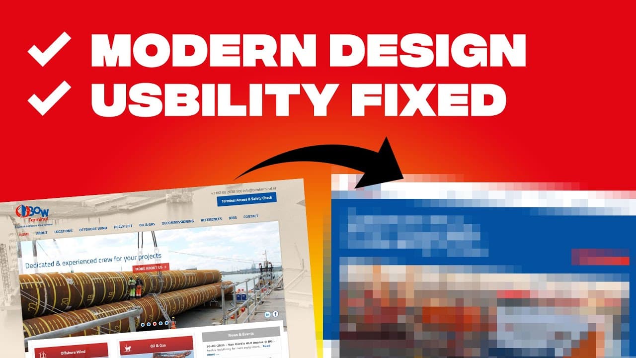
on today's video I'm going to take this old school vintage website and turn it into this modern website and while this design might not be award-winning it sure is much more user-friendly and modern and it took me only 44 minutes to do this redesign and I want to break through why I did the things I did how I thought about this so that you can Impl... Read More
Key Insights
- The original website is weakened by a brown background that resembles an old photograph, makes the navigation harder to read, and competes with the existing blue and red brand colors. Removing that dominant color allows the established identity and important interface elements to become clearer.
- A 12-column grid is the structural foundation of the redesign because it supports one-column, two-column, three-column, and four-column compositions. It also keeps images, text, navigation, and content sections aligned consistently throughout the page rather than allowing elements to occupy arbitrary widths.
- The hero section is built around a blue branded area, white navigation, a relevant boat image, a clear value proposition, and a call-to-action button. Choosing an image containing orange and blue also helps the photography fit naturally with the company's existing visual identity.
- Typography becomes more cohesive when its geometry relates to the logo. Avenir is chosen after comparing geometric fonts, while font size, line height, text width, and wrapping are adjusted until the value proposition forms a balanced block without a single orphaned word on the final line.
- Figma supports fast layout evaluation by allowing an artboard to be duplicated and modified. The designer compares a multi-image grid against a simpler composition with one large image and adjacent text, then selects the single-image alternative after examining both versions side by side.
- Navigation becomes easier to process when related items are grouped under a Services dropdown. The redesign limits the number of visible choices because the designer states that navigation should not contain more than seven items, instead of placing every destination at the top level.
- Service cards simplify the original combination of images, icons, and red stripes. Each redesigned card uses a photograph with a red multiply overlay, readable text, a white content area, and a subtle drop shadow, creating separation without introducing another unrelated visual treatment.
- Consistency is achieved by repeating established cards, heading styles, body typography, dividing lines, shadows, and read-more arrows. Reusing these components across services, news, and the terminal project makes the interface look simpler, more cohesive, and more professional within the 44-minute redesign.
Install to Summarize YouTube Videos and Get Transcripts
Explore YouTube Video Summarizer or Get YouTube Transcript Extractor
Questions & Answers
Q: How do you modernize an outdated website design?
Begin by identifying the elements that make the existing page feel old, cluttered, or difficult to read. In this redesign, that means removing the dominant brown background, restoring the blue and red brand colors, simplifying the navigation, separating competing content into focused sections, improving typography, using relevant photography, and presenting repeated information through consistent cards and layout patterns.
Q: Why should a website redesign use a 12-column grid?
A 12-column grid makes it easier to create several organized compositions within one consistent system. The designer can divide the page into one, two, three, or four columns while keeping every section aligned. In the demonstrated redesign, six columns support the image portion of the split hero, and two-column arrangements organize both services and later content sections.
Q: How should you design a clear website hero section?
A clear hero section should establish the brand, explain the business, and offer an action without overwhelming the visitor. Here, the designer uses a blue branded background, a white navigation area, one strong boat photograph, a value proposition taken from the company's About page, and a call-to-action button. The simplified composition gives each element enough room to remain readable.
Q: How do you choose typography for a website redesign?
Choose typography that works with the existing identity and then refine its presentation through careful spacing. The logo in this redesign has geometric forms, including a completely round letter O, so geometric fonts such as Avenir and Futura are tested. Avenir is selected as the closest fit, after which size, line height, text width, and wrapping are adjusted.
Q: How can you compare alternative website layouts in Figma?
Duplicate the existing artboard, place the copy beside it, and develop a different composition without destroying the first option. The designer uses this process to compare a grid containing several images with a simpler version containing one large image beside the text. Viewing both alternatives side by side makes the preferred layout easier to identify before continuing the page.
Q: How many items should a website navigation contain?
The designer recommends keeping no more than seven visible items in the navigation because people cannot remember everything when too many options appear together. For this redesign, several destinations are grouped beneath a Services dropdown instead of remaining separate top-level links. This reduces visible clutter while preserving access to the service pages and making the navigation easier to scan.
Q: How can service cards remain readable over photographs?
Place a brand-colored overlay over each photograph and choose a blending treatment that preserves enough image detail while strengthening text contrast. In this design, a red layer uses the multiply blending mode, making the image appear in red and black tones. The text remains readable, the photograph still hints at the service, and a subtle shadow separates the white card area.
Q: Why should website components be reused across sections?
Reusable components help separate content while maintaining a recognizable visual language. After creating cards for the services, the designer repeats the card treatment for the news and terminal project section instead of inventing new boxes or separators. Consistent headings, body text, dividing lines, shadows, and read-more arrows make the finished interface feel simpler, cohesive, and professional.
Summary & Key Takeaways
-
The redesign begins with a critique of the existing website. Its brown background makes the interface feel old, reduces navigation readability, and overwhelms the established blue and red brand colors. Sliding messages, crowded navigation, unrelated content, and a poorly framed map create additional clutter and prevent the page from communicating a clear hierarchy.
-
A new Figma file and a 12-column grid establish the redesigned structure. The hero uses blue branding, a white navigation area, a relevant boat photograph, a concise value proposition, and a call-to-action button. Avenir is selected after comparing geometric typefaces, while text size, spacing, line height, and wrapping are adjusted carefully.
-
The remaining page is simplified into focused sections with repeatable components. Services use two-column cards featuring red image overlays, readable text, and subtle shadows. News and the terminal project share a consistent two-column section, while repeated typography and arrows reinforce cohesion. The map is zoomed into the business's relevant Western European area.
Read in Other Languages (beta)
Share This Summary 📚
Summarize YouTube Videos and Get Video Transcripts with 1-Click
Try YouTube Summary with ChatGPT & Claude or YouTube Transcript Generator
Explore More Summaries from Flux Academy 📚


Summarize YouTube Videos and Get Video Transcripts with 1-Click
Try YouTube Summary with ChatGPT & Claude or YouTube Transcript Generator