What YouTube Thumbnail Styles Get Clicks in 2026?
TL;DR
Thumbnails earn attention by looking distinct within the surrounding YouTube feed, not merely by appearing polished in isolation. Current options include neo-minimalist layouts, organized surround compositions, color-coded rankings, authentic whiteboard diagrams, and familiar interface designs, but every style should remain readable at thumbnail size and match the video's actual value proposition.
Transcript
So today I've got something quite important that I need to show you. 2.1 million views, 3.3 million views in 6 months. And this one, 2.9 million views, and it's only been up for 3 weeks. If you're stuck wondering why your small channel isn't getting any views, even though you swear you've done everything right, I've got some bad news for you. You m... Read More
Key Insights
- Neo-minimalism is a visual rest stop in a crowded YouTube feed. It attracts attention by contrasting with thumbnails dominated by arrows, circles, oversized fonts, and bright colors, giving the viewer one clear subject instead of another dense composition.
- A neo-minimalist thumbnail is built with one subject, at least half of the image left clear, no more than two colors, and simple readable typography when text is necessary. White or muted monochromatic backgrounds and strong contrast support immediate recognition.
- Thumbnail effectiveness is contextual rather than permanent. Neo-minimalism works while it remains different, but the transcript warns that widespread copying could make it less effective within six months as novelty fades and viewer attention shifts elsewhere.
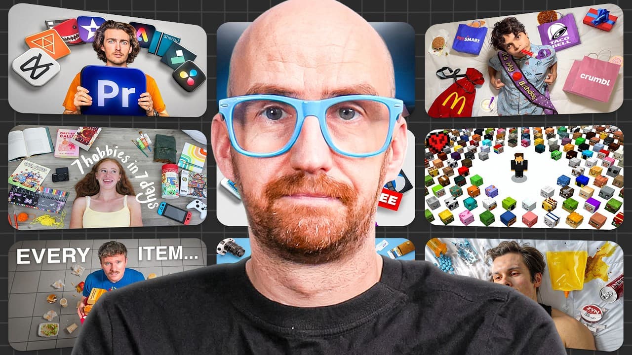
- The surround style is controlled visual abundance. It places a face or primary object in the center, then organizes products or other elements around that focus in a circle or grid, encouraging viewers to inspect the image for several extra seconds.
- The surround style is most suitable when quantity or variety forms part of the video's value proposition. Product comparisons, attempts to try every option, testing videos, hobby experiments, and collection showcases can use recognizable surrounding objects to communicate scope.
- The rainbow style is a color-coded ranking framework. It uses a full color spectrum to suggest completeness, then adds hierarchy through a red-to-blue gradient, numbers, and consistent base images, encouraging viewers to compare placements and form opinions.
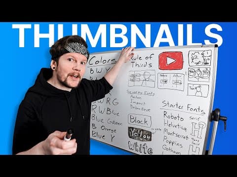
- Whiteboard thumbnails are an established signal for educational content. Hand-drawn diagrams and frameworks imply that the creator will provide a practical system, while imperfect or partially unclear markings can create curiosity and communicate authenticity instead of polished, artificial presentation.
- Familiar interface thumbnails borrow credibility through recognizable framing. Designs resembling social posts, verified profiles, reviews, listings, booking pages, app cards, price tags, or certification badges can make an idea feel shared or validated even when the underlying information has not changed.
Install to Summarize YouTube Videos and Get Transcripts
Explore YouTube Video Summarizer or Get YouTube Transcript Extractor
Questions & Answers
Q: How do you make a neo-minimalist YouTube thumbnail?
Use one primary subject and leave at least half of the thumbnail completely clear as negative space. Limit the design to two colors, choose a pure white or muted monochromatic background, and use high contrast. If text is needed, keep the font clear and easy to read. The goal is to simplify the image until it provides visual relief within a crowded YouTube homepage.
Q: Why do minimalist thumbnails attract clicks on YouTube?
Minimalist thumbnails attract attention because they contrast with a feed where many creators use arrows, circles, large fonts, bright colors, and numerous competing elements. A plain background with one object gives the viewer's eyes a visual rest stop and directs attention immediately toward the subject. The approach is disruptive because it looks different from the majority of surrounding thumbnails, not because complexity is inherently required.
Q: When should creators use the surround thumbnail style?
Creators should use the surround style when a video's appeal depends on quantity, variety, or breadth. It works well for product comparisons, videos about trying every option in a category, testing multiple items, exploring several hobbies, and showcasing collections. The main face or object belongs in the center, while the surrounding elements should reinforce the range of material covered by the video.
Q: How can a surround thumbnail avoid looking cluttered?
A surround thumbnail avoids clutter by using controlled organization. Place the main subject in the center, then arrange supporting products or objects in a deliberate circle or grid. Every element must remain identifiable when the image is reduced to normal thumbnail size. If viewers cannot recognize the surrounding objects, the design loses its ability to communicate variety and becomes uncontrolled visual noise instead.
Q: How does a rainbow ranking thumbnail work?
A rainbow ranking thumbnail uses color as both an aesthetic device and a hierarchy. The transcript recommends presenting three, five, or ideally seven topics, applying an intuitive red-to-blue gradient, adding numbers, and keeping the base images consistent. Because color becomes the main differentiator, viewers can quickly understand the ranking framework, judge each placement, and decide whether they agree with the creator's choices.
Q: Why can ranking thumbnails generate controversy and engagement?
Ranking thumbnails state visually that one person, product, tool, movie, or other subject is better or worse than another. That hierarchy naturally invites opinions from viewers who agree or disagree with the placements. Creators may even make intentionally controversial choices to encourage reactions. The resulting debate can support engagement, although the transcript notes that some people may regard this technique as engagement bait.
Q: Why do whiteboard thumbnails still work?
Whiteboard thumbnails still work because viewers immediately associate hand-drawn diagrams and frameworks with educational value and practical systems. The board does not need to reveal a complete solution at thumbnail size. Its markings can remain somewhat chaotic or mysterious as long as they create curiosity. The physical board and marker drawings also provide authenticity amid polished Photoshop compositions and images with an AI-like appearance.
Q: How do familiar interface designs influence thumbnail credibility?
Familiar interface designs change how viewers frame the information. A statement that resembles a social post can feel widely shared, while a verified-profile treatment can feel credible. Reviews, listings, booking pages, app cards, price tags, and certification badges use similarly recognizable visual cues. The underlying claim has not necessarily changed, but the interface can imply that a familiar platform or the wider internet has already validated it.
Summary & Key Takeaways
-
Effective thumbnail design depends on contrast with the surrounding feed. Neo-minimalism creates that contrast through one subject, substantial negative space, limited colors, readable typography, and a white or muted background. Its current strength comes from offering visual relief among thumbnails filled with arrows, circles, large fonts, and bright colors.
-
Surround compositions and rainbow rankings communicate structured abundance. A surround thumbnail places the main subject centrally and arranges recognizable items around it, making it suitable for comparisons, collections, and testing videos. Rainbow layouts use consistent images, a red-to-blue gradient, and numbers to establish a hierarchy that invites viewers to evaluate the ranking.
-
Established thumbnail formats still work when their visual language supports the video's promise. Whiteboards signal educational systems, practical value, curiosity, and authenticity. Familiar interfaces such as social posts, reviews, listings, price tags, and verification badges borrow recognizable visual framing, which can make information feel shared, credible, or previously validated.
-
Thumbnail styles have a limited shelf life because their effectiveness depends partly on novelty. A design that disrupts the feed today may become less distinctive after widespread imitation. Creators should inspect the current thumbnail landscape and preview designs alongside competing videos before publishing, since a strong isolated design may disappear in context.
Read in Other Languages (beta)
Share This Summary 📚
Summarize YouTube Videos and Get Video Transcripts with 1-Click
Try YouTube Summary with ChatGPT & Claude or YouTube Transcript Generator
Explore More Summaries from vidIQ 📚




Summarize YouTube Videos and Get Video Transcripts with 1-Click
Try YouTube Summary with ChatGPT & Claude or YouTube Transcript Generator