How to Make YouTube Thumbnails That Get Clicks
TL;DR
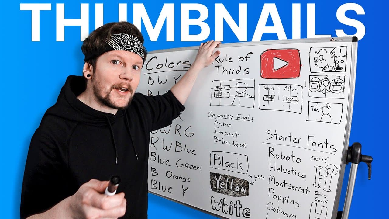
A successful YouTube thumbnail should catch the eye, convey the video's idea, and create curiosity. Keep the composition understandable within roughly two seconds by using readable text, strong contrast, and no more than three main points of focus. The thumbnail should also set an expectation that the opening seconds of the video immediately fulfill.
Transcript
I went back through every one of our live streams to find the most common thumbnail related questions and in this video we're going to answer them now Pro tip there are a lot of pro tips in this video so I'd recommend grabbing a notebook question number one what are the key features to making a successful thumbnail I.E what makes a thumbnail good n... Read More
Key Insights
- The three C's of effective thumbnails are catching the eye, conveying the video's idea, and creating curiosity. A thumbnail that misses any of these functions may struggle because viewers need both immediate comprehension and a compelling reason to click.
- The feed test is a practical way to study visual attention. Open YouTube on a desktop, identify the first thumbnail that catches your eye, and determine whether its advantage comes from color, a recognizable face, large text, or contrast with surrounding thumbnails.
- The thumbnail sets an expectation that the opening of the video should fulfill. Because viewers can hover over a video and preview its beginning, a mismatch between the thumbnail and the first seconds gives them an immediate reason to choose another option.
- The best thumbnail color depends on context rather than a universal formula. Useful starting combinations mentioned include black, white, and yellow; black, white, and red; blue and yellow; green and purple; or blue and green with an accent color.
- Text is a tool rather than an inherently good or bad thumbnail feature. It can attract attention, clarify the video's idea, or generate curiosity, but every word should serve a purpose because viewers may give the thumbnail only about two seconds.
- Sans serif fonts are generally suitable for thumbnails because they can be made bold and easy to read. Suggested starting fonts include Roboto, Helvetica, Montserrat, Poppins, Gotham, Arial, Open Sans, and Source Sans, while Anton and Impact fit more letters into narrow spaces.
- Thumbnail elements are the distinct points of focus, including text, people, objects, graphics, and meaningful backgrounds. A cluster can count as one element when viewers perceive it as a single focal group rather than several separate things requiring individual attention.
- The rule of thirds gives thumbnail compositions order by dividing the frame into three vertical and three horizontal sections. Creators can place a person on one side and supporting text or another focal point on the opposite side to reduce clutter.
Install to Summarize YouTube Videos and Get Transcripts
Explore YouTube Video Summarizer or Get YouTube Transcript Extractor
Questions & Answers
Q: What makes a good YouTube thumbnail?
A good YouTube thumbnail performs three jobs: it catches the eye, conveys the central idea of the video, and creates curiosity. Catching attention gets the viewer to pause, clear communication helps the viewer understand what is being offered, and curiosity supplies a reason to click. If one of these functions is missing, the thumbnail may fail to convert attention into a view.
Q: How can creators test what catches attention on YouTube?
Creators can use the feed test by opening YouTube on a desktop and noting the first thumbnail that catches their eye. They should then identify why it stood out. Possible reasons from the discussion include bright colors, a recognizable face, large text, or contrast with nearby thumbnails, such as a bright green design surrounded by yellow and black designs.
Q: Should the start of a video match its thumbnail?
Yes, the opening seconds should match the expectation created by the thumbnail. YouTube viewers can hover over a video and quickly see whether the beginning supports what the thumbnail promised. Even if the promised content appears later, failing to meet the expectation immediately can cause viewers to leave because many alternative videos are available.
Q: What colors work best for YouTube thumbnails?
There is no single best thumbnail color, but frequently observed combinations can provide a starting point. Examples include black, white, and yellow; black, white, and green; black, white, and red; red, white, and blue; blue and yellow; green and purple; and blue and green with an accent color. Creators should also study current YouTube results to see what works in their context.
Q: How can thumbnail text remain readable on any background?
Thumbnail text can remain readable by separating it visually from the background. White text can use a drop shadow, outline, stroke, or outer glow when placed over light or unpredictable imagery. Another reliable method is placing text inside a contrasting box, such as black text on white, white text on black, or black text on yellow.
Q: How many words should a YouTube thumbnail contain?
There is no fixed correct number of words, but thumbnail text should be kept as short as possible. A viewer scrolling through YouTube may give the design only about two seconds, so a paragraph is likely to be ignored. Text should contribute directly to attention, context, or curiosity while remaining large and immediately readable.
Q: What fonts are best for YouTube thumbnail text?
Bold sans serif fonts usually work well because they are easy to read quickly. Suggested starting choices include Roboto, Helvetica, Montserrat, Poppins, Gotham, Arial, Open Sans, and Source Sans. When more letters must fit into a narrow area, taller, condensed options such as Anton or Impact can use the limited space more efficiently.
Q: How many visual elements should a thumbnail use?
A thumbnail should generally contain three or fewer points of focus. These elements can include people, objects, text, graphics, or a background that requires attention. A group of related items may count as one element when it forms a single focal cluster. More than three elements can take longer than roughly two seconds to understand, increasing the chance that viewers scroll past.
Summary & Key Takeaways
-
Effective thumbnails follow three core principles: catch the viewer's eye, communicate the video's central idea, and create enough curiosity to earn a click. Creators can study what attracts attention by performing a feed test, noting the first thumbnail they notice on YouTube and identifying the specific visual reason it stood out.
-
Color has no universally best answer, so existing YouTube thumbnails provide useful starting points for selecting combinations. Text must remain readable against changing backgrounds through contrast, outlines, drop shadows, outer glows, or colored boxes. White text is a dependable fallback, while black text inside a yellow or white box can stand out clearly.
-
A thumbnail should be understood in roughly two seconds, which favors short text, bold sans serif fonts, and three or fewer points of focus. Common elements include people, objects, text, graphics, and meaningful backgrounds. The rule of thirds can organize these elements into a cleaner, less cluttered composition.
Read in Other Languages (beta)
Share This Summary 📚
Summarize YouTube Videos and Get Video Transcripts with 1-Click
Try YouTube Summary with ChatGPT & Claude or YouTube Transcript Generator
Explore More Summaries from vidIQ 📚


Summarize YouTube Videos and Get Video Transcripts with 1-Click
Try YouTube Summary with ChatGPT & Claude or YouTube Transcript Generator