How to fix common interior design problems at home
TL;DR
There is no single correct answer for all spaces, so start by reducing clutter and unifying the room. Then establish a color palette from a favorite piece or artwork, and add vertical interest with a wall element such as a faux headboard or picture ledge. Finally, use three light sources to create layered illumination for depth and warmth.
Transcript
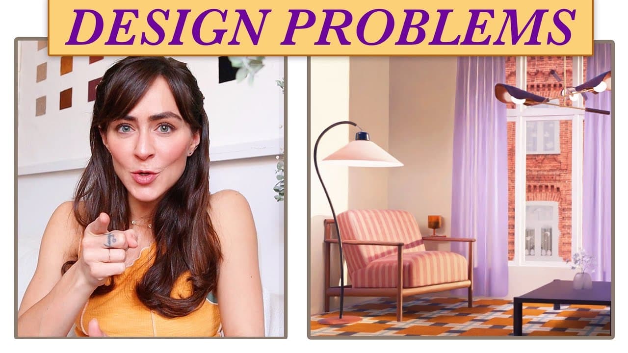
what's going on today we're going to talk about some of the most common design problems that I hear people struggling with again and again and we're going to do that in a really fun way by looking at two actual spaces of two people that I love we're gonna do some virtual designing for them I'm going to share my recommendations and the cherry on top... Read More
Key Insights
- There is no single correct answer for how a space should look, and flexible design choices prevent paralysis when planning a room.
- Clutter reduction is the first step before adding furniture or decor to any room, creating a focused canvas for color and layout decisions.
- A long wall can be treated as sections or kept unified with a wall feature to add visual interest and balance in a small or narrow space.
- A wall to wall headboard concept can be simulated with paint or shelving to create height and drama without structural changes.
- Color palettes should be pulled from existing favorites like art or textiles to ensure cohesive, personal styling.
- Rugs and other textiles can appear differently online; always check reviews and customer photos to gauge the true color and texture.
- Layered lighting with three light sources is ideal to avoid flat lighting and to enhance room perception and warmth.
- intentional details such as scalloped shelves and framed artworks can elevate a space without requiring a full redesign.
Install to Summarize YouTube Videos and Get Transcripts
Explore YouTube Video Summarizer or Get YouTube Transcript Extractor
Questions & Answers
Q: How can I design a long wall in a rental bedroom to look intentional without repainting the whole room
To design a long wall in a rental bedroom you can either break it into sections or keep it continuous and add a vertical focal point. The idea is to create rhythm with evenly spaced art or a faux wall depth like a wall to wall headboard effect. Use a picture ledge to introduce height and a single large artwork to anchor the space. If you prefer a more partitioned look, separate the wall into dresser area, mirror, and art groupings to visually define zones. The key is to avoid overwhelming the wall with clutter while maintaining balance and room flow.
Q: What is the best way to choose a color palette when I don’t have a dominant piece yet
If you don’t have a dominant piece yet you should look for inspiration in items you already love, like a small artwork or textiles. Use that piece to drive the color palette by pulling greens, blues, or other favorite tones from it. Avoid introducing too many conflicting colors and aim for a cohesive family of shades. You can also sample a rug or a throw blanket as the starting point and build around it to create harmony across walls, furniture, and textiles.
Q: Why should I consider a wall to wall headboard idea in a rental space
A wall to wall headboard idea helps define the sleeping zone, adds visual height, and introduces texture or color without structural changes. In rentals where building a real headboard is not feasible, you can simulate this effect with paint, a picture ledge, or beadboard trim along the wall. The approach creates depth and warmth, breaks up a flat wall, and can be upgraded or removed with minimal effort if you move.
Q: How many light sources are ideal for a cozy interior design setup
Three light sources are ideal for a cozy interior design setup. Use a combination of ambient lighting, task lighting, and accent lighting to avoid relying on harsh overhead light. Placing a pendant light over a dresser area, adding a bedside lamp, and incorporating a wall sconce or floor lamp can create layered lighting that adds depth, mood, and practicality while keeping the space flexible for different activities.
Q: What are practical tips for making a small room look less cluttered but still functional
Start by paring down belongings to essentials and select furniture with built in storage or slim profiles to reduce visual clutter. Group similar items with a consistent finish, and leave breathing room around furniture so the space feels airy. Use vertical space for storage or display, like floating shelves or a wall ledge, and choose a limited color palette so everything feels cohesive rather than chaotic.
Q: How can I safely add decorative shelving without overwhelming a space
Add decorative shelving by selecting a slim, low-profile design and placing it where it can be reached comfortably without crowding the room. Use a mix of decorative objects and books with careful spacing to avoid a cluttered look. A scalloped trim or light decorative edging can add charm without visual heaviness. Keep the arrangement balanced to preserve room flow and ensure you won’t bump into shelves easily.
Q: What is the role of artwork and textiles in grounding a color palette
Artwork and textiles play a key role in grounding a color palette by providing color references that anchor the room’s scheme. A single artwork can set the dominant hue family and guide the selection of pillows, rugs, and throws. Matching textiles to the artwork creates a cohesive look, while a few carefully chosen accents keep the space dynamic without overloading it.
Q: How do you evaluate online rug colors before buying
When evaluating online rug colors before buying, read reviews and check customer photos because official images may misrepresent color. Look for terms like olive versus lime and compare user-provided pictures to gauge the true shade. Consider lighting in your space and the rug’s fiber pile, which can affect apparent color. If possible, order swatches or opt for retailers with generous return policies to test the color in your room.
Summary & Key Takeaways
-
This summary emphasizes the universal design approach discussed in the video, focusing on removing excess clutter first, which creates a cleaner canvas for applying a cohesive color palette and intentional focal elements like a wall feature. It also highlights the strategy of adding vertical interest to avoid a flat look and improve room perception.
-
The summary stresses deriving color direction from existing favorites or artwork, which helps knit together greens, blues, and neutrals for a harmonious space. It also notes the practical tip of using a headboard-inspired wall treatment or ledge to define the space and create visual height, even in rentals.
-
A third summary point outlines lighting as a core tool, recommending three light sources to avoid harsh overhead lighting and to generate depth. It reinforces that careful placement of furniture and decor enhances room flow and perception without overhauling the entire space.
Read in Other Languages (beta)
Share This Summary 📚
Summarize YouTube Videos and Get Video Transcripts with 1-Click
Try YouTube Summary with ChatGPT & Claude or YouTube Transcript Generator
Explore More Summaries from Caroline Winkler 📚





Summarize YouTube Videos and Get Video Transcripts with 1-Click
Try YouTube Summary with ChatGPT & Claude or YouTube Transcript Generator