How to Design a Website Layout That Converts
TL;DR
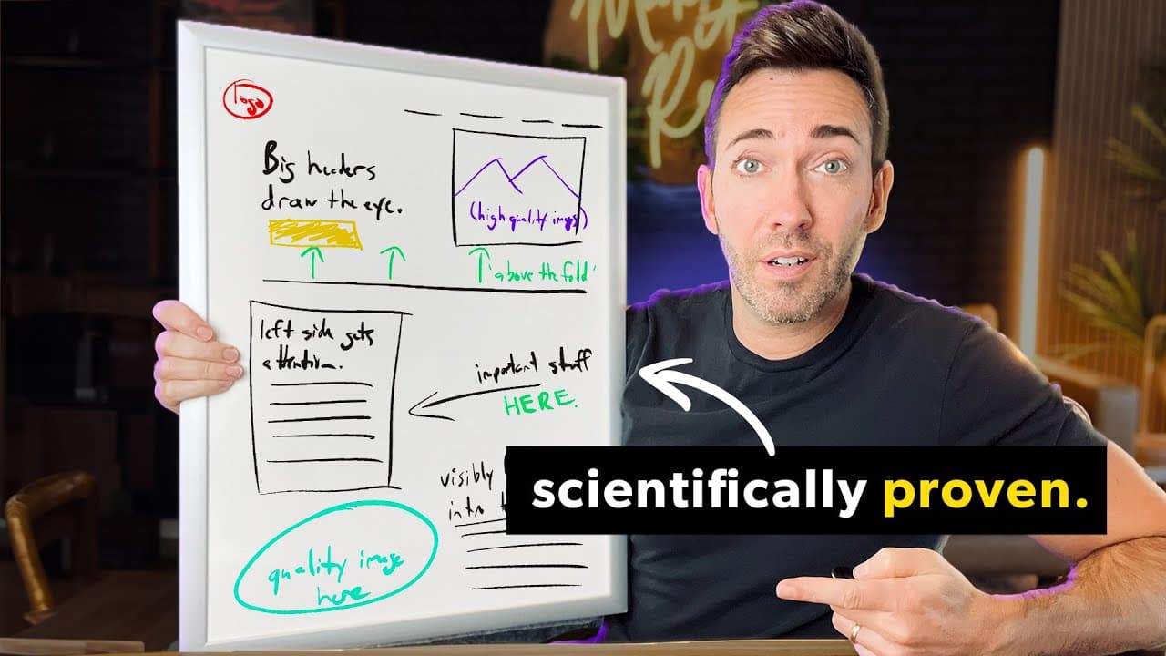
Put a clear, benefit-focused headline, supporting subheadline, and specific call to action in the left side of the hero section. Keep this essential message above the fold, pair it with a large and authentic customer image, and format longer copy with a larger opening sentence and bold key phrases so visitors can quickly recognize the offer and its value.
Transcript
imagine leaning on a scientifically proven Website Layout and tripling your growth and sales as a result that's exactly what Mike did his secret he figured out what real users were up to on his site you know where they were getting stuck and why they were ultimately Jumping Ship then he fixed it and the way he figured all this out was through some ... Read More
Key Insights
- Website visitors are usually scanning for immediate signs that a business can solve their problem, rather than reading every sentence carefully. A concise opening statement should therefore identify the offer and its value before the visitor decides whether to continue or leave.
- The headline is the most important sentence in the opening section because it draws attention and communicates the promised result. The recommended approach is to prioritize clear language over clever phrasing, since visitors need to understand the offer quickly before they can respond to it.
- Above-the-fold content is the website's crucial first impression because visitors decide whether scrolling is worthwhile based on what they initially see. The hero should explain what the business does, why it matters, and what the visitor should do, all within about 5 seconds.
- A strong hero section is built from a value-focused headline, a supporting subheadline, and a specific call to action. The headline presents the desired result, the subheadline explains how it is delivered, and the button names the exact next step.
- Left-aligned content matches the reading habits of Western audiences and receives substantially more visual attention. The cited eye-tracking research says users spend about 80% more time looking at the left side, so primary text, navigation, highlighted services, and calls to action belong there.
- Large, high-quality photographs can use the right side of the hero without competing with its primary message. Images of real customers are presented as more attention-grabbing than stock models, while a forward-facing, satisfied expression can make the person appear approachable beside the call to action.
- Authentic customer images are more effective when they avoid exaggerated poses, artificial excitement, and obvious stock-photo styling. The recommended photograph shows a genuinely happy or satisfied customer, uses enough width to command attention, and has sufficient resolution to avoid blurry or pixelated presentation.
- Long-form website copy becomes more approachable when the opening sentence is visibly larger and compelling phrases are bolded. One cited study found that 95% of test subjects shown a larger opening paragraph viewed all or part of it, supporting a format designed for skimming.
Install to Summarize YouTube Videos and Get Transcripts
Explore YouTube Video Summarizer or Get YouTube Transcript Extractor
Questions & Answers
Q: How should a website hero section be structured?
A website hero section should contain a main headline, a supporting subheadline, and a specific call-to-action button. The headline should emphasize the result, value, or transformation customers want. The subheadline should explain how the business produces that result. The button should describe the next step clearly, such as scheduling a free consultation or downloading a lead magnet, instead of using a vague label such as click here.
Q: What should a website communicate above the fold?
The area above the fold should immediately communicate what the business does, why its offer matters, and what the visitor needs to do next. This information belongs at the top of the website before any scrolling is required. Visitors will scroll when the initial section confirms that they are in the right place, but the opening content has about 5 seconds to establish that relevance.
Q: Why should important website content appear on the left?
Important content should appear on the left because Western audiences read from left to right and naturally look for the beginnings of sentences there. The cited eye-tracking findings say users spend about 80% more time looking at the left side of a page. For that reason, the hero headline, subheadline, call-to-action button, important service, menu, and About Us text should favor the left side.
Q: How do you write an effective website headline?
An effective website headline clearly states the value, result, or transformation available to the visitor. It should address the problem driving the intended audience and confirm that the business offers a relevant solution. The transcript recommends investing substantial effort in this one sentence and choosing clarity over cleverness. The objective is not to impress competitors, but to help prospective customers understand the offer and move toward a purchase.
Q: What kind of image should appear in a website hero section?
A hero section should use a large, high-resolution image that supports the business message, ideally showing a real customer rather than an obvious stock model. The person can look happy or simply satisfied with the business, without exaggerated smiles, fist bumps, or celebratory poses. A forward-facing subject is described as inviting and approachable, and the image should be at least one column wide to create sufficient visual impact.
Q: How can long website copy be made easier to read?
Long website copy can be made easier to enter and skim by enlarging the first sentence of the opening paragraph and bolding selected phrases throughout the remaining text. The enlarged sentence should introduce the visitor's most compelling pain or concern. Bold only the few ideas that matter most, so someone scanning the section can still understand the essential message without reading every sentence from beginning to end.
Q: Why should website calls to action be specific?
A specific call to action tells visitors exactly what will happen when they select it, which makes the next step easier to understand. Instead of a generic label such as click here, the button should name the requested action or outcome, such as scheduling a free consultation or downloading a lead magnet. In the hero section, this button completes the sequence established by the headline and explanatory subheadline.
Q: How can eye-tracking findings guide a website layout?
Eye-tracking findings can guide layout decisions by showing where visitors look, what they ignore, and where they may become stuck before leaving. The recommendations presented include placing essential text on the left, keeping the main offer above the fold, using large and authentic people-focused images, and emphasizing the opening line of longer copy. These choices align the page with predictable scanning behavior instead of requiring visitors to adapt to an unusual design.
Summary & Key Takeaways
-
Visitors treat a business website more like a passing billboard than a book, scanning briefly for signs that it offers what they need. The opening message should immediately state what the business does, why the result matters, and what action the visitor should take, using clarity instead of clever or competitive-sounding language.
-
The hero section should place a result-focused headline, explanatory subheadline, and specific call-to-action button above the fold. These elements should appear on the left because Western readers scan from left to right, and the cited eye-tracking findings indicate that users spend about 80% more viewing time on the page's left side.
-
The right side of the hero can support the offer with a large, high-resolution photograph of a real and satisfied customer facing forward. Longer sections become easier to engage with when the opening sentence is visibly larger and the most important phrases are bolded, giving skimming visitors a clear path through the message.
Read in Other Languages (beta)
Share This Summary 📚
Summarize YouTube Videos and Get Video Transcripts with 1-Click
Try YouTube Summary with ChatGPT & Claude or YouTube Transcript Generator
Explore More Summaries from Wes McDowell 📚
Summarize YouTube Videos and Get Video Transcripts with 1-Click
Try YouTube Summary with ChatGPT & Claude or YouTube Transcript Generator