How to critique Instagram carousels for better design
TL;DR
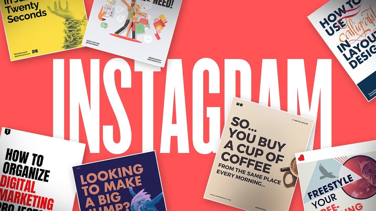
The video walks through a structured critique of Instagram carousel submissions using five criteria: clarity, fulfillment of the idea, typography rules, alignment of design with message, and the creator's unique edge. It also shows practical fixes like better dimensions, copy flow, and consistency across slides to improve engagement.
Transcript
what's up beautiful people hope you're having an amazing day today one of our most popular episodes has been on how to grow an audience on instagram so in this episode i'm going to review some submissions from my instagram carousel clinic and give some pointers on what i think is working and what can be improved before we begin i want to thank late... Read More
Key Insights
- Clarity matters first, as viewers must immediately understand the message on each slide.
- The design should fulfill the promise of the copy, ensuring imagery and text support the concept rather than contradict it.
- Typography rules matter, including proper spacing, alignment, and avoiding oversized or mismatched elements.
- Copy flow benefits from natural speaking rhythm, which can be achieved by reading the carousel aloud and breaking thoughts across slides.
- Dimensions and aspect ratios must fit platform requirements to avoid cramped or distorted content.
- Consistent color and icon treatment across slides enhances visual harmony and reduces viewer distraction.
- The closing slide should reinforce personal branding without overpowering the core message or CTA.
- Adding a personal touch or unique edge helps content stand out and become memorable.
- More videos from this channel:
- More from this channel: The Futur
Install to Summarize YouTube Videos and Get Transcripts
Explore YouTube Video Summarizer or Get YouTube Transcript Extractor
Questions & Answers
Q: What is the main purpose of this Instagram carousel critique episode
The main purpose is to critique real Instagram carousel submissions to teach viewers how to improve copy, typography, and design. It focuses on five criteria including clarity, how fulfilling the idea is, typography integrity, whether the design supports the concept, and the X factor that gives a unique touch. The aim is to provide actionable feedback that viewers can apply to their own work.
Q: How should you handle slide copy to improve flow
To improve flow, break a singular thought across multiple slides and use connectors like commas or ellipses to link ideas. Read the copy aloud to ensure natural pacing and make sure transitions between slides reflect a continuous thought rather than abrupt shifts. This approach helps the reader follow the message without feeling overwhelmed.
Q: What typography issues are commonly mentioned in the critique
Common issues include improper indentation and spacing that disrupts the relationship between list items, inconsistent font sizes, and misalignment with the intended emphasis. It is also noted that bottom source text is often too small and overly verbose. Correcting these details helps readability and credibility.
Q: Why is consistency across colors and icons important
Consistency across colors and icons matters because it creates a cohesive visual language that reduces cognitive load for the viewer. When colors or icons vary slightly, it can feel off and distract from the message. Uniform treatment signals a professional approach and strengthens brand recognition.
Q: What role does the call to action play in a carousel
The call to action should be simple and directly connected to the content, guiding the viewer toward a next step without overshadowing the message. A strong CTA can encourage sharing, engagement, or further exploration, but must be integrated with the design so it feels like a natural conclusion rather than an afterthought.
Q: How can someone improve their overall design edge
To improve the design edge, creators should consider what makes their carousel uniquely theirs, such as a signature color palette, typography style, illustrative approach, or inter-frame transitions. This unique touch should be consistently applied across all slides to reinforce personal branding and create memorability.
Q: What is the recommended approach to evaluating dimensions
The recommended approach is to ensure the carousel uses proper dimensions suitable for the platform, avoiding narrow or squished layouts. Previewing the slides as a whole and aligning each frame with the next helps maintain a smooth visual flow and prevents readers from losing interest due to poor formatting.
Q: How can feedback be made actionable for creators
Feedback should be specific, focusing on concrete improvements like adjusting spacing, refining headlines, tightening copy, and aligning visuals with the message. Providing before and after examples or suggested phrasing helps creators implement changes more efficiently and see measurable improvements in engagement.
Summary & Key Takeaways
-
The episode presents a clear framework for evaluating Instagram carousels including readability, flow, typography, and visual cohesion, with practical fixes to common issues.
-
Case studies of six submissions illustrate how small changes in layout, typography, and branding can dramatically improve clarity and engagement.
-
The host emphasizes consistency, concise copy, and a strong personal brand as key drivers of successful carousel design and audience growth.
Read in Other Languages (beta)
Share This Summary 📚
Summarize YouTube Videos and Get Video Transcripts with 1-Click
Try YouTube Summary with ChatGPT & Claude or YouTube Transcript Generator
Explore More Summaries from The Futur 📚





Summarize YouTube Videos and Get Video Transcripts with 1-Click
Try YouTube Summary with ChatGPT & Claude or YouTube Transcript Generator