How Does the Client Logo Design Process Work?, Building A Brand, Ep 6
TL;DR
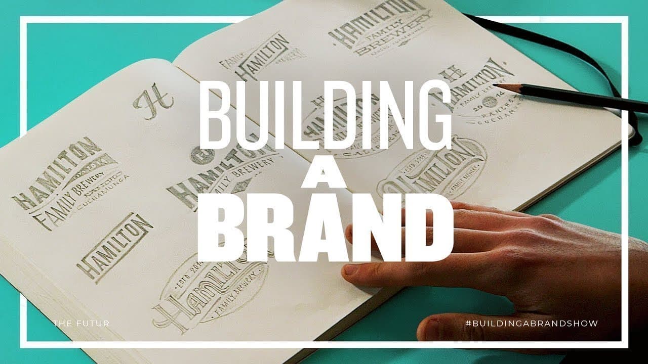
A strong client logo process moves from an approved visual direction to broad concept exploration, focused critique, refinement, and presentation. For Hamilton Family Brewery, Blind assigns typography, H-mark, and hand-lettering explorations, then plans to narrow the work to three or four client-ready options. Read on to see how stylescapes, adaptable lockups, and realistic mockups guide each decision.
Transcript
Josh finally responded to the logo and website we posted last week yeah he sent us some some feedback in its own it's a lot this is blind brand strategy design consultancy based in Santa Monica California since 1995 blind has used the power of design to help diverse clients reach their customers and stand out in the marketplace in this series you'l... Read More
Key Insights
- A logo’s job is to identify a brand, not explain what the business does. The design should give the company a recognizable identity without trying to place every service, product, or brand story inside one complicated mark.
- A client-approved stylescape establishes the shared visual direction before logo exploration begins. Blind combines elements from the Ornate Heritage and Merit Badge directions, creating a curated reference that aligns the designers and the Hamiltons before detailed logo concepts are produced.
- The creative brief gives designers boundaries for generating many possible logo options. Creative directors then evaluate the breadth and depth of that work, refine promising ideas, and reduce a large body of exploration to only three or four client-ready concepts.
- Logo versatility depends on clear hierarchy and adaptable lockups. Emily’s typography explorations consider boxy and circular compositions, flat surfaces, cans, and bottles, while one favored concept can be simplified from the full brewery name to a smaller H-based arrangement.
- A monogram technically combines two or more letters with a decorative flourish, according to the definition discussed by the team. Because Hamilton Family Brewery is a long name, Min instead explores a single H that can abbreviate and identify the brand at the center of the system.
- Hand lettering supports the handcrafted quality the Hamiltons valued in the daring artisan direction. Emanuele builds balanced, symmetrical lockups with limited flourishes, while the creative directors adjust scale, curves, accent lines, typeface combinations, and letterforms to strengthen heritage and clarity.
- Creative critique works best when feedback identifies a visual problem and proposes an exploration. The directors flag competing elements, excessive bulges, rounded forms that weaken the heritage feeling, and details that create clutter, then request alternative scale, spacing, typeface, and construction treatments.
- Realistic mockups show how a logo will live and breathe if selected. Blind plans to test concepts on beer bottles, cans, a building, and bottle caps, as well as in black-on-white and white-on-black versions, covering both very large and very small applications.
Install to Summarize YouTube Videos and Get Transcripts
Explore YouTube Video Summarizer or Get YouTube Transcript Extractor
Questions & Answers
Q: How does the client logo design process work in Building A Brand, Ep 6?
Blind first refines a client-approved stylescape and gives the designers a creative brief. Emily explores typography, Min develops an H mark, and Emanuele Ricci creates hand-lettered concepts. The creative directors then critique and refine the work before presenting three or four options to the Hamiltons.
Q: What is the purpose of a logo in brand design?
A logo’s job is to identify a brand, not explain what the business does. For Hamilton Family Brewery, the team seeks a recognizable identity instead of trying to place the entire business story inside the mark.
Q: How does a stylescape guide logo development?
A stylescape is a curated reference used to determine the brand’s direction with the client’s approval. Blind combines elements from the Ornate Heritage and Merit Badge directions so the Hamiltons and designers share the same visual reference before logo exploration begins.
Q: How should designers generate logo concepts for a client?
Designers work within a creative brief and create as many options as possible in the allotted time. Separate assignments broaden the exploration: Emily focuses on refined typography, Min explores marks built around the letter H, and Emanuele develops hand-lettered lockups.
Q: How many logo concepts should be presented to a client?
Blind plans to present only three or four logo options to the Hamiltons. Before that presentation, the creative directors review a much larger body of work and help refine the most promising concepts into client-ready directions.
Q: What makes a logo versatile across different applications?
The Hamilton concepts are evaluated for hierarchy, recognizable forms, and layouts that work in different spaces. Emily explores boxy and circular compositions for flat surfaces, cans, and bottles, while one lockup can be reduced from the full brewery name to an H for smaller uses.
Q: Why does Hamilton Family Brewery’s identity use hand lettering and an H mark?
The Hamiltons expressed interest in a more hand-drawn logo, so Blind brought in Emanuele Ricci, a lettering artist trained in calligraphy. Because Hamilton Family Brewery is a long name, Min also explores a single H that can abbreviate and identify the brand when the full lockup is impractical.
Q: Why should logo concepts be presented with realistic mockups?
Mockups help clients understand how a proposed identity will perform in practice and at different sizes. Blind plans to show concepts on bottles, cans, a building, and bottle caps, along with black-on-white and white-on-black versions.
Summary & Key Takeaways
-
Blind turns the Hamilton family brewery’s approved visual direction into a focused logo brief. Emily explores refined typography and adaptable layouts, Min develops a simplified H mark, and hand-lettering artist Emanuele Ricci creates crafted lockups. Their varied assignments produce a broad collection of ideas without losing the agreed brand direction or constraints.
-
Creative directors Ben Burns and Matthew Encina critique hierarchy, balance, legibility, letterforms, typography, and versatility. They identify promising features, suggest precise revisions, and encourage further exploration. Emanuele’s handcrafted direction receives extra attention because it preserves the quality the clients appreciated from an earlier daring artisan concept while supporting the desired craftsman aesthetic.
-
The team plans to refine roughly ten to twelve strong concepts, select about four, and demonstrate them through realistic applications. Bottle, can, building, and bottle-cap mockups reveal performance at different scales, while black-on-white and white-on-black versions test contrast. These presentations help clients understand how each identity could function in practice.
Read in Other Languages (beta)
Share This Summary 📚
Summarize YouTube Videos and Get Video Transcripts with 1-Click
Try YouTube Summary with ChatGPT & Claude or YouTube Transcript Generator
Explore More Summaries from The Futur 📚
Summarize YouTube Videos and Get Video Transcripts with 1-Click
Try YouTube Summary with ChatGPT & Claude or YouTube Transcript Generator