How to Present Brand Concepts to Clients
TL;DR
Present brand concepts as a small set of clearly differentiated directions, then use descriptive names and a narrative to frame how clients perceive each option. Explain that reference imagery establishes a visual compass rather than showing finished designs, connect every direction to discovery insights, and invite honest reactions before developing the logo, packaging, and broader identity.
Transcript
I feel like they have created a space where we can be pretty honest with them I don't feel like I'm gonna offend them by saying I don't like something in fact if I knew what to say to offend Ben I would just say it for the sake of offending Ben I didn't this is blind a brand strategy design consultancy based in Santa Monica California since 1995 bl... Read More
Key Insights
- A strong client presentation begins with a limited set of clearly differentiated options. Blind removes a fifth stylescape because it repeats visual elements found in other directions, prioritizing meaningful contrast and reducing the risk that too many similar choices will complicate the decision.
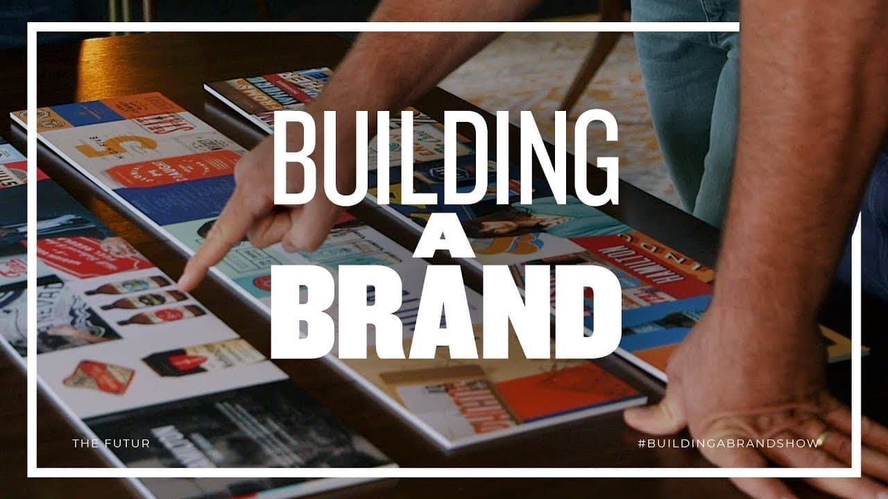
- A stylescape is a curated collection of reference imagery used to communicate a proposed visual direction. It translates descriptive words from discovery into images and establishes the brand's compass before designers create the logo, packaging, and other original identity elements.
- Descriptive titles frame how clients interpret visual work. Names such as Ornate Heritage and Built to Last summarize the intended feeling, create an entryway into each concept, and give the presenter a narrative for connecting individual visual references into one coherent direction.
- The discovery session provides the factual foundation for presenting creative work. Blind positions each stylescape as an interpretation of the words the Hamiltons previously selected, allowing the designers to connect subjective visual decisions back to qualities the clients already identified for their brand.
- Reference material must be distinguished from finished client work. Ben explicitly tells the Hamiltons that the displayed items were curated to communicate a vibe and were not designed for them, preventing the clients from mistaking exploratory imagery for completed logos, packaging, or identity assets.
- Effective concept explanations connect details to strategic intent. The presenters describe how ornamentation conveys heritage, bright color accents freshen traditional references, industrial textures suggest working-class grit, and lighter blue balances bold reddish orange, black, and white elements that might otherwise feel overly masculine.
- Client reactions become more useful when the environment supports honesty. The Hamiltons feel comfortable stating what they like, what feels too traditional, what seems familiar, and which direction appears risky, giving the designers clearer information than polite approval would provide.
- A visual direction can serve the brand even when it differs from a client's personal preference. Josh recognizes that customer preferences may not match his own, showing why designers should present concepts through the intended audience's perspective rather than treating the owner's individual taste as the only criterion.
Install to Summarize YouTube Videos and Get Transcripts
Explore YouTube Video Summarizer or Get YouTube Transcript Extractor
Questions & Answers
Q: How should designers present brand concepts to clients?
Designers should present a small group of visually distinct directions, explain how each one interprets language gathered during discovery, and give every direction a descriptive title. They should clarify that curated references establish a visual compass rather than represent finished designs. Each explanation should connect colors, typography, imagery, materials, and graphic details to the intended brand qualities and audience.
Q: How many design directions should be shown to a client?
Blind chooses four directions for the Hamilton Family Brewery presentation after considering five. The team leaves one option behind because it overlaps with elements already represented in the others. The practical lesson is to select a manageable group with substantial contrast, rather than presenting every available concept or giving clients several choices that communicate nearly the same visual idea.
Q: What is a stylescape in a branding presentation?
A stylescape is a curated set of existing visual references assembled to communicate a potential brand look and feeling. It helps clients move from descriptive words to imagery before original identity assets are developed. In this process, the stylescape establishes direction for later work such as the logo and packaging, but none of its reference material is presented as finished client design.
Q: Why should design concepts have descriptive names?
Descriptive names summarize a concept and influence the client's first interpretation of the work. Blind replaces a generic title, The Shield, with Built to Last because the revised phrase communicates heritage, durability, and the intended shield imagery more clearly. A carefully chosen name also gives the presenter a narrative that connects separate visual references into one understandable and memorable direction.
Q: How can designers reduce confusion during a concept presentation?
Designers can reduce confusion by explaining the purpose and status of the material before discussing individual options. Ben tells the clients that the imagery was curated to establish a vibe and was not designed specifically for them. He also outlines the next steps, including logo and packaging development, so the clients understand that they are choosing direction rather than approving completed identity assets.
Q: How should a presenter explain visual design choices?
A presenter should connect each visual choice to a specific brand goal instead of merely describing what appears on the board. Blind links ornamentation and monograms to heritage, bright accents to freshness, sturdy colors and industrial imagery to working-class Americana, and lighter blue to balance. These connections show clients why the ingredients belong together and what the overall direction is intended to communicate.
Q: Why is contrast important when selecting client options?
Contrast ensures that each option represents a genuinely different path and produces more informative client feedback. Blind removes a stylescape whose textures and elements blur into the other concepts. By retaining only differentiated directions, the team can compare clear alternatives, observe which qualities attract or repel the clients, and avoid forcing them to distinguish between several nearly interchangeable collections of references.
Q: Should personal taste determine a brand design direction?
Personal taste is one source of feedback, but the presentation shows that the intended customers also matter. Josh identifies a direction he likes while acknowledging that his customers may hold a different preference. Blind further filters a concept through a target user described as a beer snob. The decision should therefore consider the audience and previously defined brand qualities alongside the owner's immediate reaction.
Summary & Key Takeaways
-
Blind prepares four stylescapes for Hamilton Family Brewery after removing an option that overlaps too heavily with the others. The team wants every direction to offer meaningful contrast, giving the clients distinct choices instead of several variations that blur together. Each selected direction interprets language gathered during the earlier discovery session.
-
Before presenting, Ben and Matthew refine names and descriptions that summarize each stylescape. Titles such as Ornate Heritage and Built to Last create an entryway into the visual idea, establish an emotional frame, and help the presenters explain how typography, color, ornamentation, photography, materials, and graphic elements support a coherent brand direction.
-
The presentation begins by clarifying that the displayed references are curated examples, not finished work designed for the brewery. The stylescapes establish a compass direction before logo, packaging, and identity development begins. The designers then connect each option to heritage, customer profiles, desired qualities, and the clients' candid responses.
-
Key Insights Q&A Summary
Read in Other Languages (beta)
Share This Summary 📚
Summarize YouTube Videos and Get Video Transcripts with 1-Click
Try YouTube Summary with ChatGPT & Claude or YouTube Transcript Generator
Explore More Summaries from The Futur 📚






Summarize YouTube Videos and Get Video Transcripts with 1-Click
Try YouTube Summary with ChatGPT & Claude or YouTube Transcript Generator