How to triple leads with new homepage layouts
TL;DR
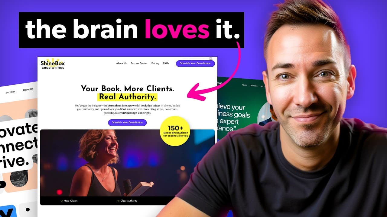
The video reveals five brand new homepage layouts that generate more leads for service businesses, focusing on a strong hero section and a balance between familiar structure and unique design. It explains how to fix the hero area, add proof and results, and choose the right layout for your specific offer to boost conversions.
Transcript
Everyone says your website should bring in leads, but no one tells you how to know if it's working or if it's been sabotaging your ability to get clients all along. Look at these two homepages. These sites offer the same service, pretty similar branding, nearly identical copy. And yet, homepage B converts three times better than homepage A. Why? Wh... Read More
Key Insights
- The key to higher conversions is a hero section that instantly communicates the offer, benefits, and next step.
- Homepage B can outperform Homepage A by three times in lead generation due to the layout structure.
- Five new layouts are introduced, each combining different visual cues with strong, result-focused messaging.
- Images should support the story but not overpower text, which remains the main communicator of value.
- Layouts add elements such as statistics and client results to sweeten the deal and build credibility.
- If you show diverse client avatars, you can demonstrate breadth of impact and relevance to different buyers.
- Advanced layouts like the Bento box offer modular design but require careful color planning to avoid visual chaos.
- Mobile design should adapt by stacking elements vertically to maintain readability and flow.
- More videos from this channel:
- More from this channel: Wes McDowell
Install to Summarize YouTube Videos and Get Transcripts
Explore YouTube Video Summarizer or Get YouTube Transcript Extractor
Questions & Answers
Q: How can I triple my leads with a new homepage layout
Tripling leads starts with a strong hero that clearly states the service and value, followed by a layout that supports the message with social proof and measurable results. The video shows five layouts that balance familiarity and uniqueness to boost conversions, plus practical tips for hero optimization and mobile stacking.
Q: What role does the hero section play in conversions
The hero section is presented as the most important area because it instantly shows what you offer and how it helps the visitor. The video states that getting the hero right puts you 80 percent of the way to conversion success, making the initial message decisive for engagement.
Q: Why are different layouts useful for service businesses
Different layouts allow you to tailor how you present offers, results, and proof to specific audiences. The layouts differ in how they position images, headlines, and social proof, enabling you to select a pattern that aligns with your service type and client expectations while maintaining clarity.
Q: How should images be used in hero sections
Images are described as a window dressing that supports the story, while the headline and sub headline convey the core offer. The video cautions against text on busy images and suggests placing text above or beside images to preserve readability and focus on the message.
Q: What is the purpose of adding statistics and results in layouts
Statistics and results act as social proof and value amplification, such as quotes like how many clients helped, five-star ratings, or client outcomes. They sweeten the proposition, making the benefits tangible and credible, which helps move visitors toward a conversion action.
Q: How can you show multiple client types in a hero layout
One layout option demonstrates different client avatars to reflect a broad audience, showing that the service can help men, women, older and younger clients. This visual diversity helps visitors see themselves in the solution and reinforces relevance across segments.
Q: What considerations matter for mobile layout
Mobile layout considerations include stacking elements vertically, selecting a primary image for mobile that aligns with the hero message, and ensuring that text remains readable despite reduced width. The video emphasizes maintaining a logical flow and readability on smaller screens.
Q: What makes a Bento box layout work and when to use it
A Bento box layout offers modular sections with distinct containers, which can look modern and organized. It requires careful color choices and balance to avoid chaos. It is suitable when you want clear separation of benefits, proofs, and calls to action while keeping a contemporary look.
Summary & Key Takeaways
-
The video emphasizes that the hero section is critical and should clearly state what you offer and how to get it, as it drives conversions and reduces bounce rates. It introduces five layouts that test different visual structures while keeping messaging clear.
-
The host demonstrates how to layer social proof and results into each layout, including statistics and client outcomes, to increase perceived value and trust before visitors scroll further.
-
The video discusses mobile considerations, recommending stacking elements on mobile while preserving desktop layout logic, and using color and image choices that support readability and emphasize the key message.
Read in Other Languages (beta)
Share This Summary 📚
Summarize YouTube Videos and Get Video Transcripts with 1-Click
Try YouTube Summary with ChatGPT & Claude or YouTube Transcript Generator
Explore More Summaries from Wes McDowell 📚



Summarize YouTube Videos and Get Video Transcripts with 1-Click
Try YouTube Summary with ChatGPT & Claude or YouTube Transcript Generator