How to Build a Landing Page That Converts
TL;DR
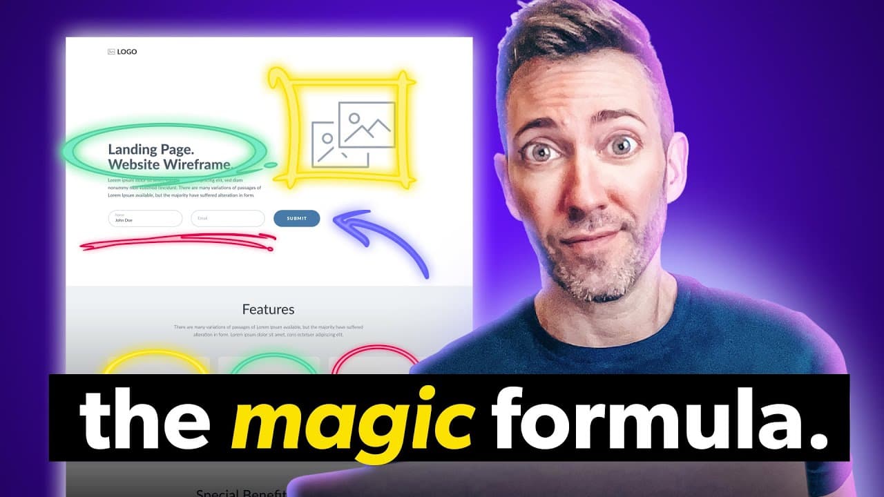
A landing page converts by focusing visitors on one offer, removing distractions, and making the desired action clear and trustworthy. The blueprint centers on a hero section with a transformation-focused headline, concrete subheadline, minimal form, specific call to action, privacy reassurance, and social proof; the transcript says this layout routinely converts over 20%, versus an average of about 9%. Read on for eight practical ways to apply it.
Transcript
the average landing page converts just about 9% of the traffic it gets but the average landing page also makes a ton of mistakes either leaving important stuff out or including too much that nobody needs that's why I'm just going to make it really easy on you with the proven landing page blueprint that easily doubles on that 9% in fact this layout ... Read More
Key Insights
- A landing page is a dedicated page designed to encourage one specific action, such as downloading content, booking an appointment, joining an email list, or purchasing a product. Every element should make that action feel clear, easy, and sufficiently trustworthy.
- Navigation is an unnecessary distraction on a focused landing page because it gives visitors additional ways to leave the intended flow. When traffic arrives from an advertisement or social media campaign, removing navigation keeps attention centered on the offer and its call to action.
- The headline is a statement of the result or transformation promised by the offer, rather than merely the name of a product, service, or resource. This approach connects the offer to the better future or improved version of themselves that visitors actually want.
- The subheadline is the logical explanation of how the promised result will be delivered. Pairing a transformation-focused headline with a concrete description of the offer supplies both emotional motivation and practical clarity, which helps visitors understand what they will receive.
- A minimal form is more likely to convert because requests for additional personal information can significantly reduce completion rates. For a free lead magnet intended to build an email list, a first name and email address are presented as sufficient information.
- The call-to-action button is most effective when its text states exactly what clicking will accomplish. Specific phrases about receiving a guide, training, consultation, or review remove uncertainty, while vague labels such as contact-oriented or generic action phrases leave the outcome unclear.
- A privacy reassurance is a trust-building statement placed beneath the form to address concerns about spam, data sharing, or personal information use. The transcript says 71% of people are wary of forms and that this small reassurance can increase conversions by 7%.
- Benefits are the meaningful outcomes produced by an offer's features. The recommended process is to list each feature, ask why customers should care about it, title the section with the resulting benefit, and briefly explain the feature that makes that benefit possible.
Install to Summarize YouTube Videos and Get Transcripts
Explore YouTube Video Summarizer or Get YouTube Transcript Extractor
Questions & Answers
Q: How do you structure a high-converting landing page?
Build the page around one specific offer and action, such as downloading a lead magnet, booking a consultation, or buying a product. Start with a hero section containing a result-focused headline, a concrete subheadline, a minimal form or booking or purchase control, a clear call to action, privacy reassurance, and social proof. Follow it with benefit-focused content and testimonials that reinforce trust.
Q: Why should a landing page remove its navigation menu?
Navigation creates competing choices and gives visitors ways to exit the intended flow. Because an advertisement or social media campaign brought them to the page for one purpose, removing navigation keeps their attention on the offer and its desired action.
Q: What should a landing page headline and subheadline say?
The headline should state the result, transformation, or better future promised by the offer instead of merely naming the product or service. The subheadline should identify the actual offer and explain how it produces that result. Together, they provide emotional motivation and logical clarity.
Q: How many fields should a landing page form include?
Ask only for the information required to complete the immediate action because conversions drop as more personal details are requested. For a free lead magnet intended to build an email list, the transcript recommends a first name and email address. Avoid requesting details such as phone numbers or addresses when they are unnecessary.
Q: What makes landing page call-to-action text effective?
The button should state exactly what will happen after the visitor clicks, such as receiving a free guide or scheduling a free consultation. Avoid vague wording such as “let’s go” or “contact us.” The transcript also says studies found that first-person wording such as “send me the free training” or “book my free website review session” can improve conversions.
Q: How does privacy reassurance improve form conversions?
A short statement beneath the call to action can address concerns about spam, data sharing, or personal-information use. The transcript says 71% of people are wary of completing forms and that one reassurance line can increase conversion rates by 7%. A direct message that the visitor’s information is safe reduces uncertainty.
Q: What social proof should appear on a landing page?
Near the hero section, social proof can include third-party star ratings, review counts, an overall rating with the review platform, or logos of businesses served. Farther down the page, short testimonials can highlight specific results or answer common objections. Customer photos can make those testimonials feel more genuine and credible.
Q: How do you turn product features into landing page benefits?
List each feature and ask why the customer should care about it. Use that answer as the benefit heading, then briefly explain the feature that makes the outcome possible. A relevant icon, photograph, or illustration can reinforce each benefit and attract attention.
Summary & Key Takeaways
-
A landing page should guide visitors toward one specific action, such as downloading a lead magnet, booking a consultation, joining an email list, or buying a product. Removing navigation limits unnecessary exit paths, while a strong hero section immediately communicates the promised result, the offer, and the next step.
-
The hero section should pair emotional motivation with logical clarity. A headline presents the desired transformation, while the subheadline identifies the offer that makes it possible. A minimal form, outcome-specific button text, privacy reassurance, third-party proof, and a customer-focused image reduce uncertainty and strengthen confidence before visitors scroll.
-
The remaining sections should explain benefits and reinforce trust. Benefits translate features into meaningful improvements by answering why customers should care. Relevant icons, photos, or illustrations can attract attention. Short testimonials should emphasize measurable transformations or address common objections, and customer photos can make those statements feel more genuine and credible.
Read in Other Languages (beta)
Share This Summary 📚
Summarize YouTube Videos and Get Video Transcripts with 1-Click
Try YouTube Summary with ChatGPT & Claude or YouTube Transcript Generator
Explore More Summaries from Wes McDowell 📚
Summarize YouTube Videos and Get Video Transcripts with 1-Click
Try YouTube Summary with ChatGPT & Claude or YouTube Transcript Generator