How to Master Flexbox for CSS Layouts
TL;DR
Flexbox is a CSS layout module that simplifies the process of designing responsive web layouts. It allows for efficient space distribution and alignment of elements within a container, making it easier to create flexible and adaptive designs. By understanding properties like flex-direction, justify-content, align-items, and others, developers can create complex layouts with minimal code.
Transcript
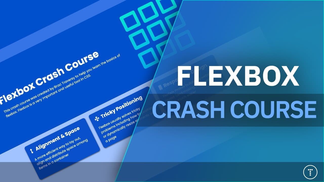
hey what's going on guys welcome to my flexbox crash course so i did one of these about five years ago or so and i'm in the process of updating all my old crash courses so in this video we're going to go from knowing nothing about flexbox to knowing just about everything and we're going to start off with some slides just to give you an idea of what... Read More
Key Insights
- Flexbox is a CSS module designed for responsive layout design.
- Flex containers and flex items are the core components of Flexbox.
- The display property is used to define a flex container.
- The main axis and cross axis are crucial for understanding alignment.
- Justify-content aligns items along the main axis.
- Align-items aligns items along the cross axis.
- Flex-grow, flex-shrink, and flex-basis control item sizing.
- Flexbox simplifies centering elements and creating responsive designs.
Install to Summarize YouTube Videos and Get Transcripts
Explore YouTube Video Summarizer or Get YouTube Transcript Extractor
Questions & Answers
Q: How to create a flex container in CSS?
To create a flex container, apply the CSS property 'display: flex' to the desired HTML element. This will make all of its direct children flex items, allowing for flexible layout management using various flexbox properties.
Q: What is the difference between main axis and cross axis in Flexbox?
The main axis in Flexbox is the primary axis along which flex items are laid out, determined by the 'flex-direction' property. The cross axis is perpendicular to the main axis. Understanding these axes is crucial for using alignment properties effectively.
Q: When should I use justify-content in Flexbox?
Use 'justify-content' to align flex items along the main axis of a flex container. It helps distribute space between and around items, with options like 'flex-start', 'flex-end', 'center', 'space-between', and 'space-around'.
Q: How does the align-items property work in Flexbox?
The 'align-items' property aligns flex items along the cross axis. It controls the vertical alignment in a horizontal flex container and horizontal alignment in a vertical flex container, with values like 'flex-start', 'flex-end', 'center', 'baseline', and 'stretch'.
Q: What is the purpose of the flex-grow property?
The 'flex-grow' property defines the growth rate of a flex item relative to others in the same container. It determines how much available space inside the flex container should be assigned to the item, allowing for proportional resizing.
Q: How can I center elements using Flexbox?
To center elements using Flexbox, set 'display: flex' on the container, then use 'justify-content: center' to align items horizontally and 'align-items: center' to align them vertically. This centers items both horizontally and vertically within the container.
Q: What is the role of the flex-shrink property?
The 'flex-shrink' property specifies the shrink rate of a flex item when the flex container is too small. It allows items to shrink proportionally based on their 'flex-shrink' value, ensuring that they fit within the container's available space.
Q: How does the flex-wrap property affect a flex container?
The 'flex-wrap' property controls whether flex items should wrap onto multiple lines. By default, items are laid out in a single line, but setting 'flex-wrap: wrap' allows items to move to the next line when there isn't enough space, enhancing layout flexibility.
Summary & Key Takeaways
-
Flexbox is a powerful CSS layout tool that helps in creating responsive web designs by using properties like flex-direction, justify-content, and align-items. It replaces older methods like floats and tables, making layout management more intuitive.
-
Understanding the main axis and cross axis is essential for using Flexbox effectively. These axes determine how items are aligned and distributed within a flex container, depending on the flex-direction property.
-
Flexbox also allows for flexible item sizing through properties like flex-grow, flex-shrink, and flex-basis, enabling developers to create adaptive layouts that respond to different screen sizes.
Read in Other Languages (beta)
Share This Summary 📚
Summarize YouTube Videos and Get Video Transcripts with 1-Click
Try YouTube Summary with ChatGPT & Claude or YouTube Transcript Generator
Explore More Summaries from Traversy Media 📚





Summarize YouTube Videos and Get Video Transcripts with 1-Click
Try YouTube Summary with ChatGPT & Claude or YouTube Transcript Generator