10 Best YouTube Videos to Learn Data Analysis (Excel, SQL & Power BI)

Aug 09, 2026
12 min read
168 views
Last updated: August 2026
This list collects 10 YouTube videos that teach data analysis with Excel, SQL, and Power BI, arranged as a learning path rather than a popularity ranking. It is written for people teaching themselves data analysis, whether for a first analyst job or to work with data in their current role.
Together the ten videos run about 22 and a half hours, from a 13 minute pivot table primer to a full 659 minute Excel analytics course. The set draws on widely watched instructors, including Kevin Stratvert, Leila Gharani, Alex The Analyst, Luke Barousse, and freeCodeCamp, so every stage of the path comes from a proven teacher.
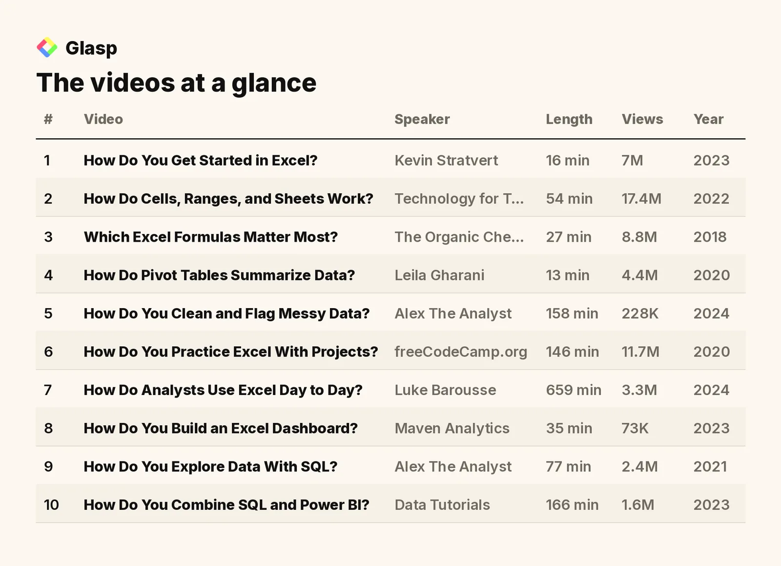
The videos on this list, in the order to watch them, are:
How Do You Get Started in Excel? (Kevin Stratvert)
How Do Cells, Ranges, and Sheets Work? (Technology for Teachers and Students)
Which Excel Formulas Matter Most? (The Organic Chemistry Tutor)
How Do Pivot Tables Summarize Data? (Leila Gharani)
How Do You Clean and Flag Messy Data? (Alex The Analyst)
How Do Analysts Use Excel Day to Day? (Luke Barousse)
How Do You Build an Excel Dashboard? (Maven Analytics)
How Do You Explore Data With SQL? (Alex The Analyst)
How Do You Combine SQL and Power BI? (Data Tutorials)
Total: 10 videos, 1351 minutes of watch time (22 hours 31 minutes), and 57M combined views.
1. How Do You Get Started in Excel?

"Excel Tutorial for Beginners" · Kevin Stratvert · 16 min · 7M views · 2023
In short: You can access Excel free at excel.new, enter data into rows and columns, then format and summarize it with tables, charts, and pivot tables.
Sixteen minutes is all this tutorial needs to get you from opening Excel to formatting data and building your first table and chart. It earns the first slot because it answers the question every self-taught analyst starts with: what does working in Excel actually look like?
Key takeaways
Excel can be accessed for free at excel.new in a web browser, and this version offers most of the features found in the desktop app.
Excel recognizes patterns during data entry, so it can auto fill sequences such as dates instead of requiring you to type every value.
Converting a range into a table adds structured features such as banded rows and total rows that make data easier to read.
Workbooks stored on OneDrive can be shared by sending a link, which lets team members collaborate in the same file.
Watch on YouTube · Read the summary and Q&A
2. How Do Cells, Ranges, and Sheets Work?
"Excel for Beginners - The Complete Course" · Technology for Teachers and Students · 54 min · 17.4M views · 2022
In short: Each cell sits at the intersection of a column and a row, named like F8, and ranges join two corner references with a colon.
This 54 minute course slows down and builds the vocabulary the quick tour skips: workbooks, worksheets, cell references, ranges, the ribbon, and the fill handle. Those references become the foundation for every formula you write later, which is why it comes second.
Key takeaways
A workbook is the full collection of sheets in an Excel file, and a single sheet is also called a spreadsheet or worksheet.
A range reference names the upper left and lower right corners joined by a colon, such as D4:J14, and describes a group of selected cells.
Clicking a cell once selects the whole cell so typing replaces its contents, while double clicking lets you edit specific text inside the cell.
The fill handle, a small green square on a selected range, extends recognized patterns such as sequential numbers down a column automatically.
Watch on YouTube · Read the summary and Q&A
3. Which Excel Formulas Matter Most?
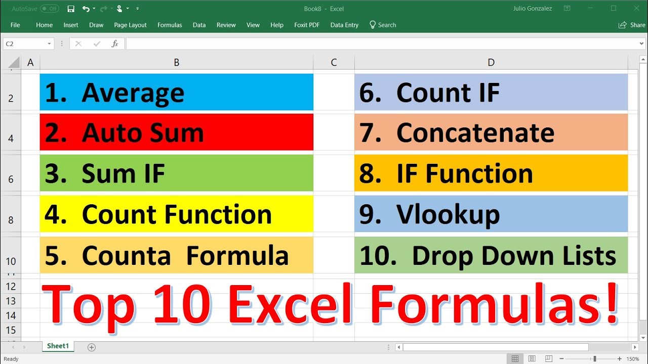
"Top 10 Most Important Excel Formulas - Made Easy!" · The Organic Chemistry Tutor · 27 min · 8.8M views · 2018
In short: The core set covers AVERAGE, SUM, SUMIF, the COUNT family, CONCATENATE, IF, and VLOOKUP, which handle most everyday calculation and lookup tasks.
Once you can reference cells, you need a working formula vocabulary, and this video teaches the ten functions analysts reach for constantly. It answers the practical question of which formulas to learn first instead of drowning you in Excel's full function library.
Key takeaways
SUMIF adds only the values in a list that match a stated criterion, while COUNTIF counts cells in a range based on criteria the same way.
COUNT tallies cells containing numbers, COUNTA tallies cells that are not empty, and COUNTBLANK tallies the empty cells in a range.
The IF function runs different calculations depending on whether a logical test passes, which introduces decision logic into a spreadsheet.
VLOOKUP looks up information in a table based on a given value, and CONCATENATE merges the contents of two columns into one.
Watch on YouTube · Read the summary and Q&A
4. How Do Pivot Tables Summarize Data?
"Excel Pivot Table EXPLAINED in 10 Minutes (Productivity tips included!)" · Leila Gharani · 13 min · 4.4M views · 2020
In short: Pivot tables summarize large data sets with drag and drop fields, and converting the source to an Excel table makes them update automatically.
Pivot tables are the single biggest productivity jump in Excel analysis, and Leila Gharani explains them in 13 tight minutes. The video answers how to go from a raw table to a summary report without writing any formulas at all.
Key takeaways
Source data must be organized in a tabular format with headers before Excel can build a pivot table from it.
Converting the source range to an official Excel table lets the pivot table pick up new data entries automatically.
Values in a pivot table can be shown as percentages of the grand total, which reveals the relative share of each category.
Slicers filter data across multiple pivot tables visually, and refreshing updates all connected tables at the same time.
Watch on YouTube · Read the summary and Q&A
5. How Do You Clean and Flag Messy Data?

"Learn Excel in Under 3 Hours | Pivot Tables, Lookups, Data Cleaning" · Alex The Analyst · 158 min · 228K views · 2024
In short: Conditional formatting highlights patterns fast, and the duplicate values rule under Highlight Cells Rules is the single most useful option for cleaning.
Real data arrives messy, so this session covers pivot tables, lookups, and data cleaning with a deep dive into conditional formatting. It answers how to spot duplicates, outliers, and trends visually before they distort your analysis.
Key takeaways
Icon sets applied across a whole table mislead because Excel compares every number together, so smaller values all turn red regardless of their own trend.
Applying icon sets one row at a time makes the indicators reflect that row's own pattern instead of the numeric spread of the whole data set.
Color scales apply a gradient that colors the highest values green and the lowest values red, making good and bad numbers visible at a glance.
The duplicate values rule flags repeated entries and includes an option that inverts the logic to highlight only values that are not duplicated.
Watch on YouTube · Read the summary and Q&A
6. How Do You Practice Excel With Projects?
"Microsoft Excel Tutorial for Beginners - Full Course" · freeCodeCamp.org · 146 min · 11.7M views · 2020
In short: You build six practical projects, from a payroll spreadsheet to a sales database, applying formulas, charts, VLOOKUP, pivot tables, and text tools.
Watching tutorials is not the same as doing the work, and this freeCodeCamp course fixes that with six projects that move from guided tutorials to challenge assignments. It answers how to turn the skills from the previous videos into hands on practice.
Key takeaways
The course progresses from guided tutorials to challenge assignments across projects including a payroll spreadsheet, a gradebook, a career decision tool, and a sales database.
Relative and absolute references determine how a formula behaves when copied, which is crucial for replicating calculations accurately across a sheet.
The projects apply formulas, charts, CSV files, VLOOKUP, and pivot tables together rather than teaching each feature in isolation.
Text functions such as split and concatenate manipulate and reorganize text, which helps when data arrives in inconvenient formats.
Watch on YouTube · Read the summary and Q&A
7. How Do Analysts Use Excel Day to Day?

"Excel for Data Analytics - Full Course for Beginners" · Luke Barousse · 659 min · 3.3M views · 2024
In short: Excel ranks second only to SQL as an analyst skill, and this free course runs from basics through pivot tables, Power Query, and dashboards.
This is the long sit of the list, a full course built specifically around data analytics rather than general spreadsheet use. It answers what the analyst workflow in Excel actually looks like, including Power Query and interactive dashboards built on real world data.
Key takeaways
Excel is a crucial skill for data and business analysts, second only to SQL, and has over 1 billion users worldwide.
The course reaches advanced features including pivot tables and Power Query while remaining designed for absolute beginners in data analytics.
Lessons are broken into short segments with practical exercises and projects, including building interactive dashboards and analyzing real world data.
Setup guidance covers installing Excel, understanding version differences on Windows and Mac, and using a virtual machine for Mac users.
Watch on YouTube · Read the summary and Q&A
8. How Do You Build an Excel Dashboard?

"Data Analyst Portfolio Project: Build an Excel Dashboard (with Solutions)" · Maven Analytics · 35 min · 73K views · 2023
In short: Profile the raw data, add calculated columns for revenue, month, weekday, and hour, then explore with pivot tables and visualize with pivot charts.
This is where the Excel half of the path becomes a portfolio piece, walking through a complete dashboard on real coffee shop transaction data. It answers how to package profiling, calculated fields, pivot tables, and charts into one interactive deliverable with solutions included.
Key takeaways
The project uses nearly 150,000 Maven Roasters transactions from three New York City locations, covering January through June 2023.
Data profiling and preparation come first, before any calculated columns, pivot tables, or charts are added to the workbook.
Line charts suit time series trends, column charts compare categories like days or hours, and bar charts fit categorical data such as product types.
Slicers let dashboard users filter the data dynamically, which turns a static report into an interactive tool for business decisions.
Watch on YouTube · Read the summary and Q&A
9. How Do You Explore Data With SQL?

"Data Analyst Portfolio Project | SQL Data Exploration | Project 1/4" · Alex The Analyst · 77 min · 2.4M views · 2021
In short: You explore a real dataset with SQL queries as the first of four portfolio projects, then extend it with your own questions and insights.
With Excel skills in place, this project opens the SQL half of the path through hands on data exploration rather than syntax drills. It answers how to start querying a real dataset and turn the result into the first piece of an analyst portfolio.
Key takeaways
The portfolio series consists of four projects covering SQL data exploration, Tableau visualization, ETL data cleaning, and Python analysis.
The projects are designed to be beginner friendly and are structured to increase in complexity as you move through the series.
Writing your own queries and insights beyond the walkthrough makes the portfolio unique rather than a copy of the tutorial.
A portfolio built on these projects is meant to showcase your skills directly to potential employers during a job search.
Watch on YouTube · Read the summary and Q&A
10. How Do You Combine SQL and Power BI?
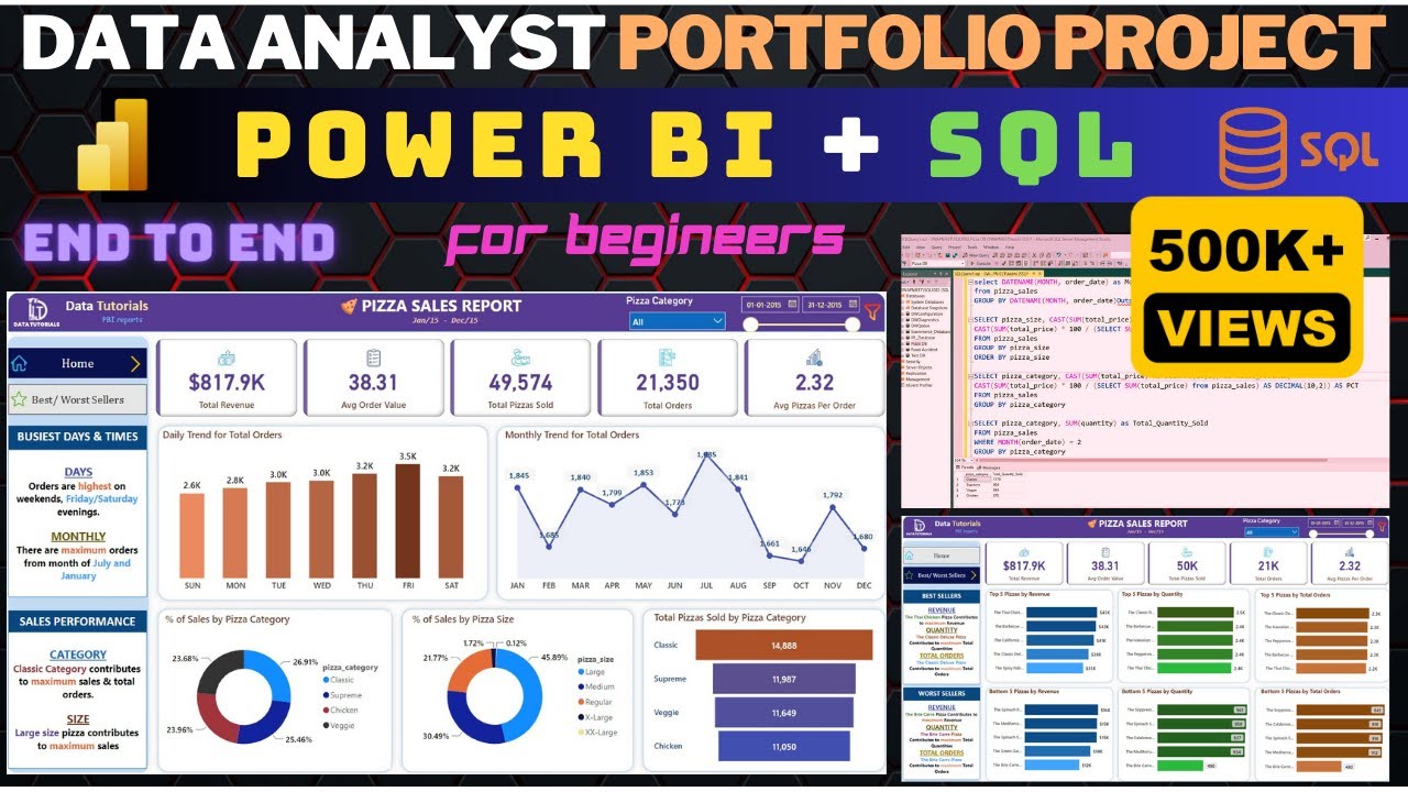
"Power BI & SQL Project | Data Analyst Portfolio | End to End | Beginner to Expert | #powerbi #sql" · Data Tutorials · 166 min · 1.6M views · 2023
In short: Import raw pizza sales data into SQL Server, query the client requirements, then rebuild and validate the results as two interactive Power BI dashboards.
The final project ties the whole path together, using SQL and Power BI end to end on one dataset. It answers how a real client engagement flows from raw data to validated dashboards, covering KPIs, trends, slicers, and best and worst seller analysis.
Key takeaways
SQL and Power BI are the two most in demand data analysis tools in the market, and this project uses both together step by step.
Comparing dashboard values against SQL query results provides two way validation that reassures the client the dashboard numbers are accurate.
The dashboards include KPI cards for total revenue and average order value, daily and monthly trend charts, slicers, and action filters.
The SQL queries rely on ANSI standard functions, so they also work in MySQL, PostgreSQL, and Oracle, not only MS SQL Server.
Watch on YouTube · Read the summary and Q&A
Frequently asked questions
Can I learn data analysis from free YouTube videos?
Yes, free YouTube courses cover the full beginner path, from Excel fundamentals and pivot tables through SQL queries and Power BI dashboards, including complete portfolio projects with solutions.
Should I learn Excel or SQL first for data analysis?
Start with Excel, since it is the most approachable tool and a core analyst skill second only to SQL, then move to SQL once you are comfortable summarizing data.
What is a pivot table used for in Excel?
A pivot table summarizes and analyzes large data sets with drag and drop fields, producing summary reports and charts without complex formulas or macros.
Do I need Power BI to become a data analyst?
Power BI is one of the two most in demand data analysis tools alongside SQL, so building at least one end to end dashboard project strengthens a job application.
How do I build a data analyst portfolio with no experience?
Work through guided portfolio projects, such as an Excel dashboard, a SQL data exploration, and a SQL plus Power BI dashboard, then add your own queries and insights to make each project unique.
How long does it take to learn data analysis with Excel and SQL?
This ten video learning path runs about 22 and a half hours of watch time in total, from a 13 minute pivot table primer to a 659 minute Excel analytics course, plus extra hours for building the three portfolio projects yourself.
Do I need to buy Excel to start learning data analysis?
No, Excel can be used for free at excel.new in a web browser, and that version offers most of the features found in the desktop app; Mac users can also follow setup guidance covering version differences and running a virtual machine.
Which Excel formulas should a beginner analyst learn first?
The core set is AVERAGE, SUM, SUMIF, the COUNT family including COUNTA and COUNTBLANK, CONCATENATE, IF, and VLOOKUP, which handle most everyday calculation and lookup tasks without needing Excel's full function library.
Is watching Excel tutorials enough to become a data analyst?
Watching tutorials is not the same as doing the work, so the project videos should be treated as work sessions rather than viewing: building a payroll spreadsheet, a sales database, an Excel dashboard, and SQL exploration yourself is what turns the material into a portfolio.
How to use this list
Watch the videos in order: the list is built as a learning path that moves from Excel basics to formulas, pivot tables, data cleaning, and then into SQL and Power BI portfolio projects. If you only have time for one video today, start with Kevin Stratvert's 16 minute tutorial if you are brand new, or jump to Leila Gharani's 13 minute pivot table video if you already know your way around a spreadsheet. Treat the three project videos at the end as work sessions rather than viewing, since building them yourself is what turns the material into a portfolio.
💡 Want summaries and transcripts for any YouTube video? Try YouTube Summary with ChatGPT & Claude.