How to Use Claude Design for Product Mockups
TL;DR
Start with a low-fidelity wireframe, provide real product context, and use Claude Design’s questions to define users, screens, accessibility, and gamification before generating polished visuals. Its strongest results are wireframes and visual mockups, while pitch decks need limited correction and animated video ads are better suited to social posts than professional commercials.
Transcript
Let's try claw design together. In this episode, I get my hands dirty with claw design. You see me struggle. You see me push the edges. And by the end of this episode, you will become a top 1% claw designer. Claw design is a bestincclass product for wireframes, visual designs, not so much videos. You'll see why by the end of this episode. This epis... Read More
Key Insights
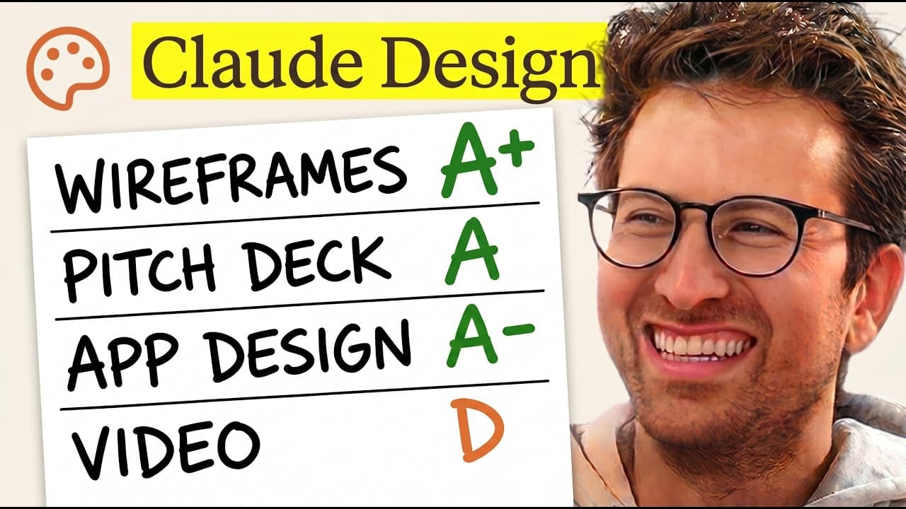
- Claude Design is strongest at generating wireframes and visual designs, based on the presenter’s end-to-end tests of an app concept, a pitch deck, high-fidelity mockups, and a 30-second animated advertisement.
- The questionnaire functions like a product manager by deriving relevant decisions from a short product brief, including target device, key screens, accessibility needs, caregiver involvement, exercise types, gamification mechanics, visual tone, and concept directions.
- Low-fidelity wireframes are the recommended starting point because they help define features and product constraints before tokens are spent on polished outputs. The presenter rejects middle-fidelity work in favor of beginning rough or moving directly to high fidelity.
- Three distinct design directions make comparison easier and give the output an agency-style presentation. For the senior brain-training app, Claude Design proposes warm and friendly, mascot-forward, and calendar ritual-first approaches rather than returning only one concept.
- Accessibility considerations emerge directly from the intended senior audience. Claude Design asks about large text, high contrast, voice narration controls, a simplified mode, and a high-contrast mode, demonstrating that audience context influences the design questions.
- The pitch deck reaches roughly 90% of the desired output with minimal input, according to the presenter. This level of completion can save hours, while still leaving room for review and correction before the deck is considered finished.
- Visual design mockups are clean and usable enough to support further iteration. The presenter estimates that about 30 minutes of back-and-forth could refine the generated visual work rather than requiring the product interface to be designed from the beginning.
- Video generation receives a rating of about 5/10 in the walkthrough. The resulting animated advertisement may work as a social post, but the presenter considers it weaker than a real commercial and less capable than the tool’s wireframe and visual outputs.
- More videos from this channel:
- More from this channel: Greg Isenberg
Install to Summarize YouTube Videos and Get Transcripts
Explore YouTube Video Summarizer or Get YouTube Transcript Extractor
Questions & Answers
Q: How should you start a project in Claude Design?
Start by giving Claude Design concrete product context and requesting a low-fidelity wireframe rather than immediately asking for a polished result. In the walkthrough, the input includes a screenshot of a brain-exercise app idea, references to gamified products, and a request for a clear, clean interface. This approach helps define features and constraints before spending tokens on detailed visuals.
Q: What questions does Claude Design ask before generating wireframes?
Claude Design asks about the primary device, required screens, number of distinct directions, gamification elements, accessibility requirements, exercise types, visual fidelity, caregiver prominence, product name, and interactive variations. For the senior-focused app, these questions cover onboarding, daily home, rewards, progress, large text, high contrast, voice controls, simplified mode, and several brain-exercise formats.
Q: Why should you create a low-fidelity wireframe first?
A low-fidelity wireframe helps determine which features belong in the product and establishes constraints before time or tokens are spent on polished designs. The presenter says that immediately attempting a one-shot final interface would likely consume many tokens. He also prefers low fidelity over middle fidelity, arguing that teams should begin rough or proceed to a genuinely high-fidelity design.
Q: How does Claude Design support designing for seniors?
Claude Design adapts its questions to the stated audience by proposing large text and high contrast as baseline considerations. It also asks about voice narration controls, a simplified mode, a high-contrast mode, and the role of family or caregivers. These prompts help shape an app that remains senior-first while allowing visible encouragement from family members without making caregivers the primary users.
Q: What design directions did Claude Design create for the app?
Claude Design develops three distinct phone-wireframe directions for the Senior Brains concept. Direction A is warm and friendly, direction B places the mascot at the center, and direction C emphasizes a calendar-based daily ritual. The alternatives cover onboarding, the daily home screen, exercise sessions, results, and progress while using a black-and-white, sketch-like wireframe style.
Q: How good is Claude Design at creating pitch decks?
The presenter concludes that Claude Design produces roughly 90% of the desired pitch-deck output from minimal input. That result can save hours compared with assembling the deck manually, although the remaining portion still requires review and iteration. Within the broader workflow, deck creation is presented as a strong capability alongside wireframing and visual design rather than a completely finished deliverable.
Q: Is Claude Design effective for visual interface design?
Claude Design produces visual mockups that the presenter describes as clean and usable. He considers them suitable for continued refinement and estimates that around 30 minutes of back-and-forth could improve the generated designs. The walkthrough’s final verdict places wireframes and visual design among the tool’s strongest capabilities, making them more convincing than its animated video output.
Q: Is Claude Design good for making animated video ads?
Claude Design is less effective for animated video advertising than for wireframes, decks, or visual mockups. After attempting a 30-second advertisement, the presenter rates the result at about 5/10. He considers it workable as a social post but weaker than a real commercial, so the tool’s video output should be treated as a rough promotional asset rather than polished production work.
Summary & Key Takeaways
-
The walkthrough begins with a brain-exercise app for seniors and turns a short idea description into three low-fidelity wireframe directions. Claude Design asks about the primary device, required screens, visual tone, accessibility features, exercise types, caregiver visibility, gamification, and product naming before producing concepts for evaluation.
-
The workflow progresses from wireframes to visual designs and a pitch deck. The generated directions resemble an agency presentation, with distinct concepts and supporting stories. The presenter considers the wireframing questionnaire especially strong, estimates that the deck reaches roughly 90% of the desired result, and finds the visual mockups clean and usable.
-
The final experiment asks Claude Design to create a 30-second animated advertisement. That output receives a rating of about 5/10 and is considered adequate for a social post but insufficient for a polished commercial. The overall verdict is that Claude Design excels at wireframes and visuals but remains comparatively weak for video production.
Read in Other Languages (beta)
Share This Summary 📚
Summarize YouTube Videos and Get Video Transcripts with 1-Click
Try YouTube Summary with ChatGPT & Claude or YouTube Transcript Generator
Explore More Summaries from Greg Isenberg 📚




Summarize YouTube Videos and Get Video Transcripts with 1-Click
Try YouTube Summary with ChatGPT & Claude or YouTube Transcript Generator