How to Read Technical Analysis Charts as a Beginner
TL;DR
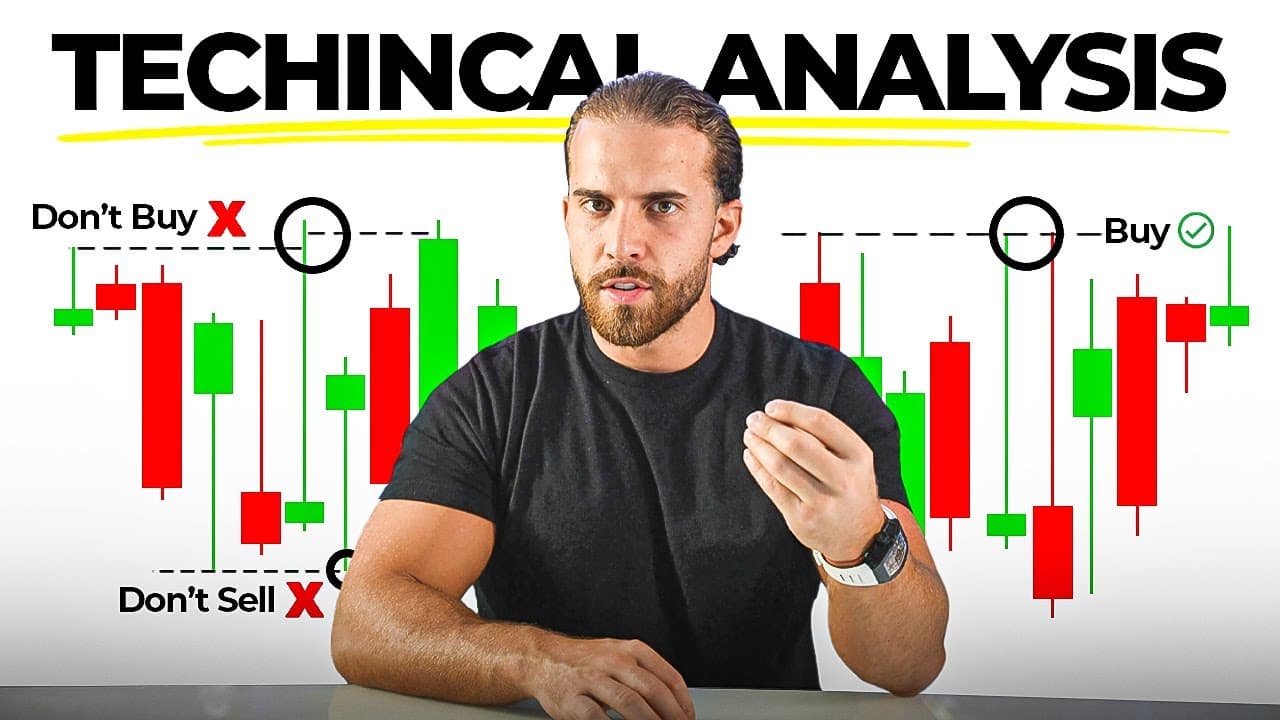
Technical analysis works by repeating what price has already done: look to the left on the chart to judge what the right side will do, because patterns repeat every day as long as candlestick charts keep printing. Start on the line chart to see bullish steps up and bearish steps down, then switch to candlesticks and focus on the most recent leg of price.
Transcript
everything in your trading Journey does not matter at all unless you know how to read technical analysis correctly if you don't you simply will not make any money in your trading career at all now I know you heard different fors you can do Market sentiment you can do news trading fundamentals you can do bar candles all this different type of stuff ... Read More
Key Insights
- Technical analysis is described as the most predictable form of trading because it repeats what price has already done. The speaker says everything else in a trading journey does not matter unless technical analysis is read correctly, and without it no money will be made.
- Patterns repeat themselves in the market every single day and will continue to do so for as long as candlestick charts keep printing candlestick charts. The practical instruction is to look to the left of the chart to know what the right side is going to do.
- The candlestick chart is the only chart type needed for success. Line charts, bar charts, and other formats all represent the same price action going up or down in a different format, so they do the same thing at the end of the day.
- The line chart works as a training stage: steps going up represent a bullish market, which means buys, and steps going down represent a bearish market, which means sells. This makes the direction of the market obvious before candlesticks are introduced.
- Analysis should focus on the most recent price rather than what happened four months ago or almost a year ago. Older price action is interesting to know but if it is not relatively close to current price it takes time and focus away from what actually matters.
- Euro USD is called the most traded pair in the entire foreign exchange market because it combines the two main traded currencies, the US dollar and the euro. In the example shown, price sits at 1.08459, the last point left off at market close on Friday.
- Each candlestick represents the length of the chosen time frame: on the daily chart one candle is a 24 hour period, on the four hour chart each candle covers four hours, and on the 30 minute chart each candle covers 30 minutes.
- Changing time frames is only zooming in or out on the same price. Many 30 minute candles combine to form one four hour candle, two two-hour candles form one four hour candle, and many four hour candles form one daily candle, so nothing about the market itself changes.
Install to Summarize YouTube Videos and Get Transcripts
Explore YouTube Video Summarizer or Get YouTube Transcript Extractor
Questions & Answers
Q: What is technical analysis in trading and why does it matter?
Technical analysis is reading the price chart to determine whether the market is going to go up or go down. The speaker argues that everything else in a trading journey does not matter unless technical analysis is read correctly, and that without it a trader simply will not make money. It is called the most predictable type of trading because it repeats what price has already done. The core method is to look to the left of the chart to know what the right side is going to do, since patterns repeat themselves in the market every single day.
Q: Why is technical analysis considered more predictable than news or fundamentals?
The speaker names market sentiment, news trading, fundamentals, and bar candles as alternative approaches, but calls all of that stuff way too unpredictable. Technical analysis is described as the most predictable type of trading because it is based on repeating what price has already done rather than reacting to outside events. Patterns repeat themselves in the market every single day and, according to the video, will do so forever for as long as candlestick charts continue to print out candlestick charts. That repetition is what gives the trader an edge on whether it makes more sense for price to go up rather than down.
Q: Which chart type should a beginner use for technical analysis?
The candlestick chart is the one to trade on and the one described as the most famous. There are line charts, bar charts, candlestick charts, and other formats the speaker says he has no idea how to read and has never even attempted. All of them simply represent price in real time in front of your face in a different type of way, showing the market going up or going down. Because they all do the same thing, only the candlestick chart is needed to be successful, and the line chart is used only as an early learning aid.
Q: How do you tell a bullish market from a bearish market on a chart?
On the line chart it is very straightforward: steps going up represent a bullish market and steps going down represent a bearish market. A bullish market means buys and a bearish market means sells. The speaker points to examples on the chart where the market makes a bearish move to the downside and other sections where it makes bullish moves to the upside. Analyzing the chart in this way is what determines whether the market is going to be going up or going to be going down, which the video describes as very simple and self-explanatory.
Q: Why start with the line chart before moving to candlesticks?
Step one is to get the feel of the line chart, learn what it is doing, get the flow of it, and understand it. Step two is to move on to the candlestick chart. The analogy given is learning to ride a bike: at first you have training wheels so you do not fall to the side, and once you have the hang of it you take the training wheels off and continue riding exactly the same way. Switching between the line chart and the candlestick chart shows the exact same price being drawn a different way, so nothing about the analysis changes.
Q: Where on the chart should you start your analysis?
Focus on the most recent price, the last leg of price action nearest to where the market is trading now. Many traders get confused and want to start really far back or somewhere in the middle. The speaker allows that doing so can help you get into the flow of the market, but says what happened four months ago or almost a year ago does not determine what the trade is going to do. If old price action is not relatively close to where price is right now, it simply does not matter and only takes away your time and focus from what actually matters on the chart.
Q: What time period does a single candlestick represent?
Each candlestick represents one unit of whatever time frame the chart is set to. On the one day time frame every single candlestick is a 24 hour period. Switching the chart from the daily to the four hour makes every candlestick consist of four hours, including the large ones, and going down to the 30 minute time frame makes every candlestick a 30 minute period. This is described as the simplicity of analyzing with candlesticks: the candle length is defined entirely by the time frame you have selected.
Q: How do different time frames relate to each other on a candlestick chart?
Changing time frames is essentially just zooming in to price. Circling one candle on the four hour chart and then dropping to the 30 minute chart captures many small candles, because all of those 30 minute candles together create that single four hour candle. On the two hour time frame, two candles combine into the accumulative of one four hour candle, and the same relationship continues up into the daily and the weekly. You are looking at the exact same market in bigger or smaller variables, and absolutely nothing else changes.
Summary & Key Takeaways
-
Technical analysis is presented as the most predictable style of trading compared with market sentiment, news trading, and fundamentals, which are called too unpredictable. The reasoning is that technical analysis repeats what price has already done, so a trader looks to the left of the chart to work out what the right side is likely to do next.
-
Charts come in several forms including line charts, bar charts, and candlestick charts, plus others the speaker says he cannot read and has never attempted. All of them do the same job of representing price in real time in a different format, so only the candlestick chart is needed to be successful in the market.
-
The line chart is the starting point because it shows steps going up, a bullish market meaning buys, and steps going down, a bearish market meaning sells. Once that flow is understood, the trader moves to the candlestick chart, described with the analogy of taking the training wheels off a bike.
Read in Other Languages (beta)
Share This Summary 📚
Summarize YouTube Videos and Get Video Transcripts with 1-Click
Try YouTube Summary with ChatGPT & Claude or YouTube Transcript Generator
Explore More Summaries from fxalexg 📚





Summarize YouTube Videos and Get Video Transcripts with 1-Click
Try YouTube Summary with ChatGPT & Claude or YouTube Transcript Generator