How to Remove Website Elements That Hurt Sales
TL;DR
Remove distractions that weaken credibility, confuse visitors, or pull prospects away from becoming customers. Use a restrained color palette, limit navigation to five essential items, write customer-focused copy, replace vague contact forms with direct scheduling, remove social links, choose authentic imagery, and replace detailed team biographies with a simple group photo.
Transcript
as a website marketing Pro I've reviewed and worked on literally thousands of websites and if your site's not helping you get more leads or paying clients it's much more likely that you don't need to add anything to your site at all but you do need to get rid of some things things that are confusing your visitors pulling them away from where you wa... Read More
Key Insights
- Excessive color is a credibility problem because visitors can sense when a design feels homemade, even if they cannot identify the exact issue. A few brand-appropriate colors should accent important buttons, headlines, icons, testimonials, and persuasive content rather than dominate entire sections.
- Simple navigation gives visitors a clear path toward becoming customers. The recommended menu contains five items focused on pages prospects need before making a decision, while media pages, blogs, job listings, and other secondary destinations can be placed in the footer.
- Customer-focused copy positions the visitor as the hero by addressing their challenges and showing how the business can guide them toward a solution. Self-congratulation, corporate jargon, and business-centered messaging make the website less relatable and can prevent the message from connecting.
- Simple language demonstrates expertise more effectively than complicated wording. Website copy should be understandable to an eighth grader, even when the intended audience includes experienced business owners and leaders, because clear explanations help readers understand the offer without unnecessary mental effort.
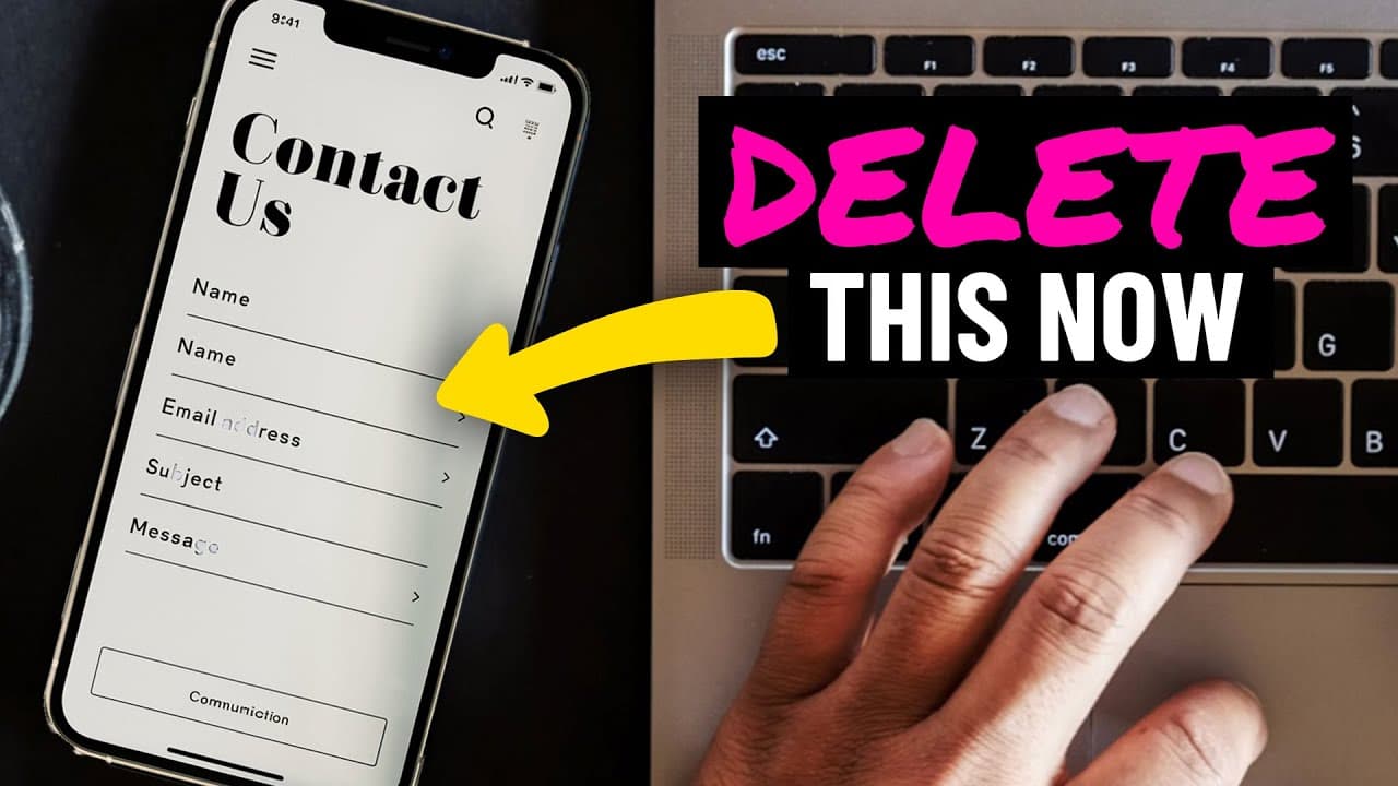
- Traditional contact forms create uncertainty because they rarely explain what happens after submission. Visitors may wonder whether they should expect an email or an inconvenient call, and this lack of clarity can discourage them from taking the next step.
- Direct calendar booking improves clarity and convenience for consultations and appointments. Visitors can see available times, select an option that works for both parties, and understand exactly what happens next without exchanging multiple messages to coordinate a meeting.
- Social media links can move visitors backward in the sales journey. Once prospects reach the website, the business controls the narrative and should keep them engaged with services and conversion-focused content instead of sending them back to distracting social platforms.
- Authentic-looking imagery supports trust, while exaggerated or visibly generic stock photography can make a business feel staged. Natural expressions, realistic locations, and genuine team photographs better represent the experience, while a group photo can replace detailed biographies and individual social links.
Install to Summarize YouTube Videos and Get Transcripts
Explore YouTube Video Summarizer or Get YouTube Transcript Extractor
Questions & Answers
Q: What should I remove from my website to get more clients?
Remove excessive colors, complicated navigation, self-indulgent or jargon-heavy copy, vague contact forms, prominent social media links, exaggerated stock photography, and detailed team biographies. Each can confuse visitors, weaken trust, or create a detour from the buying process. Replace them with restrained design, focused navigation, customer-centered language, direct scheduling, natural imagery, and a simple team photograph.
Q: How many items should a service business website menu have?
A service business website menu should contain five items, based on the approach described in the transcript. Those items should lead to pages that prospects genuinely need to evaluate the business and become customers. Media, blogs, job listings, and other secondary content should not occupy the main navigation when they do not directly support conversion. Such links can remain accessible in the footer.
Q: How should colors be used on a business website?
Choose a few colors that fit the brand and use them selectively as accents rather than dominant backgrounds throughout the site. Color can highlight calls to action, headlines, icons, testimonials, persuasive words, and other important elements. Neutral backgrounds help those accents stand out. Avoid clashing blocks, unrelated gradients, and excessive variation that makes the design feel homemade or overwhelms visitors.
Q: How should website copy be rewritten to attract clients?
Rewrite website copy around the visitor's challenges, needs, and desired solution instead of focusing mainly on the company's achievements. Present the customer as the hero and the business as a guide that can help solve the problem. Remove corporate jargon and unnecessarily large words. Use simple, relatable language that an eighth grader could understand, even when the target audience includes experienced business leaders.
Q: Why should a website replace its contact form with a booking calendar?
A traditional contact form can leave visitors uncertain about what happens after they submit it, including whether they will receive an email or an unexpected call. A direct calendar booking tool displays availability and allows people to choose a suitable appointment time immediately. This removes back-and-forth coordination, makes the next step predictable, and can increase willingness to schedule a consultation or appointment.
Q: Why should social media links be removed from a website?
Social media usually sits near the top of the sales funnel, while the website represents a deeper stage where prospects evaluate services and move toward a purchase. Prominent social buttons or embedded feeds can send visitors backward and expose them to distractions. Keeping them on the website lets the business control the narrative, explain its services, and guide prospects toward a decision instead of merely gaining another follower.
Q: What kinds of website photos build more trust?
Use photographs that feel natural, realistic, and connected to the experience customers have after working with the business. Satisfied expressions are preferable to exaggerated excitement, and real locations can feel more authentic than plain, artificial backgrounds. Stock or AI-generated images can still be used when they are high quality and do not look generic, staged, or disconnected from the service being offered.
Q: Should a company website include individual team biographies?
Detailed team biographies about personal preferences, hobbies, favorite foods, and similar information should be removed because clients generally do not need them to make a buying decision. Individual social profile links also create unnecessary exits from the website. A strong group photograph on the About page can show that real, approachable people support the business without leading prospective clients through unrelated personal details or external pages.
Summary & Key Takeaways
-
A website can lose potential clients when excessive colors, complicated navigation, and self-focused language create confusion or distrust. Colors should accent buttons, headlines, icons, and other important elements against neutral backgrounds. Navigation should emphasize only essential conversion-related pages, while clear, relatable copy should focus on customer challenges and desired outcomes.
-
Traditional contact forms create uncertainty because visitors may not know whether to expect an email or an unexpected call. For consultation calls and appointments, an embedded calendar booking tool gives visitors visible availability, lets them select a mutually suitable time, removes tedious back-and-forth communication, and clarifies exactly what will happen next.
-
Social links, generic stock photography, and extensive employee biographies can distract prospects or reduce trust. Keep visitors focused on services and purchasing decisions, use natural images that reflect customer satisfaction, show genuine people on the About page, and represent the team with a simple group photograph instead of individual biographies and social profiles.
Read in Other Languages (beta)
Share This Summary 📚
Summarize YouTube Videos and Get Video Transcripts with 1-Click
Try YouTube Summary with ChatGPT & Claude or YouTube Transcript Generator
Explore More Summaries from Wes McDowell 📚





Summarize YouTube Videos and Get Video Transcripts with 1-Click
Try YouTube Summary with ChatGPT & Claude or YouTube Transcript Generator