How to Make YouTube Thumbnails More Clickable
TL;DR
Design thumbnails to create questions or emotions without depending on the title, and keep the main idea visible when the bottom half is covered. Improve performance by gathering 10–15 varied references, removing clutter, emphasizing one main character, and testing several text options. If TV accounts for at least 10% of your viewership, place essential elements near the top.
Transcript
Over the last 5 years, I've reviewed thousands of thumbnails from hundreds of creators, ranging from folks who are just starting out to those who [music] have been at this for years. And recently, I've come to realize that 90% of the time, I give the exact same feedback. [music] So, in the next 10 minutes, I want to walk you through the most common... Read More
Key Insights
- TV-friendly thumbnails keep their essential message in the upper half because YouTube's TV homepage and suggested views initially show only the top portion of recommendations. The 50% test checks whether covering the bottom half still leaves enough context or intrigue for viewers to press down on their remote.
- Thumbnails increasingly carry more responsibility for earning attention because YouTube interfaces display them prominently while titles appear smaller. Viewers may browse thumbnail images first and read a title only after making an intentional choice, so relevant imagery alone may no longer provide enough motivation to click.
- Questions and emotions generate stronger interest than simple topic relevance. A useful brainstorming process starts by deciding what the viewer should wonder and feel, then selecting imagery, typography, lighting, expressions, and other elements that serve those specific psychological purposes rather than merely illustrating the subject.
- Thumbnail inspiration works best when it is numerous and varied. The recommended process gathers 10–15 references from internal outliers, external outliers, model channels covering other subjects, saved YouTube thumbnails, and off-platform sources such as billboards, movies, television shows, album covers, and advertisements.
- Reference analysis requires identifying the mechanism behind a design, not simply copying its visible surface. For each example, creators should ask what questions it raises, what emotions it evokes, and exactly how its composition produces those responses before adapting the mechanism to a different topic or niche.
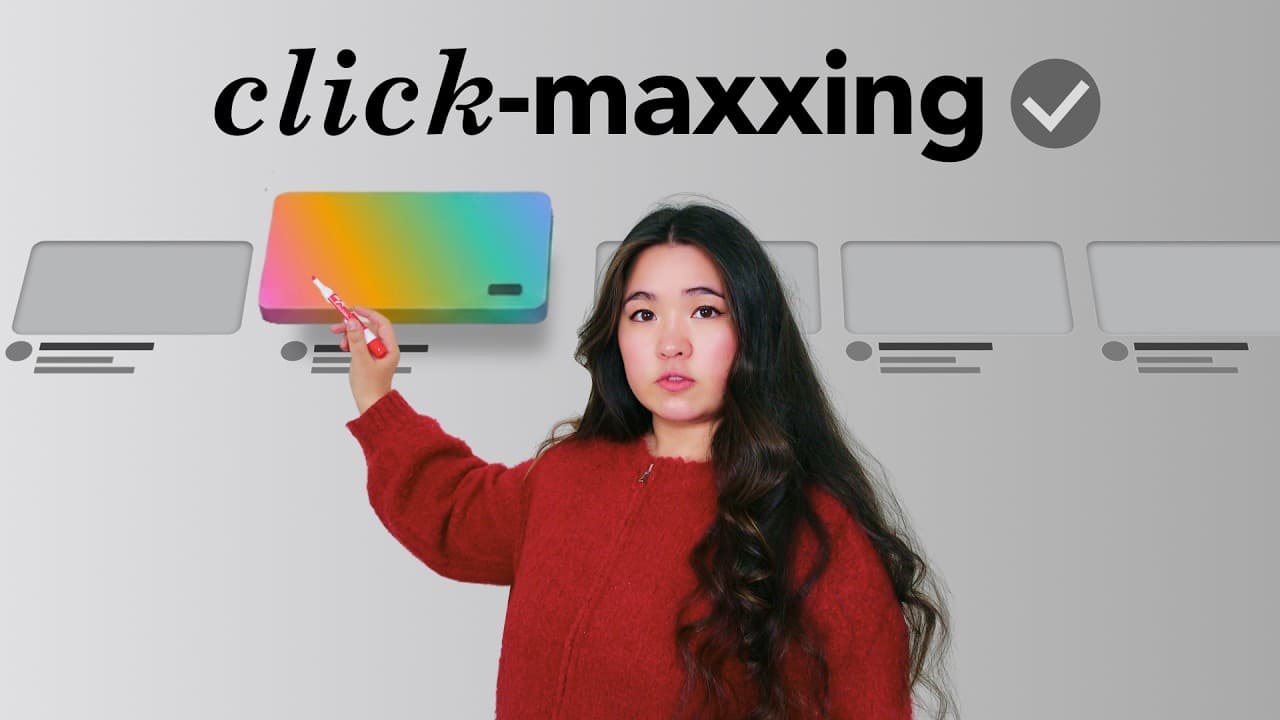
- Subverting expectations can create novelty in a thumbnail. The featured example began with a television frame that made traditionally two-dimensional elements appear three-dimensional, then transferred that mechanism to YouTube by exploring how a normally flat thumbnail could be presented with a three-dimensional appearance.
- Clutter weakens a thumbnail when background details compete with the intended subject. Elements that accurately reflect the real setting can still be counterproductive, so removing unnecessary structures or visual noise helps viewers focus immediately on the information and characters that support the video's central idea.
- A clear main character and tested text variations are practical improvements that require limited effort. Changing a subject's color, adding a label, or simplifying surrounding elements can establish visual priority, while spending five additional minutes generating alternative phrases creates several options for thumbnail testing.
Install to Summarize YouTube Videos and Get Transcripts
Explore YouTube Video Summarizer or Get YouTube Transcript Extractor
Questions & Answers
Q: How do I make a YouTube thumbnail TV-friendly?
Check your analytics by opening Audience and scrolling to device type. If at least 10% of viewership comes from TV, apply the 50% test: cover the thumbnail's bottom half and determine whether the remaining top portion still communicates the general topic or creates enough interest to make someone press down on the remote. Move essential elements upward or add text within the top third if needed.
Q: Why should a thumbnail work without its video title?
YouTube interfaces increasingly give thumbnails more visual space while displaying titles in smaller text. According to the transcript, viewers therefore tend to browse thumbnails first and read a title only as an active, intentional choice. A thumbnail that merely matches the topic may be overlooked, so it should independently create curiosity, emotion, or both before the viewer relies on the accompanying title.
Q: How can a YouTube thumbnail create more interest?
Begin by asking what viewers should wonder and what they should feel, rather than starting with the objects or people you could show. Build each visual element around those intended reactions. Questions can create curiosity about missing information or an unrevealed outcome, while typography, lighting, styling, and vulnerable or surprising imagery can evoke emotions such as credibility, taste, novelty, or vulnerability.
Q: How many thumbnail references should I collect?
Collect between 10 and 15 references from varied sources. The suggested sources include your own videos that exceeded your channel average, relevant videos that outperformed on other channels, high-performing videos from channels with a similar format but different subject matter, thumbnails saved while browsing YouTube, and off-platform materials such as billboards, movies, television shows, album covers, and advertisements.
Q: How should I use thumbnail inspiration without copying it?
Treat each reference as an example of an underlying approach rather than a design to reproduce directly. Ask what question it makes you ask, what emotion it makes you feel, and which specific design mechanism creates that response. Once the mechanism is clear, transfer it to your own video concept, even when the original reference comes from another niche or an off-platform source.
Q: What is the 50% test for YouTube thumbnails?
The 50% test evaluates whether the top half of a thumbnail can attract TV viewers before the full recommendation is visible. Cover the entire bottom half, then judge whether the remaining image provides a general understanding of the subject or enough intrigue to encourage interaction. If it fails, reposition the most important subject, result, or message near the top, or place concise text in the top third.
Q: How can I remove clutter from a YouTube thumbnail?
Evaluate every visible element according to whether it actively supports the thumbnail's central message. Accuracy to the real setting is not enough if background details distract from the subject. In the swimming-pool example, removing structural bars made the important content easier to notice. Simplifying the background and eliminating competing objects helps direct attention toward the intended focal point immediately.
Q: How do I make the main character obvious in a thumbnail?
Make the main character visually distinct from every surrounding element so that viewers notice it first. The transcript demonstrates this by changing an Olympic diver's swimsuit color and adding a text label when she was difficult to identify. Creators can similarly use color contrast, labels, and reduced background clutter, then test alternate text phrases to determine which version communicates most effectively.
Summary & Key Takeaways
-
YouTube interfaces increasingly emphasize thumbnails while making titles less prominent, so a thumbnail must communicate and generate interest independently. Creators should use the 50% test to check whether the visible top half gives TV viewers enough information and intrigue to select the recommendation and reveal the complete thumbnail and title.
-
Effective thumbnail ideation begins with the questions and emotions viewers should experience, rather than merely choosing relevant imagery. Creators can develop stronger concepts by collecting 10–15 varied references, identifying the psychological mechanism behind each example, and transferring that mechanism to their own topic, format, audience, and established visual style.
-
Three small adjustments can improve many thumbnails immediately: remove every element that does not support the idea, make the main character the first obvious focal point, and test alternative wording whenever text appears. Color changes, labels, and simplified backgrounds can direct attention, while multiple text versions provide inexpensive opportunities to improve performance.
Read in Other Languages (beta)
Share This Summary 📚
Summarize YouTube Videos and Get Video Transcripts with 1-Click
Try YouTube Summary with ChatGPT & Claude or YouTube Transcript Generator
Explore More Summaries from Aprilynne Alter 📚
Summarize YouTube Videos and Get Video Transcripts with 1-Click
Try YouTube Summary with ChatGPT & Claude or YouTube Transcript Generator