Why Does Clarity Beat Persuasion in Digital Marketing? 5 Examples
TL;DR
Clarity beats persuasion because people must understand an offer before persuasive tactics can influence them. The examples show how vague headlines, disconnected images, and confusing choices weaken the first four inches of a page. The lesson is then applied to a Facebook ad experiment targeting a 1% US look-alike audience, giving marketers a concrete framework worth reading on to apply.
Transcript
okay I think people are just now kicking through and beginning to join this broadcast I'm going to give them just a moment I apologize everyone for the delay but let me give if you're just joining let us know and I want to be able to see that chat pretty soon Paul so one between one of the other will stay on top of this and also I would suggest the... Read More
Key Insights
- Clarity is the most basic requirement of effective digital messaging because visitors need to understand the offer before persuasive language can influence them. If the first section of a page leaves people asking what is being sold, attractive design and polished copy cannot repair that initial confusion.
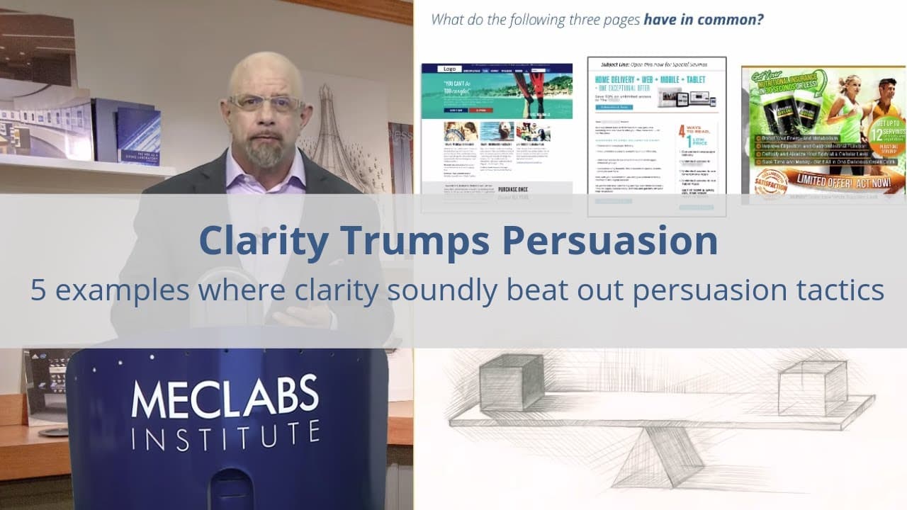
- The first four inches of a page are critical because they immediately reveal whether the visitor can identify the offer and understand the headline. Across three examples, the shared failure is unclear meaning, even though the pages use design, imagery, and copy intended to attract attention.
- Clever headlines can waste valuable character space when they rely on clichés, puns, or turns of phrase instead of communicating meaning. A reader in a hurry is looking for an answer, not an opportunity to decode or appreciate the creativity of the marketer's wording.
- Concrete language answers three immediate questions: what is being sold, why someone should buy it from this provider, and why the visitor should continue paying attention. A headline that does not advance those answers imposes effort without delivering useful information.
- Images should serve the message directly rather than requiring visitors to infer a distant connection. The travel insurance page's diving fins might suggest vacation activity and danger, but reaching travel insurance from that image requires several interpretive steps that most visitors may not take.
- Confusing choices intensify an unclear opening because visitors cannot determine which option deserves attention or how each option connects to the rest of the page. The travel insurance example compounds its vague headline and image with three options and a large gray box lacking an obvious relationship.
- Marketing experiments should begin with a hypothesis that applies a specific principle to a defined campaign. The planned Facebook ad test uses the clarity lesson to create a new control, run an experiment, study the data, and report what the audience learns from the result.
- A previous audience-created hypothesis produced a 96 percent increase in total click-through, demonstrating the value of structured experimentation in the presented methodology. The current campaign follows the same general process, but focuses specifically on how clarity should shape the ad's wording, imagery, and format.
Install to Summarize YouTube Videos and Get Transcripts
Explore YouTube Video Summarizer or Get YouTube Transcript Extractor
Questions & Answers
Q: Why does clarity matter more than persuasion in digital marketing?
People cannot be persuaded by an offer they do not understand. Visitors first need to identify what is being sold, why they should choose it, and why the message deserves more attention. If the page forces them to infer its meaning, they have an immediate reason to stop reading.
Q: What should marketers examine in the first four inches of a page?
They should determine whether visitors can immediately identify the offer and understand the headline. Across three example pages, the first four inches fail because their meaning is unclear. Design and persuasive copy cannot correct the initial confusion if visitors leave.
Q: How can marketers write clearer headlines?
Headlines should use concrete language that communicates the offer and its relevance immediately. Marketers should remove clichés, puns, and clever phrases that consume limited space without helping readers understand what is available or why it matters.
Q: Why is the headline "You can't be too careful" unclear?
The headline does not identify travel insurance, explain its value, or give visitors a reason to continue reading. Because it is a vague cliché, visitors must inspect other page elements and infer what the company is selling.
Q: How should images support a digital marketing message?
Images should reinforce the intended message without requiring several interpretive steps. In the travel insurance example, diving fins may suggest a risky vacation activity, but connecting them to travel insurance requires too much inference. A clearer image would directly support understanding of the offer.
Q: What questions should a clear landing page answer immediately?
It should answer what is being sold, why the visitor should buy it from that provider, and why the visitor should keep paying attention. If the opening does not answer those questions, additional design and persuasive tactics begin from a position of confusion.
Q: Why are unexplained choices harmful on a landing page?
Unexplained choices make it difficult for visitors to identify the appropriate path or understand how the options relate to the offer. The travel insurance page compounds its vague headline and unclear image with three options and a large gray box whose relationship to the message is not obvious.
Q: How can marketers test a clearer Facebook advertisement?
Marketers can create a hypothesis based on clarity, develop a more concrete ad as the new control, run an experiment, and examine the resulting data. The described campaign targets a 1% US look-alike audience created from the MECLABS subscriber list and considers image or video formats. An earlier audience-created hypothesis produced a 96% increase in total click-through.
Summary & Key Takeaways
-
The central marketing problem is often not weak persuasion but missing clarity. Three example pages fail within their first four inches because visitors cannot quickly identify the offer or interpret the headline. When understanding requires inference, extra attention, or prior context, prospective customers gain an easy reason to stop reading.
-
The travel insurance example uses the vague headline "You can't be too careful," an unclear diving image, three unexplained options, and a large gray box. Although the page may look attractive, its meaning demands too much work. The message should instead state concretely what is being sold and why it deserves attention.
-
The lesson is applied to building a Facebook advertising campaign for a one percent US look-alike audience created from the MECLABS subscriber list. The campaign will use an image or video format, form a testable hypothesis, establish a new control, run an experiment, and examine the resulting data together.
Read in Other Languages (beta)
Share This Summary 📚
Summarize YouTube Videos and Get Video Transcripts with 1-Click
Try YouTube Summary with ChatGPT & Claude or YouTube Transcript Generator
Explore More Summaries from Flint McGlaughlin 📚

Summarize YouTube Videos and Get Video Transcripts with 1-Click
Try YouTube Summary with ChatGPT & Claude or YouTube Transcript Generator