How to Create Search-Friendly Mobile Sites
TL;DR
Responsive web design is the recommended approach for creating mobile-friendly sites due to its simplicity and effectiveness. It avoids issues like faulty redirects and unplayable content that can arise with other configurations. Google offers tools like the Mobile-Friendly Test and PageSpeed Insights to help ensure sites meet mobile usability standards.
Transcript
Hey everybody. Thanks for joining. Give me a quick second, let me get oriented and we'll start the presentation. All right, awesome. Thanks for joining everybody. We have a very special and very festive Hangout today. We'll be talking about search-friendly mobile sites. But we'll be talking specifically from kind of like a content management system... Read More
Key Insights
- Responsive web design is the preferred method for mobile-friendly sites as it uses the same URL and HTML, simplifying management.
- Google recommends not blocking CSS and JavaScript files to ensure proper rendering and mobile-friendliness detection.
- Common mobile site pitfalls include blocked content, faulty redirects, and unplayable content.
- Googlebot should be treated like any regular user, avoiding special user-agent treatments.
- Tools like Fetch as Google and PageSpeed Insights help diagnose and improve mobile site performance.
- Creating fast, mobile-friendly default themes and robust documentation can help users easily transition to mobile.
- Mobile usability errors, such as small font sizes and inadequate tap targets, can be identified using Google’s Webmaster Tools.
- Google provides extensive resources and documentation to assist in building mobile-friendly sites, accessible via their developer and Webmaster Tools pages.
Install to Summarize YouTube Videos and Get Transcripts
Explore YouTube Video Summarizer or Get YouTube Transcript Extractor
Questions & Answers
Q: How can I make my website mobile-friendly?
To make your website mobile-friendly, consider using responsive web design, which adapts the layout to different screen sizes while using the same URL and HTML. Ensure that CSS and JavaScript files are not blocked, as this helps search engines properly render the site. Tools like Google's Mobile-Friendly Test can provide insights and suggestions for improvements.
Q: What are common mistakes in mobile site configuration?
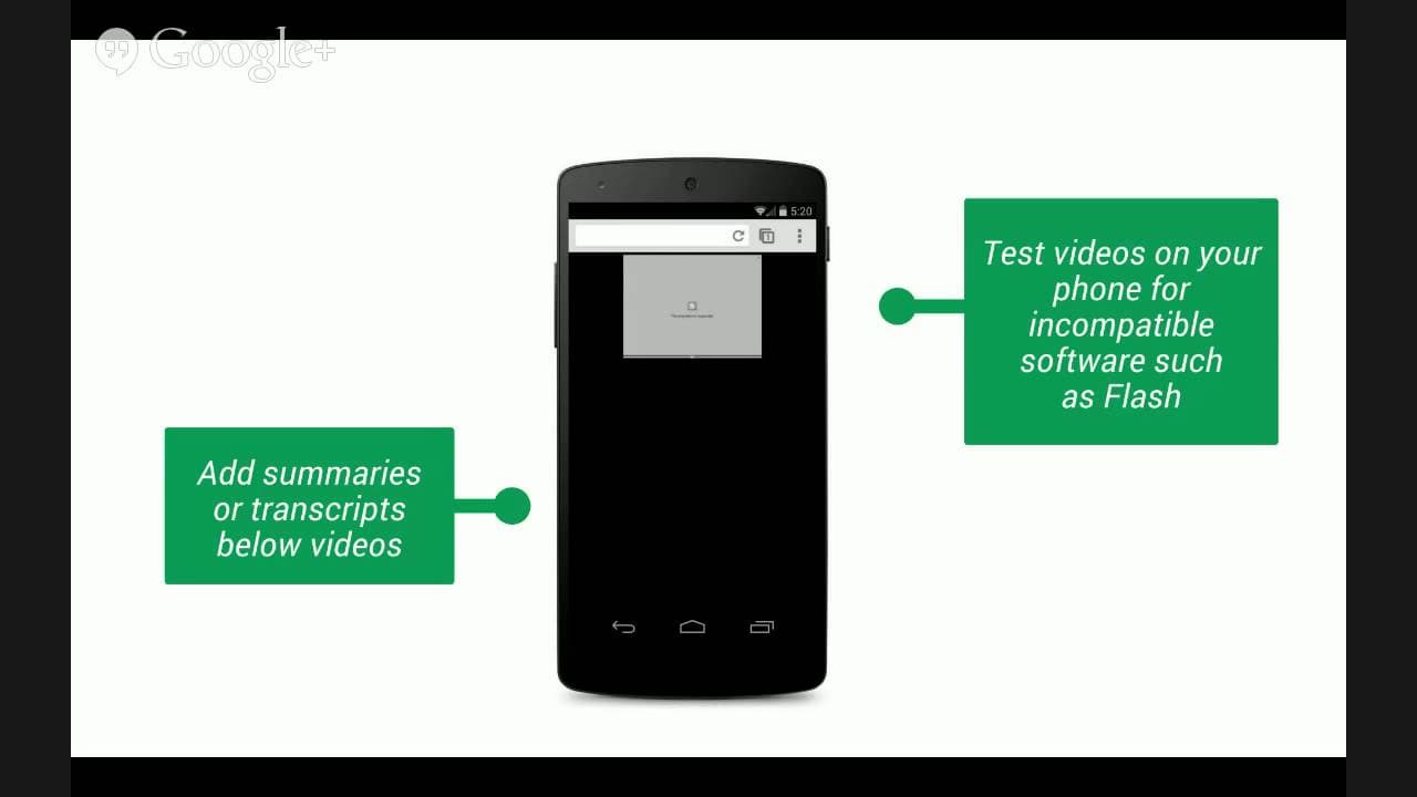
Common mistakes include blocking important resources like CSS and JavaScript, which prevents search engines from recognizing the site's mobile-friendly attributes. Faulty redirects, such as redirecting mobile users to the homepage instead of a specific URL, and unplayable content due to incompatible software like Flash, are also frequent issues.
Q: Why is responsive web design recommended for mobile sites?
Responsive web design is recommended because it simplifies site management by using the same URL and HTML for all devices, avoiding complications from redirects or user-agent detection. It ensures a consistent user experience across devices and simplifies the process of making a site mobile-friendly.
Q: How does Google identify mobile-friendly sites?
Google identifies mobile-friendly sites by checking for readable font sizes, appropriately sized tap targets, and the absence of Flash. Sites should provide a good user experience on smartphones, with content easily accessible without horizontal scrolling. Google's Mobile-Friendly Test and Webmaster Tools can help verify a site's mobile usability.
Q: What resources does Google offer for mobile-friendly site development?
Google offers several resources, including the Mobile-Friendly Test, PageSpeed Insights, and detailed documentation on their developer site. These tools help diagnose mobile usability issues and provide recommendations for improvements. Webmaster Tools also offer insights into site performance and potential mobile usability errors.
Q: How can I ensure my site loads quickly on mobile devices?
To ensure fast loading times, optimize your site's performance by minimizing resource sizes, leveraging browser caching, and prioritizing visible content. Google's PageSpeed Insights tool provides specific recommendations to improve site speed. Consider using fast, mobile-friendly templates and themes to enhance performance.
Q: What is the impact of mobile usability errors on user experience?
Mobile usability errors, such as small font sizes and inadequate tap targets, can significantly hinder user experience by making content difficult to read or interact with. These issues can lead to user frustration and increased bounce rates. Addressing these errors ensures a smoother and more accessible experience for mobile users.
Q: How can CMS providers support users in creating mobile-friendly sites?
CMS providers can support users by offering mobile-friendly default themes, creating comprehensive and intuitive documentation, and providing tools that facilitate the transition to mobile-friendly designs. Encouraging the use of Google's resources and tools can also aid users in optimizing their sites for mobile devices.
Summary & Key Takeaways
-
Responsive web design, dynamic serving, and separate mobile sites are the three configurations for mobile-friendly sites. Responsive web design is recommended due to its simplicity and effectiveness in providing a seamless user experience across devices.
-
Common mobile site issues include blocked content, faulty redirects, and unplayable content, which can hinder user experience and search engine recognition. Google tools like Fetch as Google and PageSpeed Insights can help identify and resolve these issues.
-
Google offers resources and tools such as the Mobile-Friendly Test and comprehensive documentation to help users create and maintain mobile-friendly sites. Ensuring fast loading times and intuitive navigation are crucial for optimal mobile site performance.
Read in Other Languages (beta)
Share This Summary 📚
Summarize YouTube Videos and Get Video Transcripts with 1-Click
Try YouTube Summary with ChatGPT & Claude or YouTube Transcript Generator
Explore More Summaries from Google Search Central 📚



Summarize YouTube Videos and Get Video Transcripts with 1-Click
Try YouTube Summary with ChatGPT & Claude or YouTube Transcript Generator