What Is Color Theory and How Can Artists Use It?
TL;DR
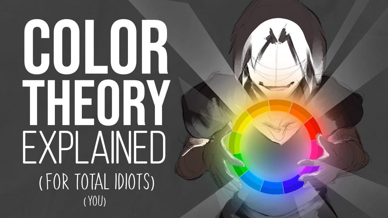
Color theory encompasses the fundamentals of hue, value, and saturation, which are essential for creating compelling artworks. Artists can utilize techniques like monochromatic and analogous color schemes for harmony, and complementary schemes for contrast. Understanding color context and aerial perspective is vital for achieving depth and cohesion in their pieces.
Transcript
Surprise Question! . nah, that's the wrong one... oh yeah! That's the one: Which colour does the mast of this ship have. Don't cheat! Just the first colour that comes into your mind. Pause the video, Write it down or just leave a quick comment- I'm gonna say it now, you ready?... it's.. Blue. Or it has a.. "blueish hue" to be precise. When I ask... Read More
Key Insights
- 🧑🎨 Color theory is essential for artists; understanding hue, value, and saturation influences the success of a piece.
- 🆘 Monochromatic and analogous color schemes help create harmonious artworks, while complementary schemes provoke contrast and visual interest.
- ❓ Color context significantly affects how colors are perceived, highlighting the importance of background and surrounding colors in artwork.
- 🚡 Aerial perspective is a crucial technique for depicting depth in landscapes, as colors must shift appropriately according to placement within a scene.
- ❓ The creator provides practical examples from their own artworks to better illustrate color concepts.
- 🧑🎨 Traditional artists need to learn mixing techniques, while digital artists can rely on software tools for color adjustments.
- 🚙 A physical calendar featuring original artwork serves as a creative blend of poster and practical utility.
Install to Summarize YouTube Videos and Get Transcripts
Explore YouTube Video Summarizer or Get YouTube Transcript Extractor
Questions & Answers
Q: What are the core components of color theory introduced in the video?
The video introduces three fundamental components of color theory: hue, which refers to the actual color itself (like red or blue); value, which indicates the brightness or darkness of a color; and saturation, which describes how intense or muted a color appears. Understanding these elements is crucial for artists to create realistic and visually appealing works.
Q: How does the creator differentiate between various color harmony techniques?
The creator discusses several color harmony techniques, including monochromatic, where only one hue is used but varied in value and saturation; analogous, which incorporates hues that sit next to each other on the color wheel for a soothing effect; and complementary, where colors opposite each other are used to create contrast. Each scheme has its unique aesthetic and emotional impact on the artwork.
Q: What is the significance of color context in artwork?
Color context refers to how colors interact depending on their surroundings in a piece. The creator illustrates that the same color can appear different based on its background; for instance, a red object may stand out vividly against a light backdrop but may blend in against darker colors. Understanding this principle enhances an artist's ability to create depth and cohesion in their work.
Q: What practical advice does the creator give for applying color theory in traditional versus digital art?
The creator emphasizes that digital artists can easily adjust colors using the color wheel in their software. Traditional artists, on the other hand, need to mix colors directly; the creator encourages them to understand the mixing process to achieve realistic colors. They also mention previous content focused on color mixing to assist traditional painters.
Q: Why does the creator prefer using a calendar over traditional posters for their artwork?
The creator expresses a personal preference for physical calendars instead of posters, as they become repetitive after a month. The calendar approach allows for ongoing engagement with their artwork throughout the year, ensuring that viewers have a fresh piece to enjoy each month while also celebrating the various artworks created over the year.
Q: What practical application does the video suggest for understanding aerial perspective in artwork?
Aerial perspective illustrates how colors shift in hue and saturation based on distance; for example, objects in the background appear more bluish and less saturated than those in the foreground. Artists are encouraged to apply this principle to create more believable and immersive landscapes where all elements harmoniously blend together.
Summary & Key Takeaways
-
The content begins with a quiz on the color of a ship's mast, leading into a discussion of color theory fundamentals, including hue, value, and saturation.
-
Various color harmony techniques are explained, such as monochromatic, analogous, complementary, and triadic schemes, each with examples from the creator's artworks.
-
Emphasis is placed on color context and aerial perspective, demonstrating how colors shift based on their environment and importance in creating cohesive artworks.
Read in Other Languages (beta)
Share This Summary 📚
Summarize YouTube Videos and Get Video Transcripts with 1-Click
Try YouTube Summary with ChatGPT & Claude or YouTube Transcript Generator
Explore More Summaries from Draw like a Sir 📚


Summarize YouTube Videos and Get Video Transcripts with 1-Click
Try YouTube Summary with ChatGPT & Claude or YouTube Transcript Generator