How to Master Top-Down Chart Analysis in 19 Minutes: A Step-by-Step Guide
TL;DR
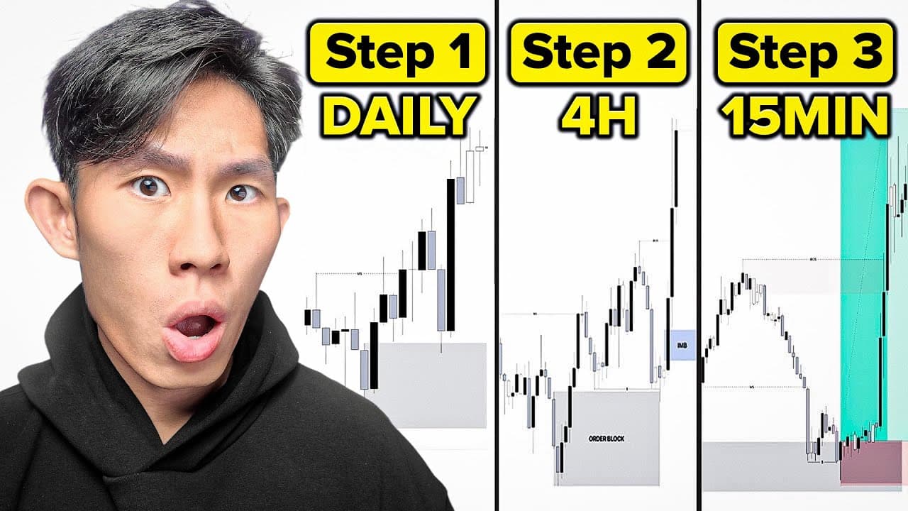
Master top-down chart analysis by removing every indicator, then mapping price across the 4-hour, 15-minute, and 5-minute time frames. Use the 4-hour chart to establish the swing narrative, the 15-minute chart to refine internal structure and entry zones, and the 5-minute chart for execution. Read on for the exact process for marking structure, supply and demand, mitigation, and liquidity.
Transcript
You are losing not because you don't have a proper strategy, but because your charts look like a bloody war zone. There's indicators everywhere. There is no clear structure. There is no direction. It's just pure confusion. I don't even know how you trade. In this video, I'm going to show you exactly how I mark up my charts every single day from the... Read More
Key Insights
- Removing all indicators is step one because indicators are lagging and inefficient, and they clutter thinking. The stated reasoning is that if you cannot read the raw chart first, layering RSI, MACD, moving averages or stochastics on top only deepens the confusion.
- The three time frame stack used is 4 hour as higher, 15 minute as medium, and 5 minute as lower. The 1 hour can be substituted as the medium time frame when the jump from 4 hour to 15 minute leaves too large a gap.
- A strong low is defined as the lowest point that led to a bullish break of structure. Because that low caused price to take out the previous weak high, it anchors the current swing range and marks the area worth focusing attention on.
- Mitigated zones are treated as unlikely to work again. When price pulls back into a demand zone and pushes up from it, the remaining buy orders inside have already been used to fuel that move, so only unmitigated zones are kept as active points of interest.
- Supply and demand zones are always mapped starting from the extreme of the range, then worked forward following the direction of price. This produces an ordered list of zones rather than boxes scattered across the chart with no relationship to the current swing.
- Liquidity is marked by finding obvious resting pools, such as equal lows. In the example, price created equal lows, came down and swept that liquidity, then pushed up, marking the area as an institutional zone where action is expected to happen again.
- Price is described as fractal: whatever happens on the higher time frame must first happen on the lower time frame. A bearish shift on the lower time frame is therefore read as facilitating a higher time frame swing pullback, not as a downtrend in its own right.
- Internal order flow overrides higher time frame bias for intraday execution. Even when the 4 hour narrative points to buys, the instruction is to keep trading with the bearish internal order flow, selling at supply zones, until the internal sentiment and bias flip.
Install to Summarize YouTube Videos and Get Transcripts
Explore YouTube Video Summarizer or Get YouTube Transcript Extractor
Questions & Answers
Q: How do you perform top-down analysis on a trading chart?
Start by removing every indicator and reading the raw price chart. Use the 4-hour chart to identify the current swing range, break of structure, strong low, unmitigated supply and demand zones, and liquidity; then use the 15-minute chart to refine the internal structure and point of interest before moving to the 5-minute chart for execution.
Q: Which time frames should you use for top-down chart analysis?
The process uses the 4-hour chart as the higher time frame, the 15-minute chart as the medium time frame, and the 5-minute chart as the lower time frame. The 4-hour builds the narrative, the 15-minute refines the tradeable range, and the 5-minute handles execution; the 1-hour can replace the 15-minute when the gap feels too large.
Q: Why should you remove indicators such as RSI and MACD first?
The speaker describes indicators as lagging and inefficient and says they clutter thinking and distract from price action, structure, and liquidity. The recommended first step is to right-click, remove all indicators, and begin with clean candles so the raw chart can be understood before anything else is added.
Q: How do you identify the current swing range on the 4-hour chart?
Find the most recent break of structure and locate the lowest point that produced it. In the bullish example, that originating low becomes the 4-hour strong low, while the broken high becomes the weak high, defining the swing range that deserves attention.
Q: What is a strong low in price action trading?
A strong low is the lowest point that led to a bullish break of structure. It is considered strong because price rallied from it and took out the previous weak high, so it anchors the current swing range.
Q: How should supply and demand zones be mapped?
Start at the extreme of the swing range and work forward in the direction of price. Discard zones that price has already returned to and used, while retaining unmitigated zones that still represent active points of interest.
Q: What is a mitigated supply or demand zone?
A zone is mitigated when price has already returned to it and then moved away. The explanation given is that the remaining orders in that zone were used to fuel the move, making the zone unlikely to work again, so the analysis focuses on unmitigated zones instead.
Q: How do you identify liquidity on a trading chart?
Look for obvious pools of resting liquidity, particularly beneath prior lows or equal lows. In the example, price formed equal lows, moved down to sweep the liquidity below them, and then pushed upward, marking that area as an institutional zone worth monitoring.
Summary & Key Takeaways
-
The process starts with a blank slate. Right click and remove all indicators, including RSI, MACD, moving averages and stochastics, because they lag, clutter thinking and distract from price action, structure and liquidity. The argument given is that if you cannot read the raw chart first, adding indicators on top only adds confusion.
-
The higher time frame, the 4 hour, is used purely to build the narrative. Identify the current swing range by finding the most recent break of structure, mark the swing low that caused it as the strong low, then map supply and demand zones starting from the extreme, discarding zones price has already mitigated and keeping the unmitigated ones.
-
The medium time frame, the 15 minute, refines everything into a tradeable range. Mapping the internal structure narrows a wide 4 hour area down to roughly 50 to 60 pips in the example shown, and the internal order flow, bearish in this case, dictates trade direction until the internal sentiment actually changes.
Read in Other Languages (beta)
Share This Summary 📚
Summarize YouTube Videos and Get Video Transcripts with 1-Click
Try YouTube Summary with ChatGPT & Claude or YouTube Transcript Generator
Explore More Summaries from The Trading Geek 📚






Summarize YouTube Videos and Get Video Transcripts with 1-Click
Try YouTube Summary with ChatGPT & Claude or YouTube Transcript Generator