How to Create Engaging PowerPoint Presentations
TL;DR
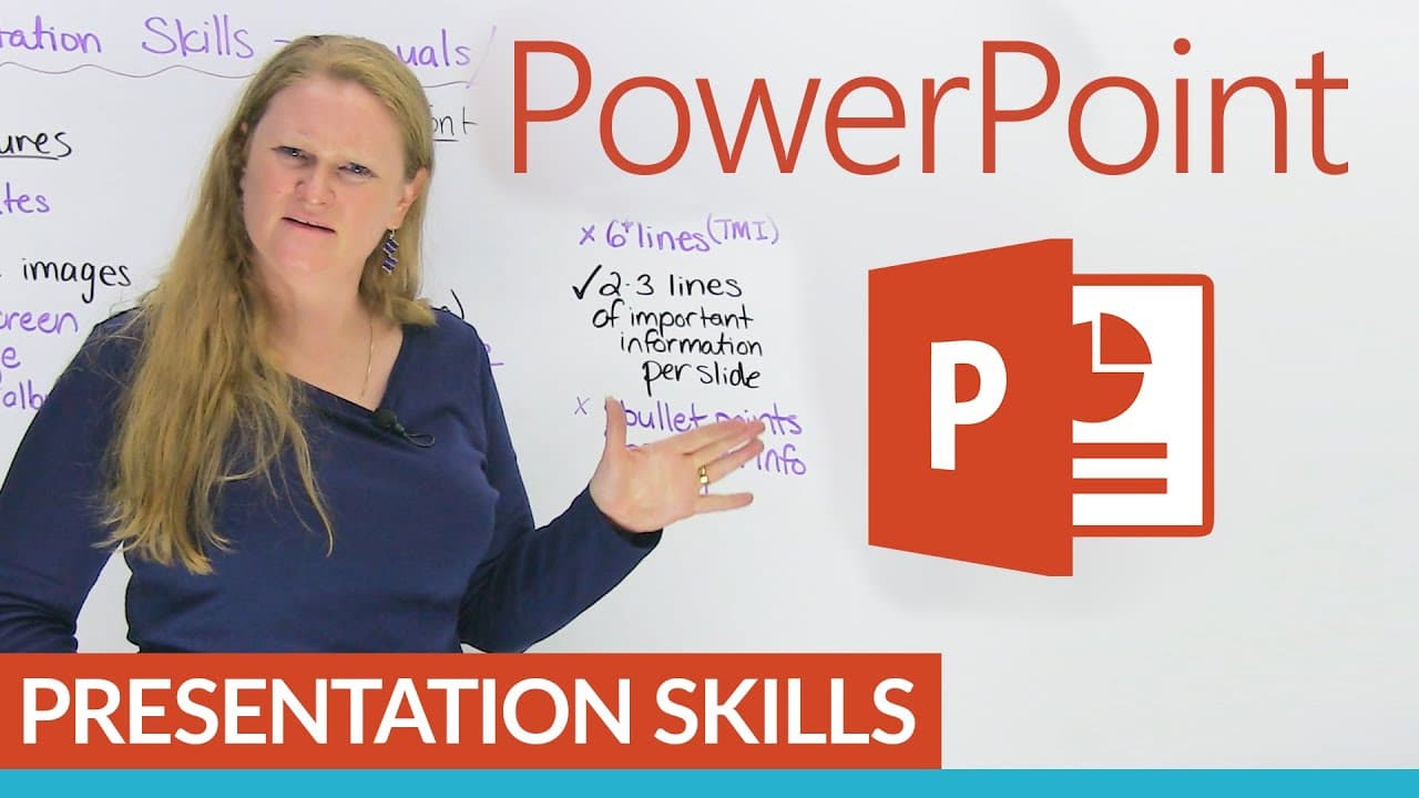
To create an engaging PowerPoint presentation, use one image per slide and limit text to two or three lines. Choose simple, readable fonts and ensure strong contrast between text and background colors. Avoid using collages or overly colorful lettering to maintain clarity and audience focus.
Transcript
Do you have to make presentations? Do you hate presentations? I like presentations, but one thing that you are probably maybe good at with presentations are making PowerPoint presentations, because you have visual aids to help you so you don't really have to talk as much, if you're nervous about talking. Presentation skills is something that you ca... Read More
Key Insights
- 😒 Use one image per slide to maintain audience focus and comprehension.
- 🫠 Choose simple and easy-to-read fonts to ensure clear visibility for all viewers.
- ❓ Adjust the font size to accommodate different projection settings.
- 🫥 Limit the amount of text on each slide to two or three lines for better retention and understanding.
- 🔑 Avoid using too many colors within a word to maintain readability.
- 😣 Emphasize important words with a single different color, while keeping the rest of the text black.
- 💪 Ensure a strong contrast between the lettering and background colors for easy visibility.
Install to Summarize YouTube Videos and Get Transcripts
Explore YouTube Video Summarizer or Get YouTube Transcript Extractor
Questions & Answers
Q: Why should I use one image per slide instead of split screens or collages in my PowerPoint presentation?
Using one image per slide allows for better focus and comprehension. Split screens or collages can be overwhelming and distract the audience from the main message of the presentation.
Q: What kind of fonts should I use in my PowerPoint presentations?
It is recommended to use simple and easy-to-read fonts, avoiding fancy or cursive styles. This ensures that all audience members, including non-native English speakers, can easily read the content.
Q: Why is it important to check the font size before projecting a PowerPoint presentation?
The font size may appear differently when projected compared to how it appears on a laptop or other devices. Checking the font size beforehand helps avoid issues with readability, ensuring that the content is visible to the audience.
Q: Why should I limit the amount of text on each slide in my PowerPoint presentation?
Studies have shown that humans can absorb or understand a maximum of six lines of text. Too much text or bullet points on a slide can overwhelm the audience and hinder their ability to retain information.
Summary & Key Takeaways
-
Use one image per slide instead of split screens or collages to make your presentation more interesting and easy to comprehend.
-
Choose simple and easy-to-read fonts for better readability, avoiding fancy or cursive styles.
-
Check the font size and adjust it accordingly to ensure readability when projecting the presentation.
-
Limit the amount of text on each slide to two or three clear lines to avoid overwhelming the audience.
Read in Other Languages (beta)
Share This Summary 📚
Summarize YouTube Videos and Get Video Transcripts with 1-Click
Try YouTube Summary with ChatGPT & Claude or YouTube Transcript Generator
Explore More Summaries from English with Ronnie · EnglishLessons4U with engVid 📚
Summarize YouTube Videos and Get Video Transcripts with 1-Click
Try YouTube Summary with ChatGPT & Claude or YouTube Transcript Generator