Why Is Green Considered the Hardest Color to Paint?
TL;DR
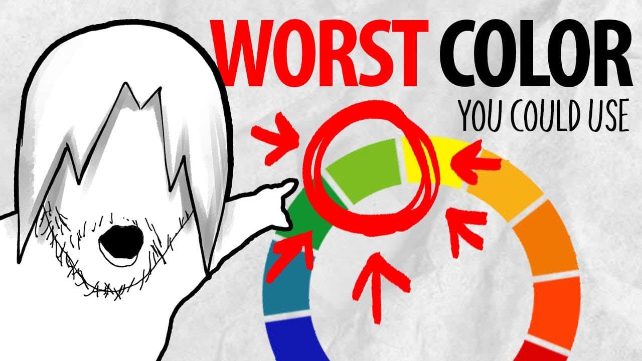
Green is often seen as the hardest color to work with because its misuse can make artwork appear amateurish. Mastering color theory, particularly through the use of warm and cool variations, enables artists to create more realistic effects in shading and highlighting, greatly enhancing their work's professional appearance.
Transcript
hi guys my name is Marcel and I have returned in order to hit you guys with some knowledge specifically knowledge about color color is such a fascinating topic for example have you considered that instead of just using the base form of every color there are cold and warm variations of every single color that you could use so what like for real who ... Read More
Key Insights
- 😌 The essence of color theory lies in understanding variations; each color has warm and cool versions that impact the artwork's mood.
- 😒 Inadequate use of green can detract from the professionalism of an artwork, making mastery of this color particularly important.
- 🖤 Many artists fall into the trap of oversimplifying shading by using pure black and white, which should be avoided for more effective results.
- 🩵 Recognizing how light sources affect color is essential in art; bounce light can add dimension and interest to artworks.
- 🔉 Applying color theory techniques can vastly enhance realistic depictions in both traditional and digital media.
- 💦 Artists should start with simpler examples to grasp the complex nuances of color theory before attempting intricate works.
- 🪡 Background color choices also significantly affect the perception of foreground colors, highlighting the need for cohesive color planning.
Install to Summarize YouTube Videos and Get Transcripts
Explore YouTube Video Summarizer or Get YouTube Transcript Extractor
Questions & Answers
Q: Why is green considered the hardest color to paint well?
Green is often misused by artists, which can lead to an amateurish appearance in artwork. Unlike other colors, variations in green—especially warm and cool tones—are critical for achieving depth and realism. An incorrect application of green can disrupt the overall harmony of an artwork and convey an unintended message.
Q: How should artists approach shading and highlighting?
Instead of merely using black for shading and white for highlighting, artists are encouraged to incorporate warm and cool colors to enhance depth. For instance, shadows might be cooler and reflect the absence of sunlight, while highlights can include warmer tones influenced by direct sunlight. This adjustment results in a more natural and appealing visual.
Q: What is the importance of color context in art?
Color context refers to how the surrounding colors influence our perception of a specific color. In nature, shadows appear bluish due to sunlight; thus, understanding and applying this concept can help artists to create more realistic pieces. It's crucial for artists to consider how colors behave in different contexts to better convey emotion and atmosphere.
Q: Can you provide an example of applying color theory to a specific artwork?
In the video, Marcel describes a calendar artwork for April, demonstrating how to paint greens highlight areas with yellowish-green when exposed to sunlight while using darker, more muted greens for shadowed sections. By adequately blending these variations, the artwork gains depth and vibrancy, showcasing a realistic representation of light interaction.
Summary & Key Takeaways
-
Color theory emphasizes the use of warm and cool variations of colors, which can significantly affect the overall perception of an artwork.
-
Green is highlighted as a challenging color to work with, especially when artists misuse it, leading to more amateurish results.
-
The video provides practical approaches to applying color theory, particularly in shading and highlighting, to create more realistic and dynamic artworks.
Read in Other Languages (beta)
Share This Summary 📚
Summarize YouTube Videos and Get Video Transcripts with 1-Click
Try YouTube Summary with ChatGPT & Claude or YouTube Transcript Generator
Explore More Summaries from Draw like a Sir 📚


Summarize YouTube Videos and Get Video Transcripts with 1-Click
Try YouTube Summary with ChatGPT & Claude or YouTube Transcript Generator