How to Build Web Page Layouts with CSS Grid
TL;DR
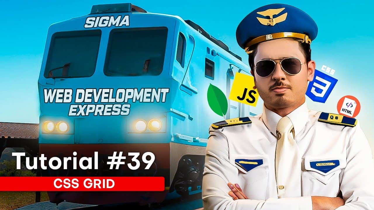
CSS Grid creates page layouts by turning a parent container into a grid and defining its rows and columns. Items can then be positioned with grid-row and grid-column, placed across multiple cells, or deliberately overlapped, while line numbers, named lines, template areas, fr units, gaps, alignment properties, and repeat syntax provide additional layout control.
Transcript
After watching this video, you will get to know about CSS Grid. I can guarantee you that. Because in this video, I have explained CSS Grid in a very easy way. And you won't be able to forget CSS Grid even if you want to, after seeing the examples I will be using. CSS Grid is used to make layouts. This is one of the ways to make layouts in CSS. Beca... Read More
Key Insights
- CSS Grid is a CSS layout method designed for structures that resemble a grid. It provides an alternative to confusing layout approaches involving floats and positioning, particularly in scenarios where rows, columns, and precisely placed elements naturally describe the desired page structure.
- A grid container is created by applying display: grid to a parent element. Unlike the demonstrated flex behavior, this declaration alone does not lay all child items out horizontally, so rows may appear without explicitly defined columns until the grid template is configured.
- Grid columns and rows are defined with grid-template-columns and grid-template-rows. A declaration can create columns measuring 120px and 100px, while separate row definitions can assign heights such as 100px to each of three rows.
- Grid terminology distinguishes four structural concepts. Grid lines are the dividing boundaries, a grid cell is one box, a grid track is the space between two grid lines, and a grid area is the region enclosed by two horizontal and two vertical lines.
- Grid lines receive positive numbers from the beginning and negative numbers from the opposite end. For example, the final line is numbered minus 1, the preceding line is minus 2, and the same physical line can therefore be referenced from either direction.
- Grid items are positioned with grid-row and grid-column by specifying their starting and ending lines. Setting both properties from line 1 to line 2 places an item inside the first corresponding cell of the defined row and column structure.
- Grid items can overlap when multiple items are explicitly assigned to the same row and column location. In the demonstration, items 1 and 4 are given matching placement values, causing them to occupy the same grid cell instead of remaining in separate automatic positions.
- CSS Grid offers additional layout controls beyond numbered placement. The lesson includes naming grid lines, defining grid template areas, using the fr unit, adding gaps, applying align-items and justify-items, using repeat syntax, and controlling the grid with justify-content and align-content.
Install to Summarize YouTube Videos and Get Transcripts
Explore YouTube Video Summarizer or Get YouTube Transcript Extractor
Questions & Answers
Q: How do you create a CSS Grid container?
Create a parent container containing the items that should participate in the layout, then apply display: grid to that parent. The browser will recognize and display it as a grid during inspection. This declaration establishes the grid container, but the demonstrated items remain visually similar until columns, rows, placement rules, or other grid properties are added.
Q: How do you define columns and rows in CSS Grid?
Use grid-template-columns to define column widths and grid-template-rows to define row heights. The demonstration creates two columns with widths of 120px and 100px, then defines three rows of 100px each. Items flow into the resulting structure automatically unless individual placement properties instruct them to occupy different rows, columns, or cells.
Q: What are grid lines and grid cells in CSS Grid?
Grid lines are the boundaries produced when a grid is divided into rows and columns. A grid cell is one box enclosed by those lines, similar to a cell in a spreadsheet. Browser grid inspection can reveal these boundaries and their numbers, helping identify the exact starting and ending lines needed when positioning an individual item.
Q: What is the difference between a grid track and a grid area?
A grid track is the space between two grid lines, whether those lines define a row or a column. A grid area is a larger region bounded by two horizontal lines and two vertical lines. These terms describe different parts of the same layout and help explain where items can be placed or extended across multiple cells.
Q: How do grid line numbers work in CSS Grid?
Grid lines are numbered in both forward and reverse directions. Positive numbers begin from the first line and continue across the grid. Negative numbers begin at the opposite end, with the last line identified as minus 1 and earlier lines as minus 2, minus 3, and so on. One physical line can therefore have both references.
Q: How do you position an item in a specific grid cell?
Apply grid-row and grid-column to the individual item, then specify the starting and ending grid lines for each direction. In the demonstration, setting both properties to start at line 1 and end at line 2 moves an item into the first corresponding cell. Explicit placement can change the automatic order created by the grid.
Q: How can CSS Grid items overlap each other?
Assign multiple items to the same row and column boundaries with matching grid-row and grid-column values. The demonstration places item 4 where item 1 originally appears, then gives item 1 the same explicit placement. Because both items occupy the same grid location, they overlap instead of being automatically distributed into separate available cells.
Q: What additional CSS Grid properties does the lesson cover?
The lesson covers named grid lines, grid template areas, the fr unit, the gap property, align-items, justify-items, repeat syntax, justify-content, and align-content. These topics extend the basic process of creating rows and columns by supporting named structures, spacing, repeated definitions, item alignment, and alignment of the overall grid within its container.
Summary & Key Takeaways
-
CSS Grid begins with a parent container containing multiple items. Applying display: grid identifies that parent as a grid container, but it does not automatically arrange every item horizontally. The developer defines the desired structure with properties such as grid-template-columns and grid-template-rows, using dimensions such as 120px, 100px, or other values.
-
Grid terminology clarifies how layouts are constructed. Grid lines form the boundaries, a grid cell is one box, a grid track is the space between two lines, and a grid area is bounded by two horizontal and two vertical lines. Browser inspection tools can display the grid structure and its numbered lines.
-
Individual items can be positioned by specifying where their rows and columns start and end. Positive line numbers count from the beginning, while negative numbers count backward from the end. Items assigned to the same location can overlap. The lesson also covers named lines, template areas, fr units, gaps, alignment, and repeat syntax.
Read in Other Languages (beta)
Share This Summary 📚
Summarize YouTube Videos and Get Video Transcripts with 1-Click
Try YouTube Summary with ChatGPT & Claude or YouTube Transcript Generator
Explore More Summaries from CodeWithHarry 📚




Summarize YouTube Videos and Get Video Transcripts with 1-Click
Try YouTube Summary with ChatGPT & Claude or YouTube Transcript Generator