How to Create an Interactive Dashboard in Excel
TL;DR
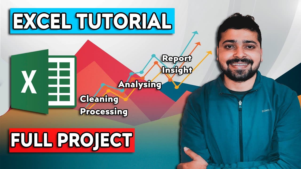
Creating an interactive dashboard in Excel involves data cleaning, processing, and visualization. By selecting values in slicers, charts dynamically update, illustrating data insights effectively. This project enhances skills like data analytics and visualization, valuable for a resume.
Transcript
Hi Folks, I'm Rishabh And in this video, will learn how to work on Data Analytics project using Excel You can see on the screen, this will be our final output that we will be working in this video If i select any value in slicers it will change the charts on the right this is an example of interactive dashboard in excel so, if i select Ajio for e... Read More
Key Insights
- An interactive dashboard in Excel allows for dynamic data visualization by updating charts based on slicer selections.
- Data cleaning and processing are foundational steps for creating effective dashboards in Excel.
- Using slicers in Excel dashboards enhances user interactivity and data exploration.
- Excel dashboards can effectively solve business problems by providing clear data insights.
- Adding Excel dashboard projects to your resume showcases skills in data analytics and visualization.
- Data visualization in Excel involves transforming raw data into insightful charts and graphs.
- A well-designed Excel dashboard can communicate complex data insights simply and effectively.
- Mastering Excel dashboard creation is a valuable skill for data analysts, enhancing career opportunities.
Install to Summarize YouTube Videos and Get Transcripts
Explore YouTube Video Summarizer or Get YouTube Transcript Extractor
Questions & Answers
Q: How to create an interactive dashboard in Excel?
To create an interactive dashboard in Excel, start by cleaning and processing your data. Use Excel's chart tools to visualize the data, and incorporate slicers to allow users to filter and interact with the data dynamically. This setup enables the charts to update automatically based on user selections, providing clear insights.
Q: What is the purpose of using slicers in Excel dashboards?
Slicers in Excel dashboards serve to enhance interactivity by allowing users to filter data dynamically. By selecting different values in slicers, users can see immediate changes in the associated charts and graphs, enabling a more in-depth exploration of the data and facilitating better decision-making based on the visual insights provided.
Q: Why is data cleaning important for Excel dashboard projects?
Data cleaning is crucial for Excel dashboard projects because it ensures the accuracy and reliability of the visualizations. By removing errors, inconsistencies, and irrelevant information from the dataset, the resulting dashboard provides clear and actionable insights, which are essential for making informed business decisions.
Q: What skills are demonstrated by creating an Excel dashboard?
Creating an Excel dashboard demonstrates skills in data cleaning, processing, and visualization. It showcases the ability to transform raw data into interactive and insightful visual representations, highlighting proficiency in Excel tools and techniques. These skills are valuable for data analysts and can enhance career opportunities.
Q: How does an Excel dashboard solve business problems?
An Excel dashboard solves business problems by providing a visual representation of data that is easy to interpret. By highlighting key metrics and trends, it enables stakeholders to make informed decisions quickly. The interactive nature of dashboards allows for real-time data exploration, further aiding in identifying and addressing business challenges.
Q: What are the benefits of adding an Excel dashboard project to a resume?
Adding an Excel dashboard project to a resume demonstrates practical experience in data analytics and visualization. It highlights proficiency in Excel, showcasing the ability to create interactive and insightful dashboards. This can differentiate candidates in the job market, particularly for roles involving data analysis and decision-making.
Q: What is the role of data visualization in Excel dashboards?
Data visualization in Excel dashboards plays a critical role in transforming raw data into graphical formats like charts and graphs. This makes complex data more accessible and understandable, allowing users to quickly grasp trends, patterns, and insights. Effective visualization is key to communicating data-driven insights and supporting decision-making processes.
Q: How can mastering Excel dashboard creation enhance a data analyst's career?
Mastering Excel dashboard creation enhances a data analyst's career by equipping them with the skills to present data in a clear and interactive manner. This capability is highly valued in organizations that rely on data-driven decisions. Proficiency in dashboard creation can lead to more opportunities and responsibilities, advancing a data analyst's career.
Summary & Key Takeaways
-
Creating an interactive Excel dashboard involves data cleaning, processing, and visualization. Users can manipulate slicers to dynamically update charts, providing clear insights into data. This project demonstrates skills in data analytics and visualization, making it a valuable addition to a resume.
-
The process of building an Excel dashboard starts with cleaning and processing data, followed by creating visual elements like charts that update based on user interactions. This enhances data exploration and insight communication, solving business problems effectively.
-
Excel dashboards are powerful tools for data analysts, allowing for the transformation of raw data into interactive and insightful visualizations. By mastering this skill, analysts can effectively communicate data insights and improve their career prospects.
Read in Other Languages (beta)
Share This Summary 📚
Summarize YouTube Videos and Get Video Transcripts with 1-Click
Try YouTube Summary with ChatGPT & Claude or YouTube Transcript Generator
Explore More Summaries from Rishabh Mishra 📚




Summarize YouTube Videos and Get Video Transcripts with 1-Click
Try YouTube Summary with ChatGPT & Claude or YouTube Transcript Generator