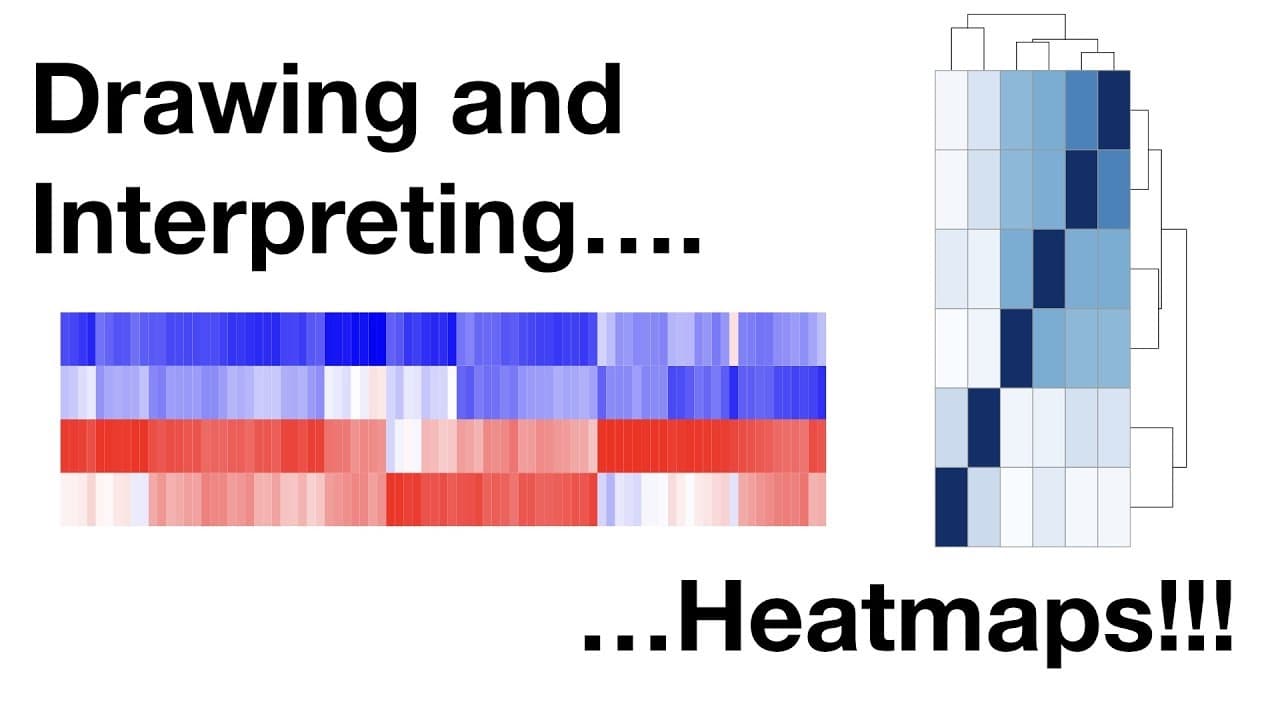
What Are Heatmaps and How Are They Used in Data Analysis?
TL;DR
Heatmaps are visualizations that display data by representing scaled and clustered rows and columns, allowing for quick insights. Clustering groups similar data points, which aids in interpretation, while scaling methods can significantly influence the clarity of the visualization. Choices regarding these processes, including distance metrics and clustering methods, are crucial for effective data analysis.
Transcript
step twist step twist step quest hello and welcome to stat quest stat quest is brought to you by the friendly folks in the genetics department at the University of North Carolina at Chapel Hill today we're going to be talking about heatmaps I know you've seen them many times before so let's just get started here's a heat map that I drew for our fri... Read More
Key Insights
- 😑 Heatmaps display relative gene expressions with scaled abundances for easy comparison.
- 🦻 Clustering groups similar genes together, aiding in pattern identification.
- ⚖️ Scale and clustering choices impact heatmap visualization clarity.
- 👥 Hierarchical clustering relies on distance metrics to group genes or samples.
- ❓ Different clustering methods like centroid or average affect heatmap outcomes.
- 😉 K-means clustering minimizes variance to create distinct data clusters.
- ❓ Default settings in heatmap creation can simplify decision-making.
Install to Summarize YouTube Videos and Get Transcripts
Explore YouTube Video Summarizer or Get YouTube Transcript Extractor
Questions & Answers
Q: How are heatmaps helpful in data analysis?
Heatmaps provide a visual representation of data, making it easier to compare gene expressions or sample patterns.
Q: What is the significance of scaling in heatmaps?
Scaling data in heatmaps allows for relative comparisons within rows or across all genes, aiding in the interpretation of expression levels.
Q: Describe the role of clustering in heatmaps.
Clustering groups genes or samples based on similarity, helping to identify patterns and relationships in the data for better insights.
Q: How do different distance metrics impact hierarchical clustering?
Distance metrics like Euclidean or Manhattan affect how genes are grouped together in clusters, influencing the visual representation of data in heatmaps.
Summary & Key Takeaways
-
Heatmaps display data with scaled abundances for quick comparison.
-
Clustering groups similar genes together for easier interpretation.
-
Scaling and clustering choices impact heatmap visualizations.
Read in Other Languages (beta)
Share This Summary 📚
Summarize YouTube Videos and Get Video Transcripts with 1-Click
Try YouTube Summary with ChatGPT & Claude or YouTube Transcript Generator
Explore More Summaries from StatQuest with Josh Starmer 📚


Summarize YouTube Videos and Get Video Transcripts with 1-Click
Try YouTube Summary with ChatGPT & Claude or YouTube Transcript Generator