Creating and analysing a simple bar graph in SigmaPlot 13
TL;DR
This tutorial provides a step-by-step guide on how to create a basic bar graph with means and standard deviations using Sigma Plot.
Transcript
hello this is a very quick introduction plot this is Sigma plot very tene which is the version which is available as a site license at King's College London and this is a very quick introduction to how to create a very simple bar graph there are many ways of entering data into Sigma plot and we'll go into this in other tutorials but more often than... Read More
Key Insights
- 🉐 Sigma Plot is a software tool that provides capabilities for creating different types of graphs, including bar graphs.
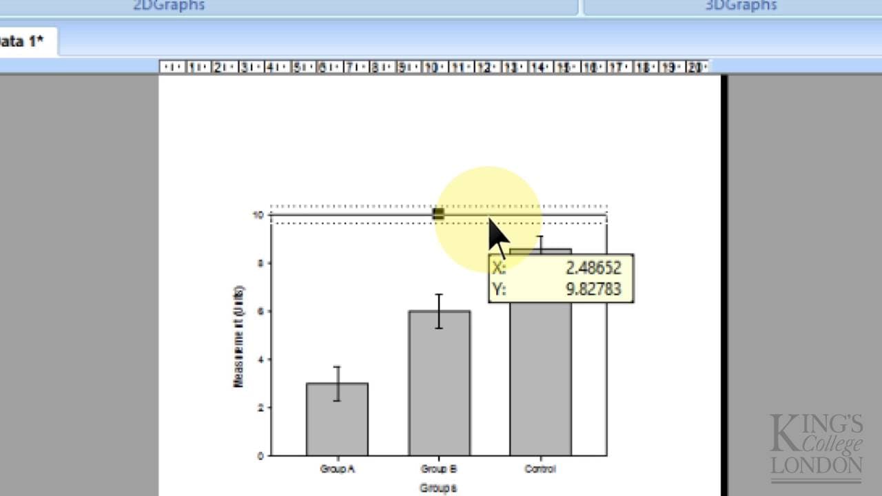
- 👥 Bar graphs are useful for comparing data between different groups, with each group having its own set of values.
- 👻 In Sigma Plot, data can be entered into a sheet, and the graph creation process allows for selecting options such as mean and standard deviation plotting.
- 🤩 Customization options in Sigma Plot include labeling, formatting, and adding annotations like stars to indicate statistically significant differences.
- 🫢 Sigma Plot also offers statistical analysis tools, such as one-way ANOVA, to compare data between different groups and perform post-hoc tests.
- 🉐 The tutorial emphasizes the simplicity of creating basic bar graphs in Sigma Plot but acknowledges that more advanced features and graph types are available.
- 🍉 Sigma Plot provides flexibility in terms of data entry, graph customization, and statistical analysis, making it a versatile tool for data visualization and analysis.
Install to Summarize YouTube Videos and Get Transcripts
Explore YouTube Video Summarizer or Get YouTube Transcript Extractor
Questions & Answers
Q: What is the purpose of creating a bar graph in Sigma Plot?
The purpose is to visually represent data for multiple groups, where each group has its own set of values, means, and standard deviations.
Q: How can data be entered into Sigma Plot for creating a bar graph?
Data can be entered into the sheet provided by Sigma Plot, where each column represents a different data group and each row represents a data point within that group.
Q: How can the means and standard deviations be plotted on the bar graph?
By selecting the appropriate options in the graph creation process, Sigma Plot can plot the means as the main value of each bar and the standard deviations as error bars above and below the means.
Q: Can the labels and formatting of the bar graph be customized?
Yes, Sigma Plot allows for customization of labels, including changing them to specific values or selecting them from different columns. The formatting options also allow for different fill colors, patterns, or hashes.
Summary & Key Takeaways
-
Sigma Plot is a site-licensed software available at King's College London for creating various types of graphs, including bar graphs and histograms.
-
This tutorial focuses on creating a bar graph with means and standard deviations for multiple data groups.
-
The process involves entering data, selecting graph options, formatting the graph, and running statistical analysis.
Read in Other Languages (beta)
Share This Summary 📚
Summarize YouTube Videos and Get Video Transcripts with 1-Click
Try YouTube Summary with ChatGPT & Claude or YouTube Transcript Generator
Explore More Summaries from Dory Video 📚


Summarize YouTube Videos and Get Video Transcripts with 1-Click
Try YouTube Summary with ChatGPT & Claude or YouTube Transcript Generator