Color Theory for Marker Illustrations
TL;DR
Learn how to apply color theory to markers, layering shades, choosing shadow colors, and creating depth in illustrations.
Transcript
hey hey party people in this video I want to talk about color theory as it applies to working with markers my previous color Theory videos they were deep dives into terminology and color mixing and working with paint but I know that many of us work with marker a huge chunk of the time if not a majority of the time and I wanted to take those same co... Read More
Key Insights
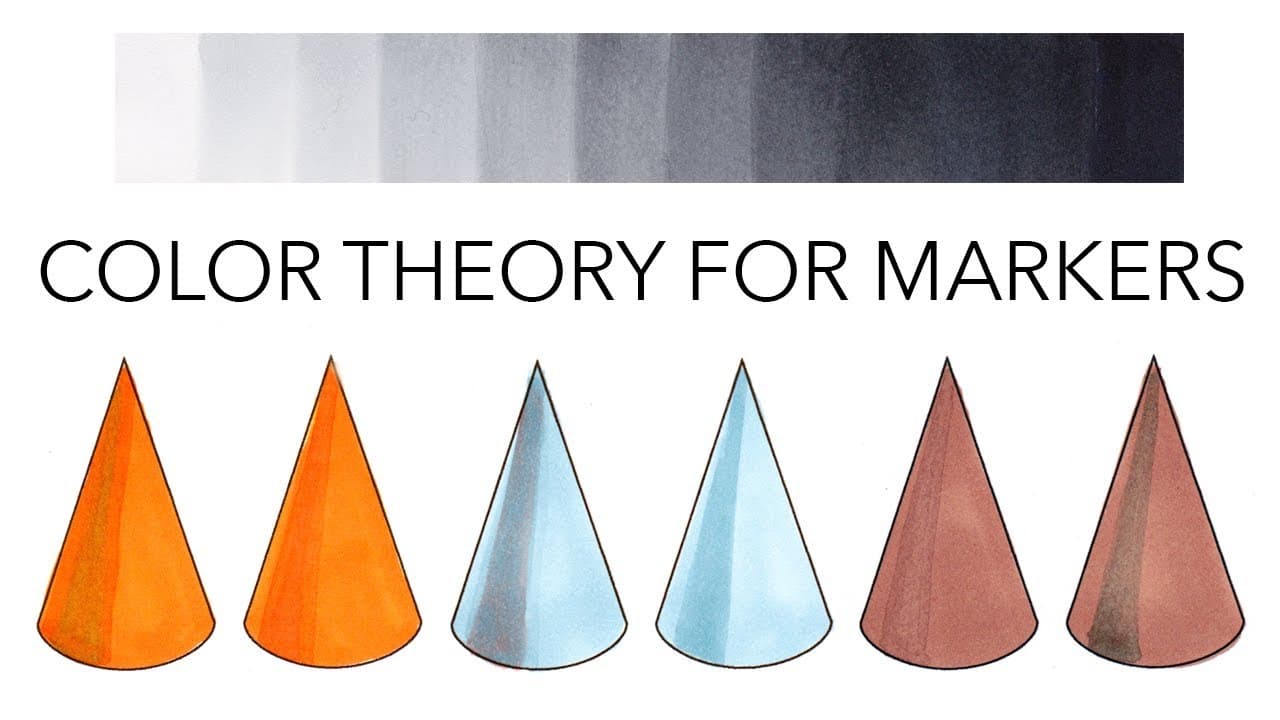
- 👶 Marker layering creates new shades but has limitations compared to paint layering techniques.
- 😐 The order of layering markers impacts the resulting color, with complementary colors creating neutral tones.
- ❓ Shadow color choices in illustrations can enhance depth, mood, and dimension.
- 🪜 Understanding color theory helps in selecting shadow colors, creating realistic shading, and adding dimension.
- 😶 Using complements for shadows can mute colors, adding depth and complexity to illustrations.
- 🏮 Paper quality affects marker performance, so choose the right paper for optimum results.
- ⚖️ Value scales and understanding value match are crucial for effective marker layering.
Install to Summarize YouTube Videos and Get Transcripts
Explore YouTube Video Summarizer or Get YouTube Transcript Extractor
Questions & Answers
Q: How can you create new shades with markers?
You can layer markers to create new shades by applying one color over another, but be mindful of the paper's ink absorption capacity. Layering can subtly alter colors without requiring additional markers.
Q: Why does the order of layering markers matter?
Layering markers in a specific order affects the resulting color, as complementary colors mixed create neutral tones. Understanding how colors interact through layering can enhance color depth in illustrations.
Q: What are the limitations of shading with markers compared to paints?
Unlike paints, marker shading options are limited due to the inability to tint with white or black effectively. Understanding alternative shading methods such as using darker marker colors or complementary colors is essential for creating depth.
Q: How does choosing shadow colors impact the overall mood of an illustration?
Selecting shadow colors based on color intensity and undertones can alter the mood of an illustration. Using darker versions of base colors, grays, or complementary colors can enhance dimension and visual interest.
Summary & Key Takeaways
-
Marker color theory discussion for layering shades and creating new colors.
-
Detailed demonstration of marker layering techniques on different papers.
-
Explanation of shadow color choices to enhance dimension in illustrations.
Read in Other Languages (beta)
Share This Summary 📚
Summarize YouTube Videos and Get Video Transcripts with 1-Click
Try YouTube Summary with ChatGPT & Claude or YouTube Transcript Generator
Explore More Summaries from Zoe Hong 📚


Summarize YouTube Videos and Get Video Transcripts with 1-Click
Try YouTube Summary with ChatGPT & Claude or YouTube Transcript Generator