How to Create Rain Cloud Plots in R for Data Visualization

TL;DR
To create rain cloud plots in R, combine density curves, box plots, and dot plots to visualize data distributions across categories effectively. Start by utilizing the ggplot2 and ggdist packages, then apply techniques to manage large datasets, such as scaling down point sizes or excluding outliers for clearer insights.
Transcript
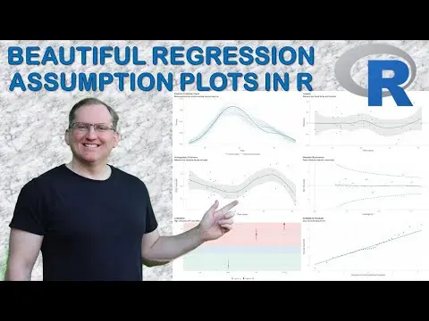
hi friends welcome back to the channel today I wanted to share with you this really nice data visualization which is called a rain cloud plot a rain cloud plot is actually a combination of several different plots so what we have is a density curve a box and whisker plot and some dot plots forming a histogram and gets its name because it looks a lit... Read More
Key Insights
- ⛈️ Rain cloud plots enhance data visualization by effectively combining multiple plots for clearer insights.
- ⛈️ The Iris dataset example illustrates how rain cloud plots allow for the comparison of petal lengths among flower species.
- 🌥️ Scaling techniques for large datasets prevent cluttering in visualizations, maintaining readability.
- 👤 Adjustments to plot aesthetics can significantly enhance user experience and data interpretation.
- 🛟 Using ggplot in R serves as a robust framework for creating intricate and informative data visualizations.
- 🤝 The ability to exclude outliers from box plots can simplify representations, especially when dealing with skewed data.
- 💄 The thematic customization of plots can improve presentation quality, making data findings more impactful.
Install to Summarize YouTube Videos and Get Transcripts
Explore YouTube Video Summarizer or Get YouTube Transcript Extractor
Questions & Answers
Q: What is a rain cloud plot, and why is it useful?
A rain cloud plot is a unique data visualization that combines a density curve, a box-and-whisker plot, and dot plots. It is particularly useful for comparing the distribution of a numeric variable across multiple categories, providing a comprehensive overview that makes interpretation easier.
Q: How does one manage large datasets when creating rain cloud plots?
When dealing with large datasets, one can either scale down the representation of dots, meaning each dot could represent multiple observations, or omit the dots altogether. This helps maintain clarity without overcrowding the visualization, allowing for easier interpretation of trends in the data.
Q: What R packages are necessary for creating rain cloud plots?
To create rain cloud plots, you need to install and load the Tidyverse and ggdist packages in R. Additionally, GG themes can be utilized to enhance the aesthetic aspects of the plots, allowing for adjustments in color schemes and styles.
Q: What adjustments can be made to the density curves in the plots?
The bandwidth of the density curves can be adjusted to smooth or reduce the smoothness of the plot. This flexibility allows users to tailor the visualization according to the specific characteristics of the data, helping to properly convey the underlying distribution.
Summary & Key Takeaways
-
The rain cloud plot combines elements of density curves, box plots, and dot plots, providing a comprehensive view of data distributions across categories.
-
This tutorial utilizes the Iris dataset to demonstrate the creation of rain cloud plots in R, focusing on petal length among different flower species.
-
Techniques to manage large datasets are discussed, including methods to scale down data points and alternatives to simplify visualizations without losing essential information.
Read in Other Languages (beta)
Share This Summary 📚
Summarize YouTube Videos and Get Video Transcripts with 1-Click
Try YouTube Summary with ChatGPT & Claude or YouTube Transcript Generator
Explore More Summaries from Dr Lyndon Walker 📚


Summarize YouTube Videos and Get Video Transcripts with 1-Click
Try YouTube Summary with ChatGPT & Claude or YouTube Transcript Generator