Box-and-Whisker Plots | Summary and Q&A
TL;DR
Learn how to create and interpret box and whisker plots to analyze the spread and median distance traveled by customers to a restaurant.
Key Insights
- 🗺️ Box and whisker plots are useful for analyzing the spread and median of data, such as the distance customers travel to a restaurant.
- 😫 The median is the middle value in an ordered set of data and represents the central tendency.
- 🍱 Quartiles divide the data into four sections, and the box in a box and whisker plot represents the middle half of the data.
- 🧡 Whiskers show the entire range of the data, including outliers and extreme values.
Transcript
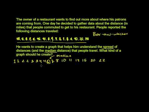
The owner of a restaurant wants to find out more about where his patrons are coming from. One day, he decided to gather data about the distance in miles that people commuted to get to his restaurant. People reported the following distances traveled. So this is our data right over here. He wants to create a graph that helps them understand the sprea... Read More
Questions & Answers
Q: Why is a box and whisker plot suitable for analyzing the spread and median distance traveled by customers?
A box and whisker plot provides a clear visualization of quartiles, the median, and the range of data, making it ideal for understanding the spread and central tendency of distances traveled.
Q: How do you find the median in a set of data to create a box and whisker plot?
To find the median, first, order the data. If the number of data points is odd, the median is the middle value. If the number of data points is even, the median is the average of the two middle values.
Q: What do the whiskers in a box and whisker plot represent?
The whiskers show the range of the data, specifically the minimum and maximum values. They indicate the entire spread of distances traveled by customers.
Q: How do you interpret the box in a box and whisker plot?
The box represents the middle half of the data. The lower edge of the box is the first quartile, and the upper edge is the third quartile. It shows where the majority of the data lies.
Summary & Key Takeaways
-
A restaurant owner wants to analyze the distance customers travel to his establishment and understand the spread of the distances and the median distance.
-
Box and whisker plots are the ideal graph for depicting medians and spreads of data.
-
By ordering the data, finding the median, and splitting the data into quartiles, a box and whisker plot can be created to visualize the spread and median distance traveled by customers.
Share This Summary 📚
Explore More Summaries from Khan Academy 📚