Ways to represent data | Data and statistics | 6th grade | Khan Academy | Summary and Q&A
TL;DR
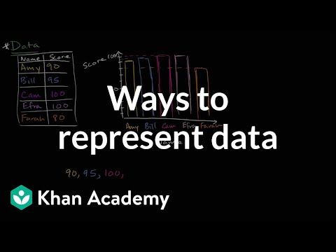
This video explores various methods of representing data, such as tables, bar graphs, histograms, and frequency plots.
Key Insights
- 💨 Data can be represented in various ways, such as tables, graphs, and plots.
- ❓ Different representations offer different perspectives and can highlight different aspects of the data.
- 💁 Each method of representation serves a specific purpose, and the choice depends on the information being conveyed.
Transcript
- [Voiceover] What I want to do in this video is think about all of all the different ways that we can represent data. So right over here, we have a list of, and I'm just using this as one form of data, a list of students' scores on, say, the last test, so Amy got 90 percent right, Bill got 95 percent right, Cam got 100 percent right, Efra also got... Read More
Questions & Answers
Q: What are some common ways to represent data?
Common ways to represent data include tables, bar graphs, histograms, and frequency plots. Each of these methods has its own advantages and can effectively convey information.
Q: How is a table used to represent data?
A table typically includes columns for different variables and corresponding values. In the case of representing student scores, one column may contain names, and another column may list the scores.
Q: What is a bar graph?
A bar graph is a visual representation of data, where the height of each bar corresponds to the value being represented. In the video's example, the height of each bar represents a student's score.
Q: What is a frequency plot?
A frequency plot shows the frequency of different values or categories. In this case, the plot displays the number of students who received each score. The highest bar represents the most frequent score.
Summary & Key Takeaways
-
The video discusses different ways to represent data, including tables, bar graphs, and frequency plots.
-
It explains how each representation conveys the same information but in different formats.
-
The video emphasizes the flexibility in presenting data and mentions that there are even more ways to represent data beyond those shown.
Share This Summary 📚
Explore More Summaries from Khan Academy 📚