Data Visualization
Discover articles and videos in Data Visualization
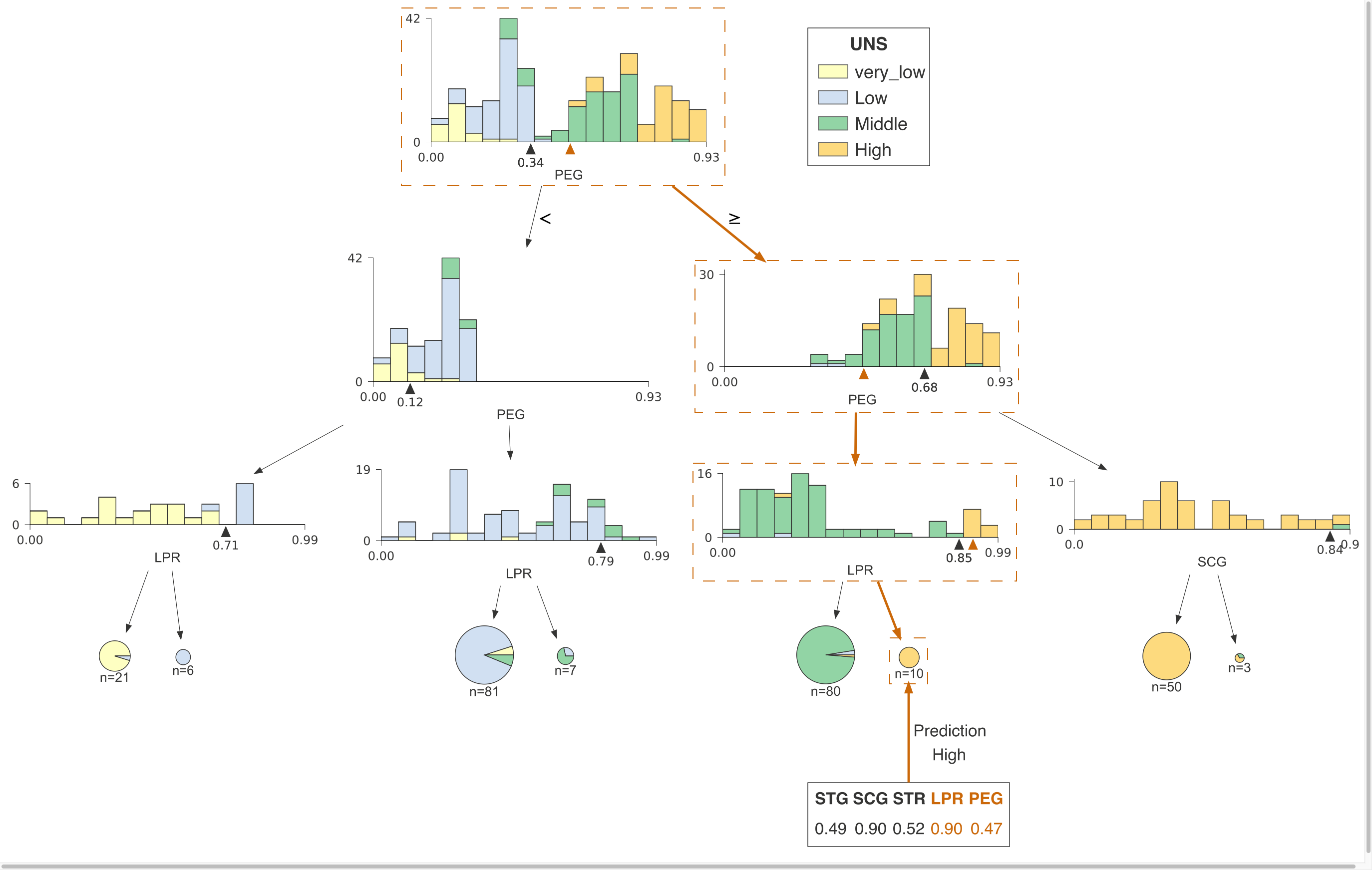
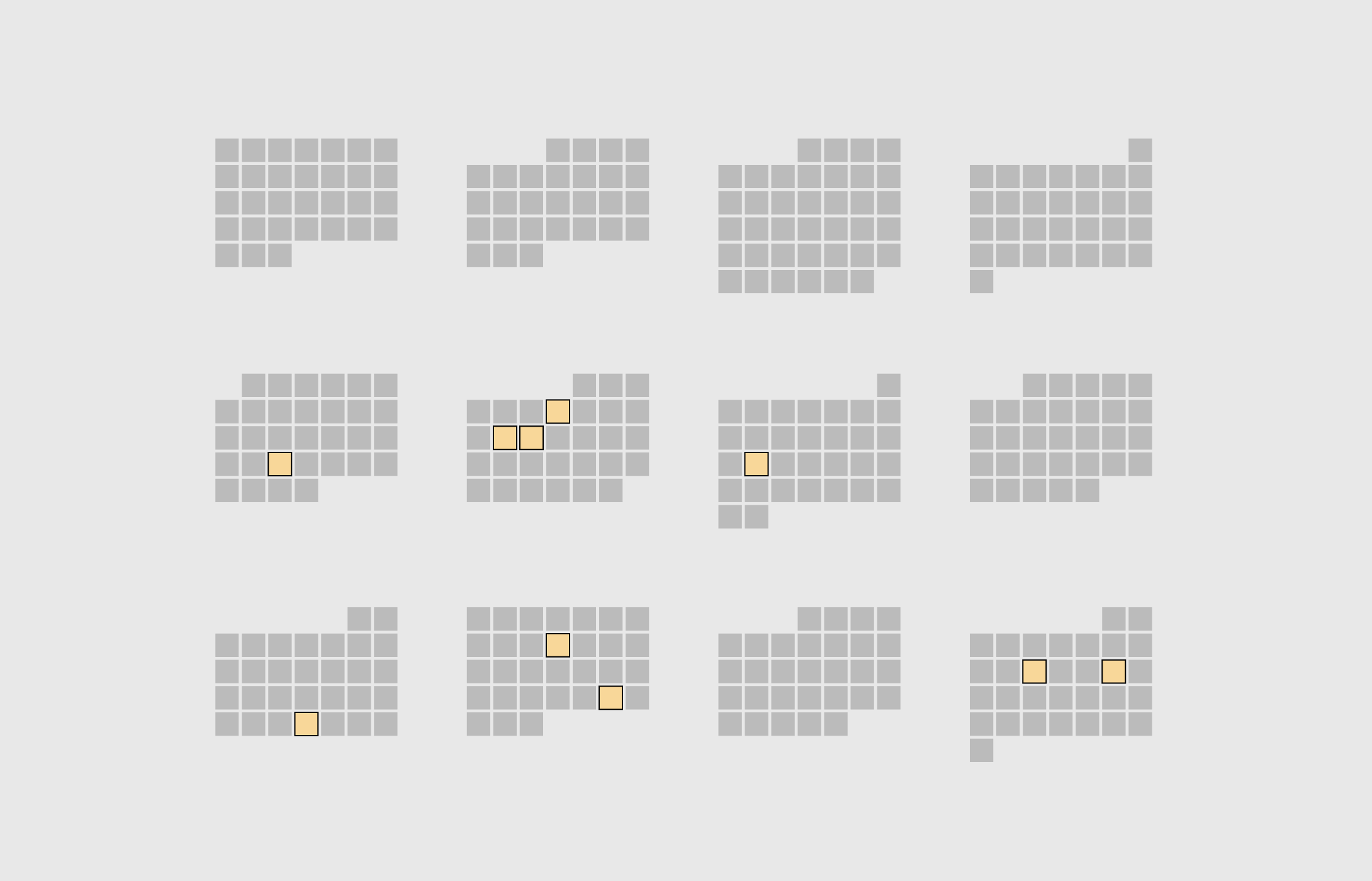
How to visualize decision tree
http://explained.ai/decision-tree-viz/index.html • 20+ min
Decision trees are the fundamental building block of gradient boosting machines and Random Forests(tm), probably the two most popular machine learning models for structured data. Visualizing decision trees is a tremendous aid when learning how these models work and when interpreting models. Unfortunately, current visualization packages are rudimentary and not immediately helpful to the novice. For example, we couldn't find a library that visualizes how decision nodes split up the feature space.
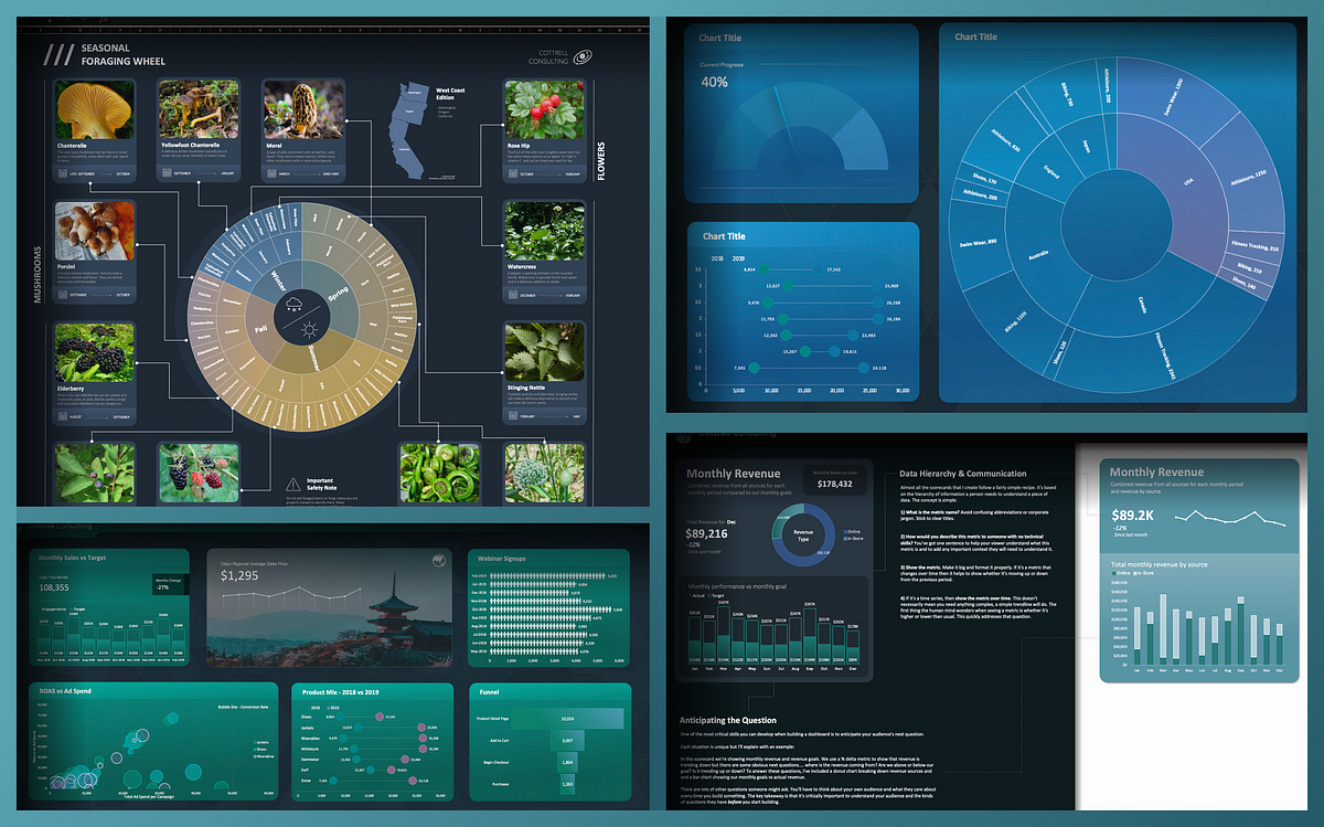
Excel is your most overlooked design tool
https://bootcamp.uxdesign.cc/excel-is-your-most-overlooked-design-tool-d5bbae988c92
A designer’s perspective on the world’s #1 spreadsheet tool — how to build infographics, dashboards, presentations & more
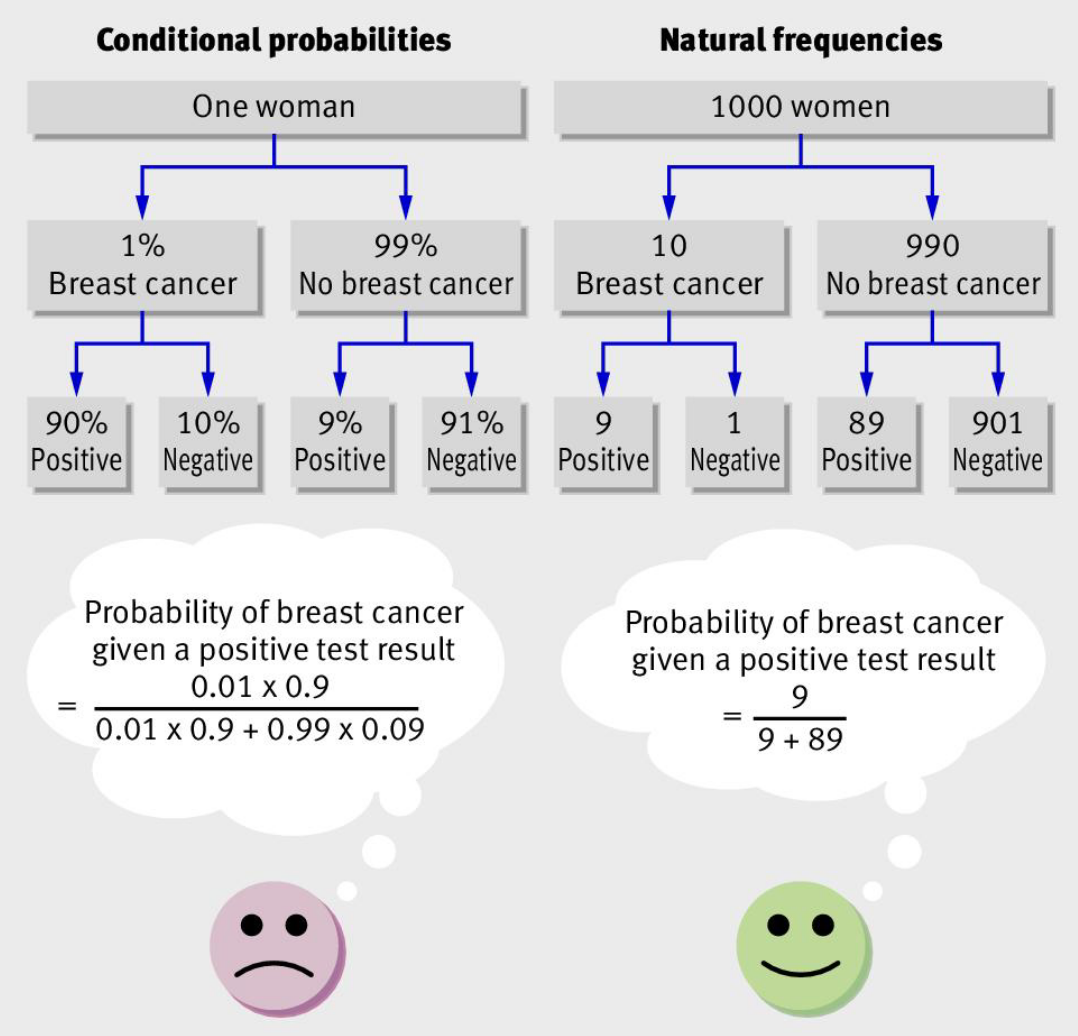
Explaining base rate neglect
https://www.jasoncollins.blog/posts/explaining-base-rate-neglect • 3 min
In a seminar for a team from an investment manager I described how base rates are often neglected when people are grappling with conditional probabilities.
Our Top 22 Visualizations of 2022
https://www.visualcapitalist.com/our-top-22-visualizations-of-2022 • 20+ min
The world was a complex and volatile place in 2022. In our signature style—combining art, data, and storytelling—we helped millions of people make sens
Simulating Fluids, Fire, and Smoke in Real-Time
https://andrewkchan.dev/posts/fire.html • 16+ min
Source code for this article can be found on my GitHub. Fire is an interesting graphics problem. Past approaches generally faked it. For example, Lord of the Rings used sprites with lots and lots of…
When is Dinner, By State
https://flowingdata.com/2023/07/25/when-is-dinner-by-state • 2 min
These are the states that eat dinner the earliest and latest, along with everyone else in between.
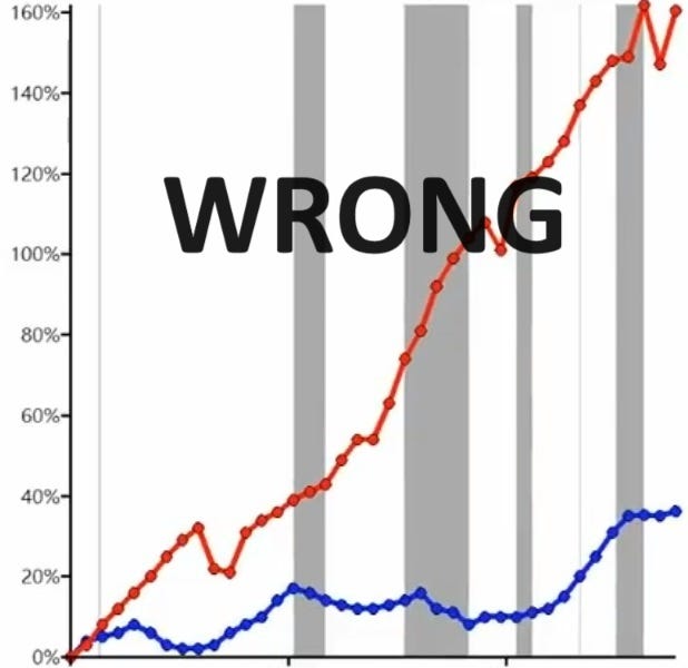
How not to be fooled by viral charts
https://www.noahpinion.blog/p/how-not-to-be-fooled-by-viral-charts • 18+ min
Part 1: How to spot misinformation, mistakes, and meaningless data

Discovering Data Visualisation: How I Discovered and Fell in Love with Data Visualisation Art
https://nightingaledvs.com/discovering-data-visualisation-how-i-discovered-and-fell-in-love-with-data-visualisation-art • 11+ min
I stumbled upon data visualisation art quite by accident early in 2022, at a time when I was at an interesting crossroads in my life. I’m a neurodivergent woman in my 40s and my life has always been a…

Visualizing fighting game mechanics
https://janezhang.ca/work/tekken • 1 min
This project aimed to create a visual aid that helped players learn how to think about the game, not just how to play it. By breaking down the game mechanics into smaller components, I designed cards…

How to pick more beautiful colors
https://blog.datawrapper.de/beautifulcolors/index.html • 11+ min
Choosing good colors for your charts is hard. This article tries to make it easier.
Best Data Visualization Projects of 2023
https://flowingdata.com/2023/12/29/best-of-2023 • 2 min
Data continues on its upwards trajectory and with it comes the importance of visualization. Many charts were made in 2023. These are my ten favorites from the year.