Writing CSS for neomorphism design as easy as possible
TL;DR
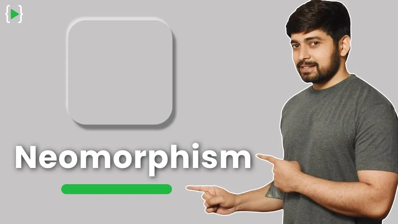
Learn how to create Neumorphism, a trending design style, in CSS by following three key principles: positioning the light source, using two types of shadows, and choosing a background color that contrasts with the element.
Transcript
hey there everyone has a she are back again with another video and in this video we're gonna learn about new morphism as easy as possible now whether you like it or not new morphism is already trending in 2020 if you watch the videos of mkbhd it's there in his logo and intro as well so if it is there it's definitely trending a little bit now writin... Read More
Key Insights
- 🙈 Neumorphism is a trending design style in 2020, seen in prominent influencers' logos and intros.
- 🙂 Key principles in Neumorphism include positioning the light source, using white and black shadows, and choosing contrasting background colors.
- 🍱 CSS can be used to implement Neumorphism effects by adjusting box shadows, background colors, and border radius.
- 🙂 Designers have flexibility in positioning the light source and playing with colors to achieve unique Neumorphism designs.
- ❓ Contrasting colors and careful placement of shadows are essential to create a realistic and visually appealing Neumorphism effect.
- 👤 Neumorphism offers a modern and minimalist aesthetic, adding depth and dimension to user interfaces.
- 👻 Experimenting with different values for shadows, background colors, and border radius allows for customizing the Neumorphism effect.
Install to Summarize YouTube Videos and Get Transcripts
Explore YouTube Video Summarizer or Get YouTube Transcript Extractor
Questions & Answers
Q: What is Neumorphism and why is it trending?
Neumorphism is a design style that creates a soft, lifelike, 3D appearance for elements. It is trending because of its modern and minimalist aesthetic, and its ability to create depth and dimension in user interfaces.
Q: How do you determine the position of the light source in Neumorphism?
The position of the light source usually affects the placement of shadows in Neumorphism. It is commonly placed in the top-left corner, but designers have the flexibility to be creative and position it differently.
Q: What are the two types of shadows used in Neumorphism?
Neumorphism utilizes white and black shadows to create the desired effect. White shadows typically represent highlights, while black shadows represent lowlights or depth.
Q: Why is it important to choose a background color that contrasts with the element in Neumorphism?
Choosing a background color that is not pure white is crucial in Neumorphism since the shadows and highlights will be less noticeable if the background color is too similar. Contrasting colors help to enhance the 3D effect.
Summary & Key Takeaways
-
Neumorphism is a trending design style in 2020, seen in logos and intros of influencers like MKBHD.
-
To create Neumorphism, consider the positioning of the light source, use both white and black shadows, and choose a background color that contrasts with the element.
-
In CSS, you can achieve Neumorphism effects by applying box shadows and adjusting background colors and border radius.
Read in Other Languages (beta)
Share This Summary 📚
Summarize YouTube Videos and Get Video Transcripts with 1-Click
Try YouTube Summary with ChatGPT & Claude or YouTube Transcript Generator
Explore More Summaries from Hitesh Choudhary 📚


Summarize YouTube Videos and Get Video Transcripts with 1-Click
Try YouTube Summary with ChatGPT & Claude or YouTube Transcript Generator