
5 quick changes that stop Windows 11 from spamming you with ads
www.xda-developers.com/changes-stop-windows-11-spamming-ads/
Jan 21, 2025
8

What is the difference between idea and information?
www.quora.com/What-is-the-difference-between-idea-and-information
Jul 13, 2024
1

'Idea' vs. 'Concept': Why Distinguishing Between Ideas and Concepts Matters in Research | Paperpal
paperpal.com/blog/academic-writing-guides/language-grammar/idea-vs-concept
Jul 13, 2024
3

How to Choose Blog Categories (That Will Actually Get Your Content Read!)
www.impactplus.com/blog/how-to-choose-blog-categories
Jul 11, 2024
61

How to Pick Blog Categories and Content Themes - Marketing Insider Group
marketinginsidergroup.com/content-marketing/pick-blog-content-themes/
May 25, 2024
43

How We Used the Pillar-Cluster Model to Transform Our Blog
blog.hubspot.com/marketing/pillar-cluster-model-transform-blog
May 25, 2024
131

How to use Keywords Everywhere for SEO on a budget
zapier.com/blog/keywords-everywhere/
May 1, 2024
26

How to Design A Website Button That Gets Clicked: 7 Tips | Orbit Media Studios
www.orbitmedia.com/blog/how-to-design-button/
Feb 9, 2024
156

Website Navigation Best Practices - 9 Navigation Design Tips and Warnings
www.orbitmedia.com/blog/website-navigation/
Feb 9, 2024
4211

What to Blog About: 25 Fresh Sources for Blog Topics|What to Blog About: 25 Fresh Sources for Blog Topics
www.orbitmedia.com/blog/what-to-blog-about/
Feb 9, 2024
825

A beginner's guide to keyword research for bloggers [2024]
www.productiveblogging.com/keyword-research-for-bloggers/
Feb 9, 2024
383

Saying goodbye to third-party cookies in 2024 | MDN Blog
developer.mozilla.org/en-US/blog/goodbye-third-party-cookies/
Dec 24, 2023
1
What is Google Trends data — and what does it mean?
medium.com/google-news-lab/what-is-google-trends-data-and-what-does-it-mean-b48f07342ee8
Dec 23, 2023
12
:max_bytes(150000):strip_icc()/GettyImages-149316436-5be0646ec9e77c0051d2766f.jpg)
How to Build a High-Intensity Weight Loss Cardio Workout Program
www.verywellfit.com/cardio-workout-program-weight-loss-1230810
Nov 21, 2023
13
:max_bytes(150000):strip_icc()/GettyImages-455244937-598090e8b2144344af56ba5f836e9072.jpg)
What Is Resistance Training and Why Is it Important?
www.verywellfit.com/what-is-resistance-training-3496094
Nov 21, 2023
9
:max_bytes(150000):strip_icc()/35-3120456-Lateral-Band-Walk-5120b1bfc7614e0fa0004a3b470c5694.gif)
At-Home Strength Workouts for All Levels
www.verywellfit.com/best-home-workouts-3495490
Nov 21, 2023
22

Reddit Keyword Research: Uncover Hidden SEO Opportunities
www.semrush.com/blog/how-to-use-reddit-keyword-research-content-marketing-strategy/
Oct 21, 2023
5

Choosing a Niche for Your Online Business: 3 Creative Models
copyblogger.com/online-business-niche/
Oct 9, 2023
131

Creating the Perfect About Us Page (Yes, We Did It!) - Marketing Insider Group
marketinginsidergroup.com/content-marketing/create-the-perfect-about-us-page/
Oct 9, 2023
22

How to Find Content Topics That Score Big with Keyword Research
copyblogger.com/post-topics-keyword-research/
Sep 26, 2023
301
How to Choose a Profitable Niche - Copyblogger -
copyblogger.com/niche-keyword-research/
Sep 26, 2023
152
Keyword Research: It's Not What You Think - Copyblogger -
copyblogger.com/keyword-research-introduction/
Sep 26, 2023
14

WordPress SEO: 20 Tips and Best Practices
ahrefs.com/blog/wordpress-seo/
Jul 25, 2023
411

How to Write a Blog Post: The Definitive Guide
backlinko.com/write-a-blog-post
Jul 15, 2023
814

17 Untapped Ways to Find New Content Ideas
backlinko.com/find-content-ideas
Jul 15, 2023
761

Keyword Research for SEO: The Definitive Guide (2023 Update)
backlinko.com/keyword-research
Jul 11, 2023
16013

Technical SEO: The Definitive Guide
backlinko.com/technical-seo-guide
Jul 8, 2023
10222

9 SEO Hacks No One Talks About
backlinko.com/9-seo-hacks
Jul 7, 2023
488
On-Page SEO: The Definitive Guide (2023)
backlinko.com/on-page-seo
Jul 5, 2023
10017

We Analyzed 3.6 Billion Articles. Here's What We Learned About Evergreen Content
backlinko.com/evergreen-content-study
Jul 5, 2023
54

What is Horse Power? How to calculate & use it effectively?
carbiketech.com/horse-power/
May 31, 2023
13
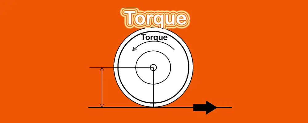
What is Engine Torque? It's Characteristics & Formula
carbiketech.com/engine-torque/
May 31, 2023
24

Horsepower vs. Torque: Which Is More Important? - Kelley Blue Book
www.kbb.com/car-advice/horsepower-vs-torque/
May 31, 2023
10

What is Torque in Cars?
www.jdpower.com/Cars/Shopping-Guides/what-is-torque-in-cars
May 31, 2023
8

Use These Blog Post Templates to Write Better SEO Content - YouTube
www.youtube.com/watch?v=fEaoxnf9KNE
Mar 27, 2023
283

Complete SEO Course for Beginners: Learn to Rank #1 in Google - YouTube
www.youtube.com/watch?v=xsVTqzratPs
Mar 18, 2023
20336
How To Determine The Traffic Potential of a Keyword [3.2] - YouTube
www.youtube.com/watch?v=nFqHWjgM3_U
Feb 16, 2023
183

The #1 Mistake New Bloggers Make [3.1] - YouTube
www.youtube.com/watch?v=ikUuEB7k5oE
Feb 15, 2023
17

Tips to Convert Blog Traffic into Email Subscribers [2.4] - YouTube
www.youtube.com/watch?v=En3IRd8_wtQ
Feb 15, 2023
9