Illusion of Transparency: Your Poker Face is Better Than You Think - Farnam Street
fs.blog/illusion-of-transparency/
Jul 23, 2022
91

The future of building and sharing knowledge — Enter Scrintal
blog.scrintal.com/the-future-of-building-and-sharing-knowledge-enter-scrintal-fc6a308a90ff
Jul 22, 2022
51
Better Than Free
kk.org/thetechnium/better-than-fre/
Jul 21, 2022
202
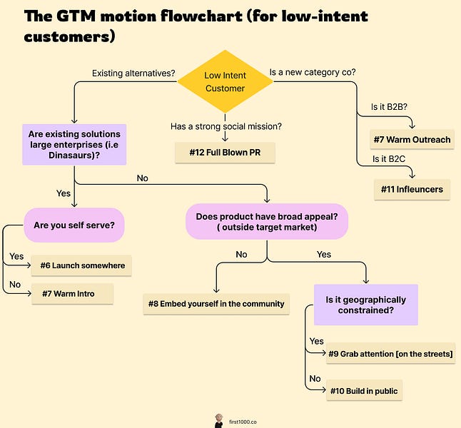
100 Unicorns: 12 different GTM Motions
read.first1000.co/p/100-unicorns-12-different-gtm-motions
Jul 20, 2022
152
Time management: do the things you actually want to do
nesslabs.com/time-management
Jul 18, 2022
82
How I Use Glasp To Highlight & Take Notes On The Internet
evchapman.medium.com/how-i-use-glasp-to-highlight-take-notes-on-the-internet-542c6afc2095
Jul 17, 2022
113
The Explosion of 2nd Brain Apps
lcwf-news.creativefibro.uk/the-explosion-of-2nd-brain-apps/
Jul 14, 2022
51

Transcript: The Art of Smart Brevity - Write Less, Say More | Jim VandeHei | TEDxOshkosh
ytscribe.com/v/NGy1o4jLkJc/
Jul 14, 2022
73

Axios HQ: The power of Smart Brevity
www.axioshq.com/smart-brevity
Jul 14, 2022
101

What You Think You Know About the Web Is Wrong
time.com/12933/what-you-think-you-know-about-the-web-is-wrong/
Jul 14, 2022
71
You Won’t Finish This Article
slate.com/technology/2013/06/how-people-read-online-why-you-wont-finish-this-article.html
Jul 14, 2022
51
New Decade, New Ideas
ev.medium.com/new-decade-new-ideas-faee8e712589
Jul 14, 2022
83

Evan Williams, Blogger/Twitter/Medium - XOXO Festival (2013)
www.youtube.com/watch?v=zR1xDBFdRZ0
Jul 14, 2022
1

Introducing Not Boring Capital
www.notboring.co/p/introducing-not-boring-capital
Jul 14, 2022
112

Going from 0-1k, SEO & Content Strategies, and Glasp
benjaminboman.com/email/ca9d9d3d-4649-4f65-82a9-ebc5150eb75e/
Jul 13, 2022
11
The Goals of Knowledge Management
web.mit.edu/ecom/www/Project98/G4/Sections/section1b.html
Jul 13, 2022
21
What's KM?
web.mit.edu/ecom/www/Project98/G4/Sections/section1a.html
Jul 13, 2022
5

The 4 Levels of Personal Knowledge Management - Forte Labs
fortelabs.co/blog/the-4-levels-of-personal-knowledge-management/
Jul 12, 2022
153

Why do so many brands change their logos and look like everyone else?
velvetshark.com/articles/why-do-brands-change-their-logos-and-look-like-everyone-else
Jul 11, 2022
121

Steelmanning: How to Discover the Truth by Helping Your Opponent
themindcollection.com/steelmanning-how-to-discover-the-truth-by-helping-your-opponent/
Jul 10, 2022
173

Dieter Rams: 10 Timeless Commandments for Good Design
www.interaction-design.org/literature/article/dieter-rams-10-timeless-commandments-for-good-design
Jul 8, 2022
15

A Brief History & Ethos of the Digital Garden
maggieappleton.com/garden-history
Jul 7, 2022
213

9 Startup Lessons From Phil Knight, Creator of NIKE
chartmogul.com/blog/startup-lessons-from-nike/
Jul 7, 2022
212

Is Your Revenue Real? — Chris Neumann
chrisneumann.com/blog/is-your-revenue-real
Jul 7, 2022
15
January 2022 - Map of Inquiry
tomcritchlow.com/2022/01/06/jan-22-map-inquiry/
Jul 6, 2022
31

The Greatest Legacy for Future Generations / Glasp
glasp.co/articles/greatest-legacy-for-future-generations
Jul 5, 2022
1

Great Thinkers: 'The Power of a Brand'
www.yannickoswald.com/post/great-thinkers-the-power-of-a-brand
Jul 5, 2022
103
The Self Destructive Nature of Humans: Why Smart People Do Stupid Things
hardfork.substack.com/p/the-self-destructive-nature-of-humans
Jul 5, 2022
11

How to write your landing page
www.demandcurve.com/playbooks/above-the-fold
Jun 30, 2022
151
Imitate, then Innovate - David Perell
perell.com/essay/imitate-then-innovate/
Jun 28, 2022
318
The Way In Which We Take Notes Gives Us Insight Into Who We Are
medium.com/taking-notes/the-way-in-which-we-take-notes-gives-us-insight-into-who-we-are-bd0195e1a56d
Jun 24, 2022
73
The Definition of Knowledge and Its Management - flomo college
help.flomo.app/mindset/the-definition-of-knowledge-and-its-management
Jun 23, 2022
201

Transcript: How Goodreads Got 50 Million Users – Otis Chandler @ Hustle Con 2016
ytscribe.com/v/5XTSl6by_iw/
Jun 21, 2022
288

Goodreads for Publishers, Booksellers & Librarians
www.slideshare.net/GoodreadsPresentations/bea-workshop-v3
Jun 21, 2022
2
USV Thesis 3.0 | Union Square Ventures
www.usv.com/writing/2018/04/usv-thesis-3-0/
Jun 20, 2022
3
The Content Marketing Handbook - Priceonomics
priceonomics.com/the-content-marketing-handbook-2/
Jun 20, 2022
8114
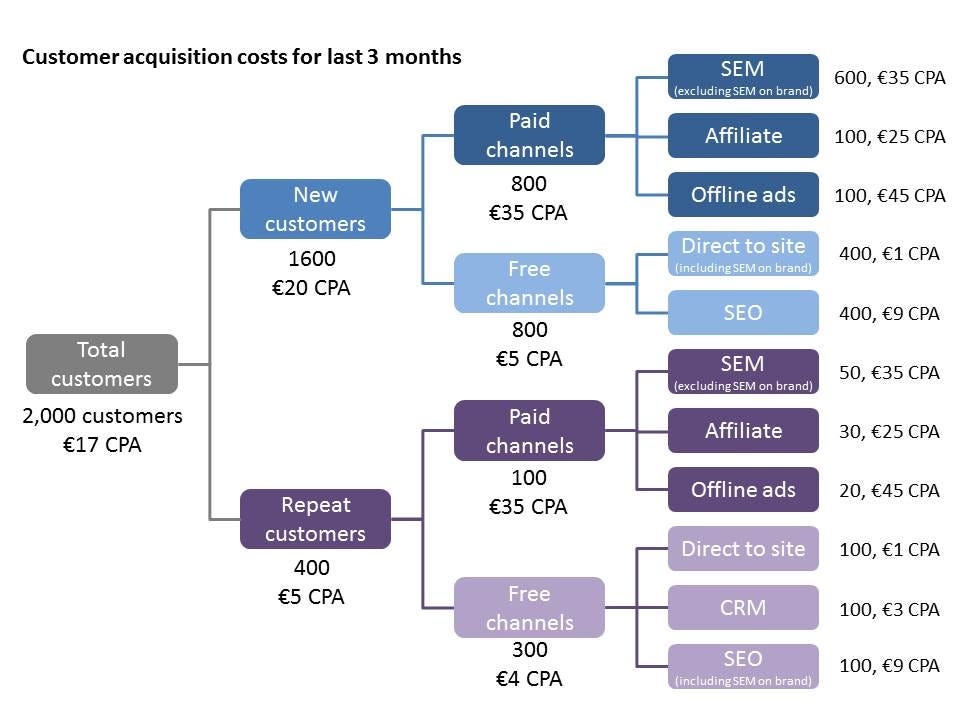
Understanding Customer Acquisition Costs
medium.com/venture-capital-growth-hacking/understanding-customer-acquisition-costs-74aec7538b4d
Jun 20, 2022
12
Memory as a Service – Nick Grossman
www.nickgrossman.xyz/2022/memory-as-a-service/
Jun 18, 2022
101

🌲When Themed Logs are More Useful than Daily Notes
www.obsidianroundup.org/themed-logs-not-daily-notes/
Jun 17, 2022
31
Announcing a new Blockchain-Based Digital Advertising Platform | Basic Attention Token
basicattentiontoken.org/announcing-a-new-blockchain-based-digital-advertising-platform/
Jun 16, 2022
121
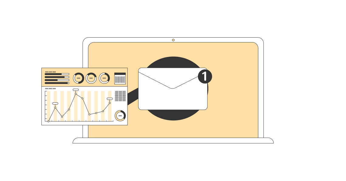
Average Email Open Rates by Industry (2022)
influencermarketinghub.com/email-open-rates/
Jun 15, 2022
122
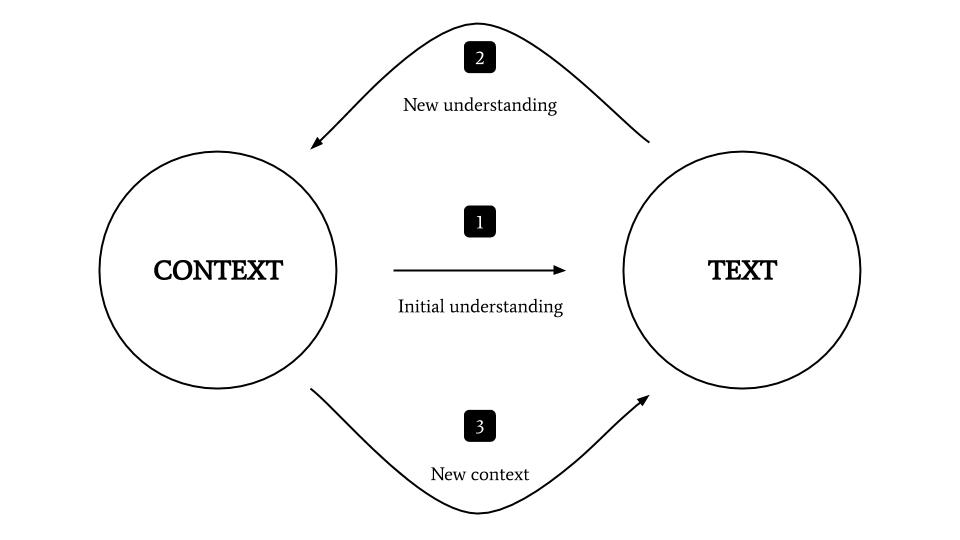
The hermeneutic circle: a key to critical reading
nesslabs.com/hermeneutic-circle
Jun 15, 2022
61
The Ultimate Productivity Hack is Saying No
jamesclear.com/saying-no
Jun 14, 2022
142
The Best Way to Find More Time to Read
fs.blog/finding-time-to-read/
Jun 14, 2022
133
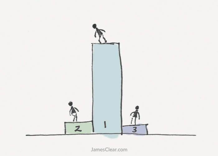
The 1 Percent Rule: Why a Few People Get Most of the Rewards
jamesclear.com/the-1-percent-rule
Jun 14, 2022
112
Get smarter everyday with Vladimir Oane, founder of Deepstash
nesslabs.com/deepstash-featured-tool
Jun 10, 2022
93